 Getly
Getly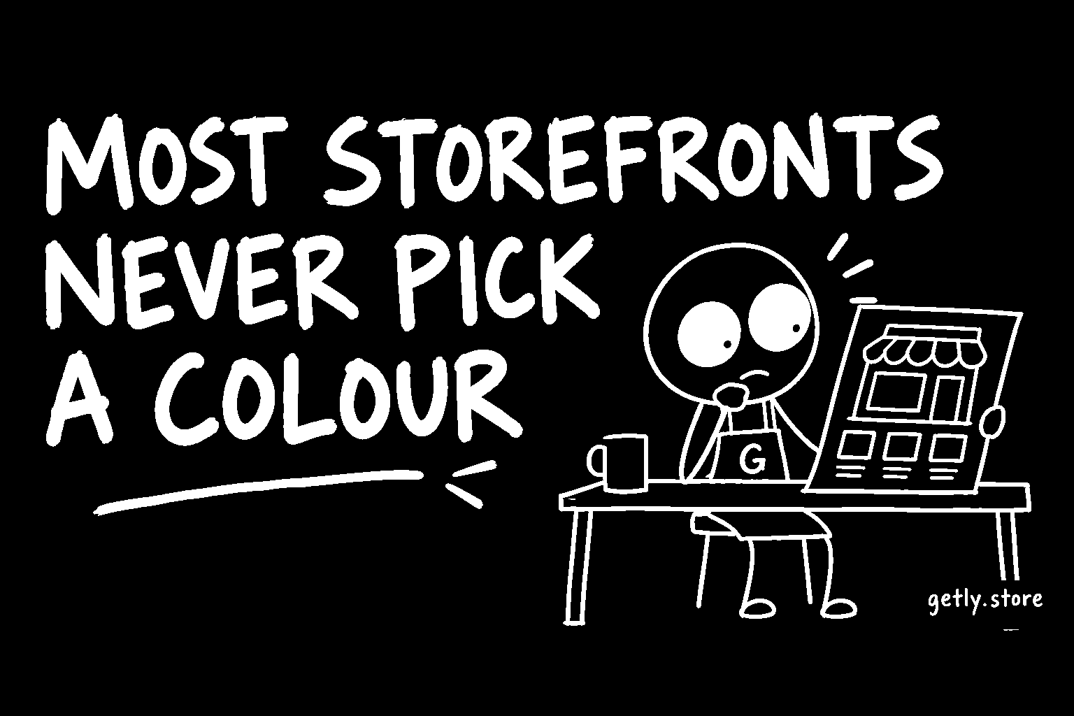
Of all the settings a seller can change on a Getly storefront, the accent colour is the cheapest. It takes one tap, it needs no file, no writing and no design skill, and it changes how every part of the shop page looks. It is also one of the least used.
Measured on 26 September 2026 across shops with at least one active listing, 16.8% had chosen an accent colour. The other five shops in six were running on whatever the platform gave them. For comparison, 33.0% had uploaded a logo, 27.5% a banner and 25.0% had written a shop description. The one setting that costs nothing is used least.
What a storefront looked like without one
Until recently, a shop with no accent colour rendered in neutral grey: a grey header, a grey ring around the avatar, grey section markers. With no logo either, the avatar was a single letter on grey. Next to another shop in a list, it was hard to tell the two apart, and on its own it looked unfinished in a way the seller probably never saw, because sellers rarely look at their own shop through a buyer's eyes.
That has changed. Every storefront now gets a colour. If the seller picked one, that colour is used. If not, the shop is given a colour from a fixed palette of ten, chosen from the shop's own id. The same shop always gets the same colour, so it does not flicker between visits, and two shops next to each other are unlikely to match.
So the question for a seller is no longer "grey or colour". It is "a colour the platform assigned, or a colour you chose".
Why choosing it yourself still matters
An assigned colour is better than grey, but it is not yours. Three reasons to pick it deliberately:
- It should match your products. The accent tints the header, the ring around your avatar and the highlights across the page. If your covers are warm oranges and the shop was assigned a cold blue, the page argues with the products it is selling.
- It should match your logo. A logo sits inside the accent ring. A colour taken from the logo makes the two read as one mark. A random one makes the logo look pasted on.
- It carries across your other pages. If you also run a Getly Page at yourname.getly.page, accent and background colour are free there too. Using the same colour on the shop and the page tells a visitor who clicks from one to the other that they are still with the same seller.
None of this is measured as a sales effect, and we are not claiming one. The measured link between a complete shop profile and sales is weak, and a colour on its own is a small signal. What a colour does is make the shop look looked-after. Buyers of digital goods cannot touch the product before paying, so how cared-for the shop looks is part of what they are judging.
The contrast problem is already handled
The usual reason not to pick a colour is the fear of picking a bad one: a pale yellow that makes text unreadable, or a dark navy that disappears on the dark theme. That is taken care of for you.
When the accent is used as text, the storefront adjusts it so it stays readable on both the light and the dark theme: darkened a little on the light page, lightened a little on the dark one, keeping the same hue. Where the accent is a filled background, the text on top of it switches between black and white, whichever reads better. Borders, fills and gradients keep your exact colour.
In practice this means you can choose by taste. The page will not let the choice become illegible.
How to set it
- Open Dashboard, Settings and find the customisation card.
- Under Accent colour, either tap one of the ten preset swatches, or use the colour picker, or type a hex code such as
#0ea5e9into the field next to it. - Save. The settings page also shows a storefront checklist (logo, banner, description, accent colour, featured products, social links) that ticks the step off once it is saved.
- Open your shop in a private window and look at it as a buyer would. Switch your device to dark mode and look again.
The ten presets are the same palette the platform uses for shops that have not chosen. That is deliberate: if you like the colour you were assigned, picking the same swatch makes it your choice, and it will stay the same even if the palette assignment ever changes.
A quick way to choose
If you are unsure which colour to use, three simple rules work for most shops:
- Take the strongest colour from your logo. If you have no logo, take it from the cover of your best-looking product.
- Avoid pure red unless it is really your brand colour. On a shop page it tends to read as a warning.
- If your products are colourful already, pick a calm, mid-strength colour so the shop frames them rather than competing with them.
Whatever you pick, you can change it later, and clearing the field hands the shop back to its assigned colour.
What to do today
Open your settings, pick an accent colour that matches your logo or your best cover, and save. It is one tap and it takes your shop out of the five in six that never chose. While you are on that page, look at the storefront checklist: if it shows the logo, banner or description as missing, those are the next three steps, and together they are what 20.3% of shops have done.