 Getly
Getly
By the end of this guide, you can describe a visual aesthetic with movements, materials, color systems, composition rules, and rendering choices instead of artist names. You can also turn that description into a repeatable prompt and adjust one style variable at a time.
This method helps creators build clearer image directions and helps buyers judge whether a prompt pack contains useful craft or vague name-dropping.
1. Separate the subject from the aesthetic
Write the subject first, then describe the visual treatment. A subject names what appears in the image. An aesthetic names the decisions that shape its appearance.
For example, “a cyclist crossing a rainy street” gives you a subject and action. “Muted teal and rust, compressed perspective, screen-printed grain, hard-edged shadows, and a limited poster palette” gives you an aesthetic. The second description can guide an image model without pointing toward a particular person’s body of work.
Use this five-part split before you write a polished prompt:
- Subject: the person, object, place, or scene.
- Action: what the subject does or how the scene behaves.
- Medium: oil paint, cyanotype, clay render, risograph print, ink wash, or another material language.
- Visual system: palette, lighting, composition, line quality, texture, and level of detail.
- Output: editorial illustration, product image, game concept, book cover, or another use.
Keep the subject stable while you test the aesthetic. A repeated subject makes differences easier to see. If you change the subject, lighting, palette, and composition together, you will not know which choice created the result.
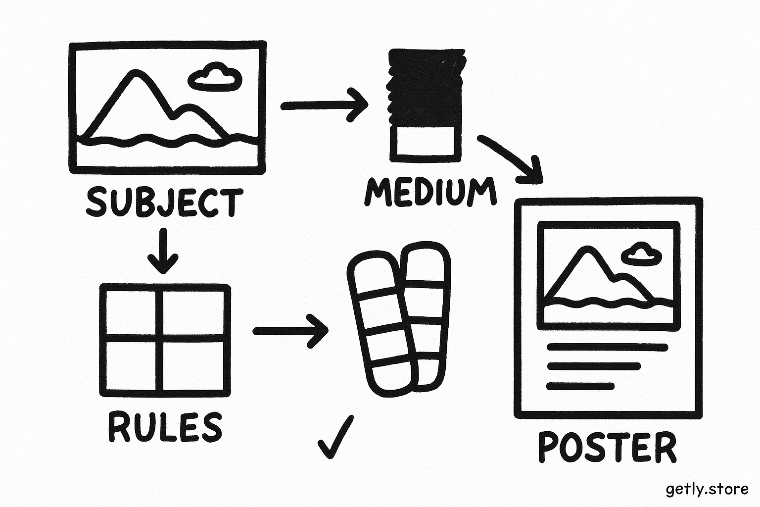
Name the subject
Write the object, setting, action, and intended output.
Choose the medium
Select a material language such as ink, paper collage, or 3D clay.
Add visual rules
Specify palette, light, composition, texture, and detail.
Set the use case
Tell the model whether you need a poster, cover, thumbnail, or product scene.
2. Name movements and design languages
Art movements and design traditions give you compact starting points. Terms such as Art Nouveau, Bauhaus, Constructivism, Surrealism, ukiyo-e, brutalism, Swiss typography, vaporwave, and editorial collage point toward recognizable families of choices. Add concrete descriptors so the prompt does not depend on the label alone.
Pair each broad term with two or more visible traits:
- Art Nouveau: flowing contour lines, botanical curves, decorative borders, jewel-like color, and flattened depth.
- Bauhaus: geometric blocks, primary color accents, functional spacing, sans-serif lettering, and balanced asymmetry.
- Ukiyo-e: flat color areas, expressive contour lines, cropped framing, patterned fabrics, and atmospheric depth.
- Brutalist graphic design: raw typography, stark contrast, rough alignment, monochrome fields, and utilitarian layouts.
- Surrealist collage: unexpected scale, combined objects, dream logic, cut-paper edges, and quiet empty space.
Use the movement as a direction, not as the entire prompt. A label such as “Surrealism” leaves too many decisions open. “Surrealist editorial collage with a giant key above a small train station, cut-paper edges, dusty red and cream, off-center composition, and a narrow caption area” gives the model a workable visual system.
3. Replace artist names with observable traits
Artist names often act as shortcuts for a bundle of visual properties. Pull that bundle apart and write the properties directly. Ask yourself what you could point to inside the image.
Use these categories to translate a name into usable language:
| Category | Questions to ask | Useful wording |
|---|---|---|
| Line | Do edges look precise, loose, tapered, or absent? | thin contour lines, dry-brush marks, blunt blocks |
| Shape | Do forms look geometric, organic, flattened, or distorted? | interlocking circles, elongated figures, flattened silhouettes |
| Color | How many colors appear, and how do they relate? | four-color palette, low saturation, complementary accents |
| Light | Where does light come from, and how hard does it fall? | overcast glow, sharp side light, candlelit shadows |
| Texture | What surface would your hand feel? | fibrous paper, cracked pigment, glossy resin, coarse grain |
| Composition | How does the frame organize attention? | centered symmetry, cropped close-up, diagonal movement |
| Finish | How much detail and polish should the image show? | rough study, clean vector finish, tactile print artifact |
Specificity matters because models respond to visual nouns and relationships. “Painterly” gives little direction. “Visible bristle marks, uneven pigment coverage, soft edges around the background, and layered ochre over a cool gray ground” gives several cues that you can inspect.
Use historical or commercial style terms when they describe a broad visual language. Avoid a living artist’s name when you can describe the same qualities through medium, form, palette, and composition. That practice also gives you more control over revisions.
4. Build a style reference with weighted priorities
Most prompts contain more adjectives than the image can support. Rank your decisions instead of adding descriptors without limits. Start with the three choices that matter most to the project.
A poster might prioritize:
- Composition: a large central figure with open space at the top for a title.
- Palette: black, warm ivory, and one vermilion accent.
- Surface: two-color screen-print texture with slight registration shifts.
Secondary choices can support those priorities. Add “flat side lighting,” “angular silhouette,” and “limited background detail” after you establish the main structure. If the result misses the poster layout, changing the texture will not fix the problem.
You can also assign rough importance during testing. Treat the percentages as attention targets, not mathematical controls.
Use a short prompt for your first test. Add one layer after you confirm the main shape. This sequence shows which wording changes the output and which wording adds noise.
5. Turn the description into a reusable prompt
Arrange the prompt in the order you want to solve the image. A practical structure looks like this:
[subject and action] + [composition] + [medium] + [palette] + [lighting] + [texture] + [output constraints]
Example:
“A botanist examining a giant greenhouse fern, three-quarter view, tall vertical composition with open space above the figure, editorial gouache illustration, muted olive and cream with a coral accent, soft window light, visible opaque brushwork and paper grain, clear silhouette, cover-ready layout.”
The prompt names an aesthetic through material and design choices. It does not rely on a person’s name, and each part gives you a revision handle. You can change “gouache” to “colored pencil” while keeping the subject and layout. You can replace the palette without rebuilding the whole direction.
Add constraints that protect the intended use. A product thumbnail may need a clean central silhouette. A book cover may need negative space for type. A game concept may need several readable material surfaces. State those needs in plain language.
Do
- Combine one broad movement with concrete visual traits.
- Name the medium, palette, composition, and finish.
- Reserve space for text when the image will support a layout.
Don't
- Stack several style labels without describing what they contribute.
- Use “beautiful,” “cinematic,” or “professional” as your main art direction.
- Change five prompt variables between two test images.
6. Test, compare, and document the result
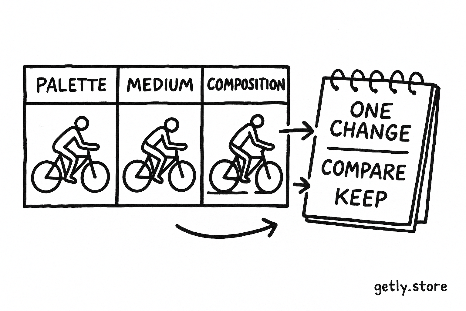
Run small comparisons instead of trusting a single generation. Keep the subject, aspect ratio, and output purpose fixed. Change one variable, such as palette or medium, and compare the results at the same viewing size.
Check four questions:
- Does the composition support the intended format?
- Can you identify the medium from the surface and edges?
- Does the palette contain the contrast that the subject needs?
- Can you explain the aesthetic without using an artist’s name?
Save the prompt beside the image and record the strongest phrases. Mark phrases that produce no visible difference. You can remove those words from the next version and make room for decisions that matter.
For a repeatable product, create a small style reference sheet. Include the aesthetic name, five visual traits, a palette, two composition examples, and a short prompt template. Buyers can adapt that sheet to new subjects, while creators can keep the product focused on transferable technique rather than a single imitation.
Common mistakes
Relying on one vague label
“Vintage,” “artistic,” and “futuristic” cover too much ground. Add a period cue, material, color behavior, and layout rule. “1970s travel poster, flat gouache, sun-faded orange and blue, simplified mountains, strong diagonal composition” gives the model a clearer route.
Mixing incompatible priorities
“Minimalist, hyper-detailed, chaotic, and calm” asks for conflicting results. Decide which quality controls the image. You can keep a calm composition with detailed surface texture, but state that relationship directly.
Confusing medium with subject matter
“Children’s book style” describes a broad audience convention, not a complete visual system. Add line quality, shape language, palette, lighting, and texture. The same subject can then support a gentle paper-cut illustration or a bold ink drawing.
Changing the whole prompt during testing
Large rewrites hide cause and effect. Keep a base prompt, duplicate it, and edit one category at a time. After you find a useful combination, remove extra words and test the shorter version.
FAQ
Can I name an art movement in an AI art prompt?
Yes. Broad movements and design traditions can provide useful direction. Add observable traits such as line, palette, composition, lighting, and texture so the prompt communicates more than a label.
How many style descriptors should I use?
Start with three primary choices and two or three supporting details. A focused prompt usually gives you a clearer test than a paragraph filled with overlapping adjectives.
What should replace an artist reference?
Describe the visual properties you want: medium, edge quality, shape language, color relationships, light, composition, surface, and finish. Those properties give you direct controls for revision.
How can I make a style prompt reusable?
Separate fixed choices from replaceable fields. Keep the medium, palette logic, texture, and composition rules in the style section. Leave blanks for the subject, action, setting, and output format.
Frequently asked questions
Can I name an art movement in an AI art prompt?
Yes. Broad movements and design traditions can provide useful direction. Add observable traits such as line, palette, composition, lighting, and texture so the prompt communicates more than a label.
How many style descriptors should I use?
Start with three primary choices and two or three supporting details. A focused prompt usually gives you a clearer test than a paragraph filled with overlapping adjectives.
What should replace an artist reference?
Describe the visual properties you want: medium, edge quality, shape language, color relationships, light, composition, surface, and finish. Those properties give you direct controls for revision.
How can I make a style prompt reusable?
Separate fixed choices from replaceable fields. Keep the medium, palette logic, texture, and composition rules in the style section. Leave blanks for the subject, action, setting, and output format.