 Getly
Getly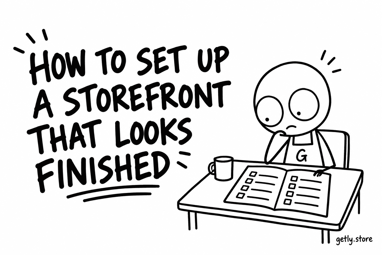
Your store page is where a buyer lands after clicking your name on a product. It answers one question before they read anything: is someone behind this? Measured on 26 September 2026 across shops with at least one active listing, 33.0% have a logo, 27.5% a banner and 25.0% a shop description; only 20.3% have all three together, and 16.8% chose their own accent colour.
None of these settings takes longer than a few minutes, and none of them is hidden. This guide goes through them in the order the dashboard shows them, and says exactly what each one changes on the page a buyer sees. It does not promise more sales from any of them; it makes the page look like a shop somebody runs.
Step 1: Open the checklist
Go to Store Settings in the dashboard. The Profile tab opens with a card titled Your storefront: N of 6 done. It lists six items: Store logo, Store banner, Store description, Store branding (the accent colour), Featured products and Social links. A finished item gets a tick, a missing one says what to add. The card re-reads itself after every save, so you can watch it fill.
Everything below lives on the same tab. Uploads and edits are applied when you press Save Changes at the bottom, not the moment a file finishes uploading, so save before you leave the page. On a desktop a small preview card sits beside the form; on a phone it is behind the Preview button. For the real thing, open your store page itself.
Step 2: Logo
Under Store Logo press Upload Logo: JPEG, PNG, WebP or GIF, up to 5 MB. On the store page the logo sits in a rounded square that overlaps the bottom of the banner. Without one, the square shows the first letter of your shop name on your shop colour.
Use a square image with the mark centred and a little margin around it. Text-heavy logos turn into grey noise at small sizes; a single shape or initials read at every size.
Step 3: Banner, or the covers instead
Under Store Banner press Upload Banner: JPEG, PNG or WebP, up to 5 MB, recommended 1200x300. The banner fills the full width of the top of your page and is shown exactly as you uploaded it, with no overlay or texture on top. The band is shorter on phones than on desktops, so the image is cropped to fit its height: keep text and faces near the vertical centre, and leave the bottom-left corner quiet, because that is where your logo overlaps it.
If you have no banner, the page does not show an empty grey strip. It fills the band with your shop colour and runs the covers of your first products along the right side, up to three on a wide screen and fewer on a phone. A shop with no banner and no product covers gets a soft gradient in its colour. So a shop with good covers already looks decent without a banner; a banner is for when you want to say something the covers do not.
Step 4: Description, where the first two lines do the work
The Description field takes up to 1,000 characters. On the store page it sits under your shop name, but only the first two lines are shown in that header. The median shop description is 200 characters, which fits comfortably; a long one is fine, as long as the opening says what you make and for whom.
Write the first sentence as an answer to "what is this shop?": "Printable planners and budget sheets for freelancers" does the job, "Welcome to my store" does not. The same sentence becomes the tagline if you later start a Getly Page from a template, so it pays twice.
One more reason to write it: a store page with exactly one product and a description shorter than 50 characters is kept out of search results, because it would say nothing the product page does not. Two products, or a real description, and the page can be indexed.
Step 5: Accent colour
Under Customization, the Accent Color field has a colour picker, a hex field and a row of Colour presets you can pick with one tap. The colour paints your storefront: the banner area when you have no banner, buttons, headings, category chips and the border around your logo. If you leave it empty, your shop is given a colour automatically from the same palette, stable for your shop, so it never renders grey. Clear returns you to that automatic colour.
Choosing one yourself is still worth it when you have a logo or banner, because an automatic colour will not match them. Pick the dominant colour of your logo or a colour your covers share. Text in your colour is darkened automatically where it would be hard to read, so a pale brand colour is safe to use.
Step 6: Announcement, featured products and links
- Store Announcement, in the same card, is a line of up to 500 characters shown in a box above your products. It appears only when the Active box next to it is ticked. Use it for something with a date: a new release, a sale that ends on Friday. Measured on 26 September 2026, 13.9% of shops run one. Untick it when it stops being true; an announcement about last month's sale reads as an abandoned shop.
- Featured Products lets you pick up to six products to show at the top of your store. With three or more, the first one gets a large spotlight card and the rest sit beside it, so put your strongest cover first.
- Social Links and Website become small links under your name. If you have a published Getly Page, an Official page link appears there too.
What the page adds on its own
Some things you do not set. Below your name the page shows your number of products and the month you joined, your number of sales once there is at least one, and your rating once you have reviews. Nothing is shown as zero: a new shop simply has fewer tiles. You do not need to explain an empty rating; there is none on the page.
What to do today
Open Store Settings, read the checklist, and fill the items in this order: description first (it costs nothing and feeds your Getly Page too), then logo, then pick a colour from the presets, then featured products. Add a banner only if you have an image made for that shape; the cover mosaic is a better default than a stretched photo. Press Save Changes, then open your store page in a private window and look at it the way a buyer would.