 Getly
Getly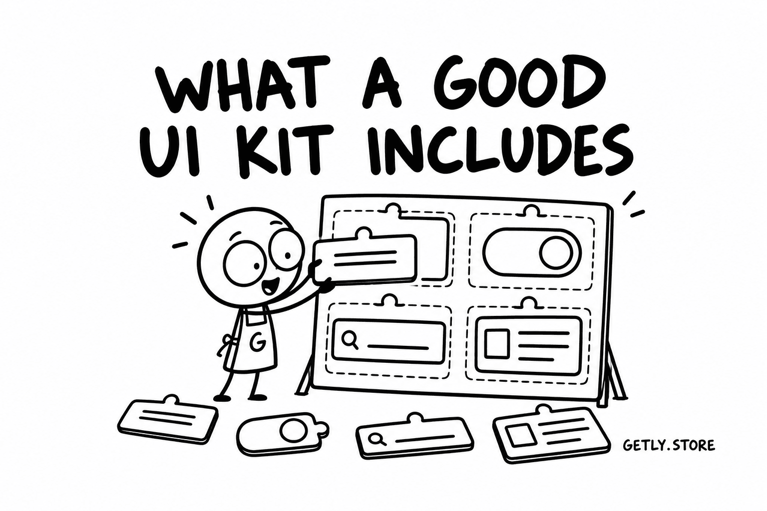
A UI kit is a promise of time saved. You buy a set of buttons, forms, cards and screens so that you do not have to draw them again, and so that the next screen you build looks like it belongs with the last one. A good kit keeps that promise for months. A weak one gives you a pretty preview, a folder of loose frames and a week of cleanup before anything is usable.
This guide is for designers and developers choosing a kit, and for anyone thinking of making one to sell. It covers the formats, the things to check before you pay, how to judge a kit from screenshots alone, and what prices look like right now.
Design kits and coded kits are different products
The word "UI kit" covers two things that only look similar. A design kit is a file for a design tool: Figma, Sketch or Adobe XD. It gives you components to assemble mockups and prototypes. A coded kit is source code: React components, Tailwind templates, Vue or Svelte components, Flutter widgets, SwiftUI views. It gives you something that runs.
Many sellers offer both, and the best ones keep them in step: the same names, the same tokens, the same states. If a kit claims to be both, check that the design file and the code actually match. A Figma button with four sizes and a React button with two is a mismatch that will cost your developer a conversation every time.
Here is how the main formats compare.
| Kit type | Who it suits | What to check |
|---|---|---|
| Figma | Most product designers and teams who share files with developers | Components with variants, auto layout on every component, local styles or variables for colour, type and spacing, a light and dark mode |
| Sketch | Mac-based designers already working in Sketch | Symbols with overrides, shared text and layer styles, the Sketch version it was saved in, whether it opens without missing font warnings |
| Adobe XD | Teams still maintaining older XD projects | Component states, whether the seller still updates it, an export path if you plan to move to another tool |
| React or Next.js | Front-end developers building web apps | TypeScript types, the styling approach, how components accept props, accessibility attributes, a live demo |
| Tailwind templates | Developers who want copy-paste HTML or JSX with utility classes | Tailwind version, a theme config that holds the tokens, responsive classes on every section, dark mode classes |
| Flutter | Mobile developers shipping to iOS and Android from one codebase | Flutter and Dart version, null safety, a theme file, behaviour on small and large screens |
| Mobile design kits (iOS, Android) | Designers working on native apps | Platform guidelines followed (safe areas, navigation patterns), real device frame sizes, touch target sizes |
Pick the format your team already works in. A beautiful Sketch kit is a poor buy for a Figma team, because conversion loses auto layout and variants, which are the parts you paid for.
What a good UI kit includes
The preview images sell the kit. What makes it useful is underneath. These are the parts to look for.
Components with variants and auto layout
Every repeated element should be a component, not a copied group of layers. A button should have its sizes, its types (primary, secondary, ghost, destructive) and its states (default, hover, pressed, focused, disabled, loading) as variants of one component, so you switch between them from a menu instead of hunting for the right frame.
Auto layout matters just as much. Type a longer label into a button and it should grow. Add a row to a table and the rows below should move. If you have to resize things by hand, the kit is a picture of an interface, not a system.
Design tokens and styles
Colour, typography and spacing should be defined once and used everywhere. In Figma that means variables or local styles; in code it means a theme file, CSS custom properties or a Tailwind config. Look for a named palette with clear roles (background, surface, text, border, primary, danger), a type scale with fixed sizes and line heights, and a spacing scale, often based on 4 or 8 pixels.
The test is simple: change the primary colour in one place. In a good kit every button, link and badge updates. In a weak one you find hard-coded hex values in fifty layers.
Light and dark modes
Dark mode is expected in most products now. A kit that offers it should do so through tokens, not through a second copy of every screen. Check that both modes have sensible contrast, that borders and shadows still read on dark surfaces, and that images and illustrations do not glow against a black background.
Accessibility
- Contrast. Body text should meet WCAG AA, which means a ratio of at least 4.5:1 against its background, and 3:1 for large text and for the edges of controls. Light grey text on white is the most common failure in kits that look elegant in previews.
- Focus states. Every interactive component needs a visible focus style for keyboard users. If the button variants have hover and pressed but no focused state, the kit was not designed with keyboards in mind.
- Touch targets. Tap areas should be at least 44 by 44 points on iOS and 48 by 48 dp on Android. Small icon buttons in mobile kits often fall short.
- In coded kits, look for semantic HTML, labels on form fields, ARIA attributes where they are needed and keyboard support for menus, dialogs and tabs.
Responsive breakpoints
A web kit should show its layouts at several widths, usually phone, tablet and desktop. In a design file, look for frames at each breakpoint and components that adapt. In code, check that the grid, navigation and tables behave on a narrow screen, not only that they shrink.
Icons and fonts, and their licences
Most kits bundle an icon set, and many use a specific typeface. Both come with their own licences. Find out which icon library is used: an open source set such as one under MIT or an equivalent licence is easy to ship, while icons drawn by the seller fall under the kit's own licence. For fonts, check whether the typeface is free for commercial use (many on Google Fonts are, under the SIL Open Font License) or whether you need to buy a font licence separately. A kit can be licensed for commercial use while the font in it is not.
Documentation
Even a short guide helps: how the file is organised, how tokens are named, how to change the theme, how to install a coded kit and which dependencies it needs. A cover page that lists the components and a changelog are signs of a seller who maintains the product.
Updates
Design tools and frameworks change. Figma introduced variables, Tailwind moved to a new major version, React keeps evolving. A kit last touched years ago may still work, but it may also miss features that make it easier to use. Look for a version number, a last updated date and a note on what the most recent update changed.
Licences for client work and commercial use
This is the question people skip and regret. Before you buy, find out:
- Can you use the kit in a commercial product you sell or run?
- Can you use it for client projects, and if so, for one client or many?
- Can you use it in a template or kit that you then resell? Almost every licence says no, and that is fair.
- Does the licence cover a whole team, or one designer?
- Do the bundled icons and fonts follow the same terms?
If a listing does not say, ask the seller before paying. A one-line written answer is worth more than an assumption.
How to evaluate a kit from screenshots
You usually cannot open the file before you buy, so learn to read the previews.
- Look for the component sheet, not just finished screens. A page showing a button in all its states, inputs with errors and helper text, and a full type scale tells you the system exists.
- Check the layers panel if a screenshot shows it. Named components and frames suggest an organised file; "Group 214" and "Rectangle copy 3" suggest the opposite.
- Look at the realistic screens. Empty states, error messages, long names in tables and loading skeletons show a kit built for real products. Ten versions of a perfect dashboard with round numbers show a kit built for screenshots.
- Zoom into text and edges. Low contrast and misaligned spacing are visible in previews if you look closely.
- For coded kits, ask for a live demo and resize the browser window. Tab through it with the keyboard. Five minutes of this tells you more than any description.
- Count what is in the box. A good listing states the number of components, screens and files, the formats and the tool versions.
Handoff to developers
A design kit earns its price when the developer can build from it without guessing. Consistent token names that match what will exist in code, components that map to real code components, and spacing on a scale rather than random values all reduce back and forth. If your team uses Figma's developer mode or a similar inspection tool, auto layout and variables translate into readable values; hand-drawn frames translate into a list of pixel offsets.
The strongest option for a product team is often a matched pair: a design kit and a coded kit from the same source, using the same tokens. If you buy them separately, choose them so their foundations agree, or plan time to align them.
What UI kits cost
On Getly, as measured on 2 October 2026, there are 18 active UI kits across UI Kits and Mobile UI Kits. None of them are free. The lower quartile price is $7.00, the median is $12.00 and the upper quartile is $19.75. Most are delivered as a .zip archive.
That gives a useful frame. Under about $7, expect a focused kit: one app's worth of screens or a small component set. Around $12, expect a reasonable component library with styles. Toward $20 and above, it is fair to ask for variants, tokens, both colour modes, documentation and a clear licence. Larger commercial systems elsewhere cost much more, so the question is never only price; it is whether the kit covers what you will actually build.
For sellers making a UI kit
If you are building a kit to sell, the checklist above is also your product spec. A few points matter most:
- Show the system, not only the shots. Include previews of the component sheet, the token page and both colour modes. Buyers who know what to look for want to see it.
- State the format and versions in the title or first line: Figma, Sketch, React, Tailwind, Flutter, and which version.
- Write the licence in plain words, including client work, team use and the terms of any bundled icons and fonts.
- List the contents with numbers: components, screens, breakpoints, files.
- Put a short readme inside the .zip so the buyer knows where to start the moment they open it.
- Update it and say so. A changelog in the description tells buyers the kit is alive.
A UI kit is a small product with a long life. Choose one that is built like a system, check the licence before you build on it, and it will pay for itself on the first project.