 Getly
Getly
Design systems scale when you stop “re-inventing” tokens in every file. In 2026, the fastest teams treat their Figma design system like infrastructure: predictable naming, token governance, and reusable components that survive handoffs.
Below is a practical setup used by real product teams to standardize tokens across a Figma design system without turning the tool into a maze. You will also find a clear checklist for choosing free Figma templates, free mockup templates, and free icon pack assets, plus where Figma plugins for designers actually earn their keep.
| Category | Median price | Typical range | Products |
|---|---|---|---|
| E-books | $7.99 | $2.00–$25.60 | 308 |
| Backgrounds & Wallpapers | $1.99 | $1.00–$5.00 | 205 |
| Android App Templates | $5.00 | $1.00–$50.00 | 133 |
| Business & Money | $12.00 | $1.00–$29.20 | 109 |
| Coloring Books (Digital) | $3.99 | $1.99–$9.99 | 108 |
| Children's Books | $5.00 | $1.99–$12.00 | 107 |
| Illustrations | $27.00 | $2.00–$100.00 | 88 |
| Education Templates | $3.00 | $2.00–$15.00 | 84 |
- Standardize tokens by splitting your Figma design system into 9 purpose-built files, not one “god” file.
- Token names, scales, and component contracts must live in the same place every time, then get reused through libraries.
- Use free Figma templates and free mockup templates to speed up layout work, but keep them out of your token source of truth.
- Curate a small free icon pack and define how icons align, size, and export so they stay consistent.
- Only adopt Figma plugins for designers that enforce naming, linting, or exports you repeat every week.
What is a Figma design system and why 9 files?
A Figma design system is the shared set of tokens, components, and rules your team uses to build interfaces with consistent spacing, typography, colors, and states. Tokens represent the decisions; components enforce them; documentation prevents drift.
If you keep everything in one file, you eventually create two failures. First, teams copy styles and mutate them. Second, the token source becomes impossible to audit because every component “owns” part of the truth.
The real problem is token drift between files
Token drift happens when you edit styles in one place and forget the copies across other files. For example, the same button style name can point to different fills, different radii, or different text styles after a few copy-pastes.
A nine-file structure stops drift by forcing one file to be the source of truth for each token family and one file to define component contracts. Everything else consumes those contracts.
Where Figma templates fit, and where they do not
Free Figma templates and free mockup templates speed up your early stages, but they can also contaminate your token governance if you import them into the token source file.
Use templates to scaffold layout and screens, then replace their ad hoc styles with your official tokens. Keep your token files clean so future audits stay fast.
Tip: Start by inventorying how many tokens your team uses today. If you cannot name every color, text style, and spacing step in plain language, you will struggle to standardize tokens across a Figma design system.
How to plan your token taxonomy for Figma
Your first job is to create a token taxonomy that maps to how people actually work. Teams do not think in hex codes. They think in “surface,” “text primary,” “brand,” “danger,” and “muted,” then they apply those meanings as styles.
Use tokens as “contracts.” A “primary button background” token must always represent the same color intention across products, themes, and component variants.
Define token families and naming rules
Token families keep your design system scannable. Your team should recognize at a glance where a token belongs: color, typography, spacing, radius, shadow, icon size, and motion.
Adopt one naming format across all token files. Example: color/brand/primary, type/body/regular, space/4, radius/md. You want the name to tell a story even when someone copies a style panel screenshot.
Decide whether you support themes now
Many teams delay dark mode and then regret it when tokens hardcode bright backgrounds into components. If you plan to support themes in 2026, you need semantic tokens early, not just raw colors.
Semantic tokens let you switch themes by reassigning token values, while components keep using the same token names. That approach reduces rework and keeps component contracts stable.
Common mistake: storing “raw UI colors” and “semantic UI colors” in the same style name. Teams later apply the wrong style to the wrong semantic role, and the UI looks correct in one screen but breaks in another.
Which 9 files standardize tokens in Figma design systems?
Split your system into nine files with clear responsibilities. Each file should answer one question: “Where do these tokens live?” or “Who owns these components?” or “How do we verify usage?”
When you use separate files, you also reduce merge conflicts and speed up review. More importantly, you stop token drift because only one file edits a token family.
File 1. Token Source: Color (semantic + states)
Put all semantic color tokens here, including hover, active, disabled, and “on-color” text tokens. Design your tokens around roles like background, surface, border, text, and icon.
Every component background fill should reference a semantic token, not an arbitrary color. When your theme changes in 2026, you update token values here and keep everything else stable.
File 2. Token Source: Typography (scales + styles)
Define text styles by role and scale. Examples: heading 1, heading 2, body, caption, and labels. Include line-height and letter spacing rules in the style definitions.
Components must not create new text styles. A card, navbar, and form label should reference the typography token styles from this file.
File 3. Token Source: Spacing, Radius, and Shadows
Centralize spacing steps, border radii, and shadows. Even if you start with three radii and eight spacing values, you want one place to expand them later.
Button, input, and modal components must reference these tokens for consistent padding and elevation.
File 4. Token Source: Motion and Interaction
Define motion tokens like duration, easing, and delay. If your product has transitions, you want a single set of values your components use.
Interaction states also belong here if you represent them as tokens, such as focus ring behavior or pressed state overlays.
File 5. Component Contracts: Base UI primitives
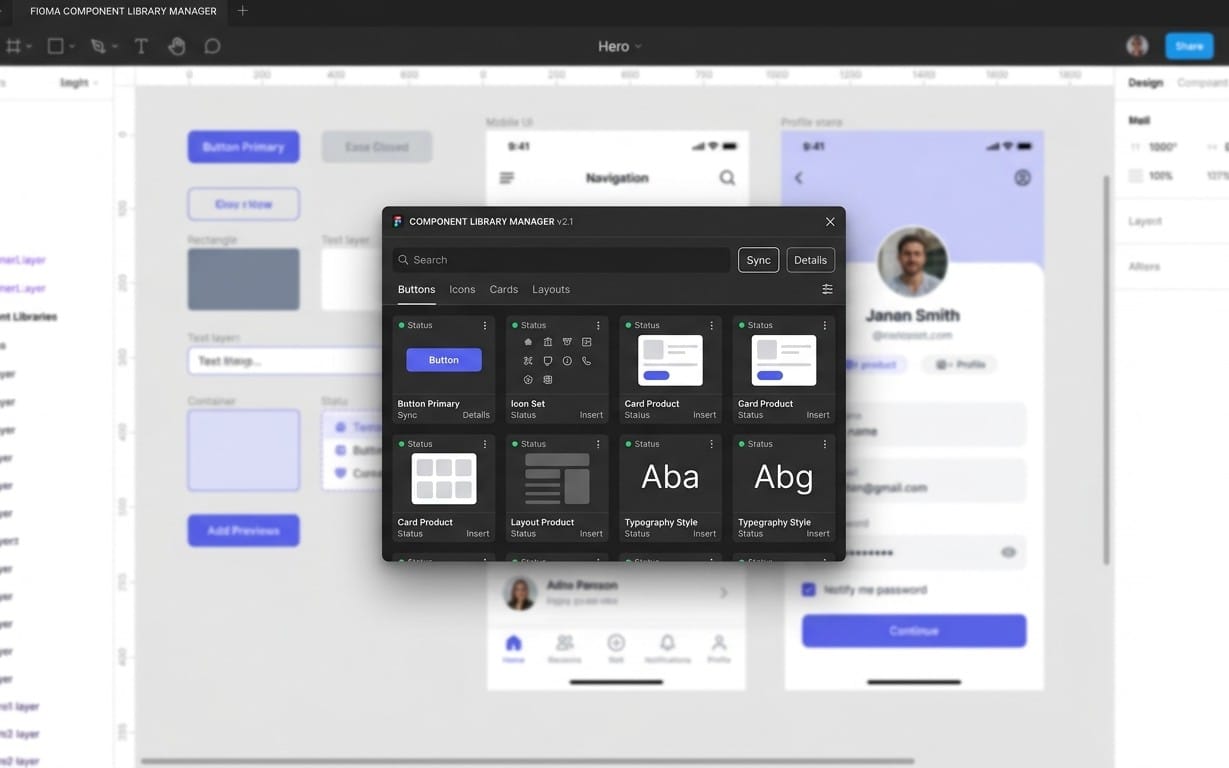
Create primitives that represent contract-level components: Button, Input, Checkbox, Toggle, Select, Tabs, and Text styles wrappers. This file contains component definitions that consume token sources.
Keep contracts strict. If a token changes value, components update. If a token role changes name, you update the contract mapping once and notify downstream files.
File 6. Composite Components: Patterns and layout
Composite components build on primitives: Navbars, Cards, Forms, Modals, Data tables, and empty states. This file maps “what the user sees” to “what tokens enforce.”
Composite components must not redefine typography, spacing, colors, or radii. They should only assemble primitives.
File 7. Screen Templates: Copy, replace, then conform
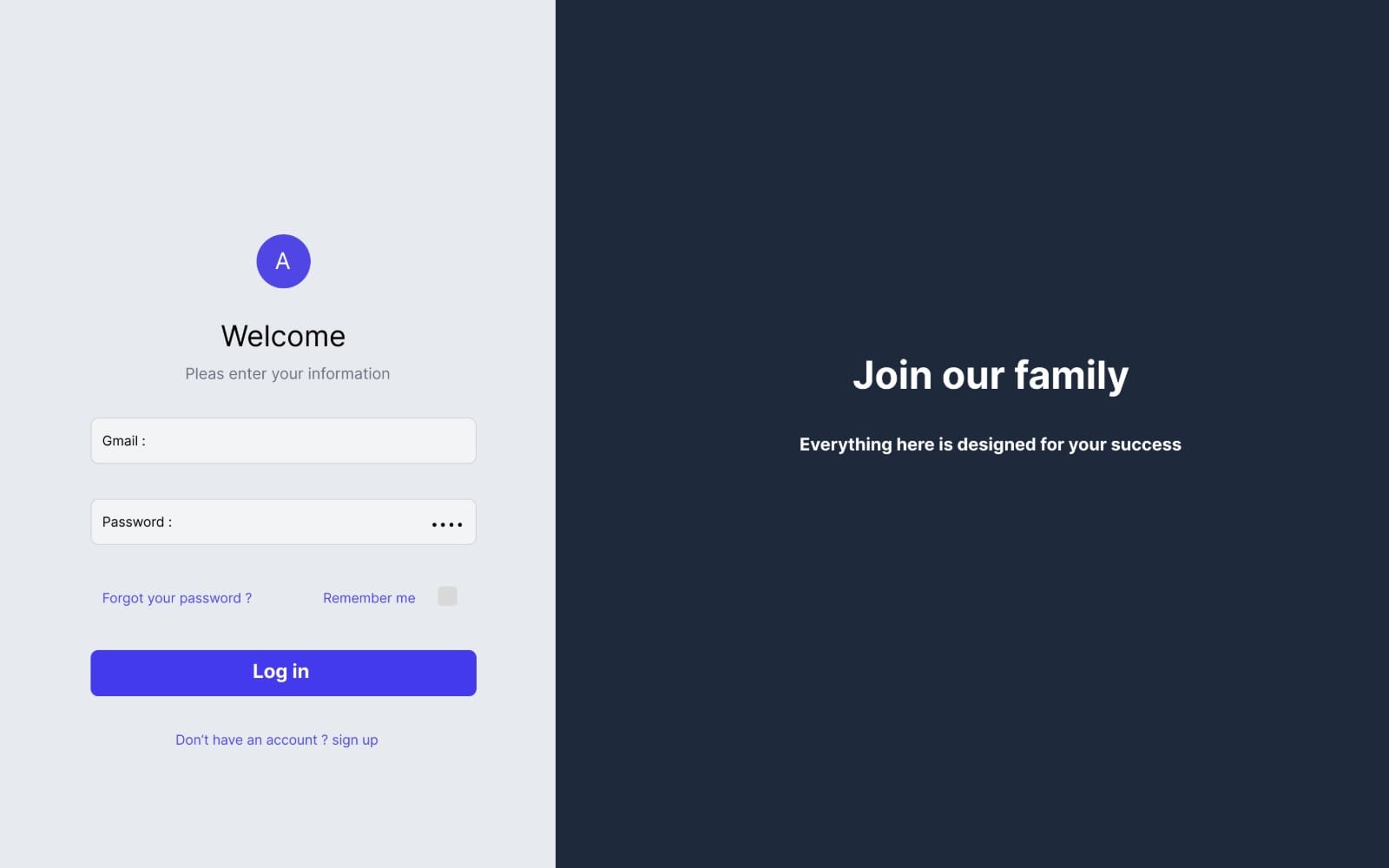
Use free mockup templates here to scaffold landing pages, onboarding screens, or dashboard layouts. You want speed, but you must not keep imported styles.
Replace all ad hoc styles with your official tokens as a standard step before exporting a UI for dev handoff.
File 8. Icon System: Free icon pack rules
Curate a small free icon pack and define alignment, padding, and export behavior. Include guidelines for stroke vs fill if you use multiple styles of icons.
If you do not define these rules, teams will import icons at random sizes and the UI will look “almost consistent.” That problem tends to show up in dense navigation and tables.
File 9. QA and Governance: Audits, token usage, and change logs
This file exists for governance. It includes audit frames, token usage checks, and a change log that explains what changed and why.
When you update tokens in 2026, use governance to prevent silent breakage. Your team should know which components and patterns relied on the old values.
Success pattern: teams keep token files open during reviews and lock component contracts so only the contract owner updates them. That approach makes design system updates predictable and prevents accidental re-styling.
How to use free Figma templates without breaking your system
Free Figma templates and free mockup templates give you instant structure, but you need rules for how they enter your workflow. Your token source files stay untouched; the templates live in screen scaffolding files.
Then you use a “replace then conform” routine. That routine turns a template into a starting point, not a permanent style reference.
A simple replace-and-conform workflow
When you import a template, you do three passes. First, map the layout blocks. Second, replace typography and spacing styles. Third, replace colors with semantic tokens.
This ensures your system ends up consistent even if the template author used different style names.
- Rename imported layers to match your pattern vocabulary (Header, Sidebar, Content, Card, CTA).
- Swap text styles to your official typography tokens.
- Swap fills and strokes to your semantic color tokens.
- Swap spacing and padding to your spacing steps.
- Verify components use primitives and composite patterns, not custom one-off shapes.
Where to source visuals and themes
Artwork and wallpapers can coexist with your design system, but they should not become token drivers. Use them as examples, placeholders, or background content for screens.
If you need UI-ready visuals quickly, you can also pull inspiration from ready-made collections and adapt them in your screen templates. For instance, you can reference entertainment artwork and adapt its typography and layout context with your own tokens.
Example items you can use as mock content while you conform the rest of your system:
- Use Solo leveling as a placeholder visual in a hero section while you standardize tokenized spacing and typography.
- Use Heath Studio as a background or cover element in a card pattern test, without adopting any colors from the artwork.
Do not sample colors directly from artwork and turn them into semantic tokens. Artwork palettes often include marketing colors that do not map cleanly to accessibility roles like text primary or border emphasis.
Which Figma plugins for designers actually help token work?
Most plugin value falls into a few categories: speeding repetitive operations, validating exports, and enforcing naming or structure. Token standardization needs those functions because you repeat them every time you scale.
Instead of chasing dozens of plugins, adopt a small toolkit that supports your governance file and your export habits.
Plugin types to prioritize
Pick plugins that help you keep tokens consistent across components. The best ones make it harder to ship wrong names or inconsistent exports.
- Style management and cleanup: helps you detect unused or duplicated styles.
- Accessibility and contrast checks: supports token semantics like text primary on surfaces.
- Icon utilities: helps you normalize icon sizes and grid alignment.
- Export helpers: ensures consistent naming and file structures for dev handoff.
- Linting or frame validation: checks that screens follow your required pattern structure.
Set plugin guardrails in your QA file
Put your plugin outputs into the QA and governance file. That way you can audit what the plugin found, then fix tokens at the source rather than patching each screen.
When you document “what to do when the plugin flags X,” new team members learn your system faster. That documentation reduces style fragmentation.
How to measure whether your token system works in 2026
A token system should reduce decision-making and prevent inconsistencies. You can measure that with practical signals: fewer style duplicates, faster component updates, and cleaner exports with predictable names.
Token governance also affects collaboration. Designers should spend less time debating “which blue” and more time designing states and flows.
Use audit frames and token usage reviews
Create an audit set in your governance file. Include example screens that cover your core patterns: forms, data tables, empty states, and navigation.
Then run token usage reviews whenever you update token values or expand token families. You want to catch components still referencing old token roles.
Track “style uniqueness” and broken references
Style uniqueness tells you whether your system consolidates decisions. If two text styles look identical, teams will keep using the wrong one unless you remove duplicates or clarify roles.
Broken references show up when a component loses a token style and falls back to manual styling. Your governance workflow should catch those before export.
Tip: When you document token changes, include a screenshot of the affected component variants. Then your QA file can link each token update to the UI that should update.
Design systems win when 80% of your UI follows tokenized components and patterns. You still allow custom work for edge cases, but you treat exceptions like temporary debt until the components grow.
You can also sanity-check your production mindset by looking at what sells in digital design categories and education templates. In Getly's catalogue measured across August 2026, education templates sit at a median $3.00 with most between $2.00 and $15.00, and e-books sit at $7.99 with most between $2.00 and $25.60. Those price distributions reflect how creators package reusable assets. Your system should do the same. Make reuse cheap and reliable.
FAQ about Figma design systems, tokens, and templates
How do I start a Figma design system if we already have 50 files?
Create the nine-file structure for token sources and component contracts first. Then migrate gradually: pick one flagship product area, replace styles with your tokens, and delete duplicates only after you confirm downstream screens still render correctly.
Do not try to fix every file in one sprint. A token system grows through predictable migrations, not through big-bang cleanups.
Where should I keep free Figma templates and free mockup templates?
Keep them in your screen templates file, not in your token sources. Import templates for layout speed, then replace typography, spacing, colors, and icons so the screen conforms to your token contracts.
This keeps your token source of truth stable and prevents template styles from drifting into production.
What should my icon system define?
Your icon system should define icon sizes, grid alignment, padding rules, stroke or fill consistency, and export naming conventions. A free icon pack only stays consistent when you treat these rules as governance, not advice.
After you define the rules, map icons to component roles such as “icon/primary,” “icon/danger,” or “icon/navigation.”
Do I need many Figma plugins for designers?
No. Start with a small set that supports what you do repeatedly: linting or cleanup, accessibility checks, and export helpers. Then wire their outputs into your QA and governance file.
Too many plugins creates noise, and noise slows token reviews.
How do I prevent token drift across the team?
Lock token source files, keep component contracts in one dedicated file, and route screen work into a template or composite area that consumes tokens. Add a governance audit routine whenever tokens update.
When you centralize ownership, you stop style mutation from spreading across unrelated files.
- Use nine files to separate token ownership, component contracts, and screen templates in your Figma design system.
- Semantic tokens reduce rework when you add themes or update brand values.
- Replace template styles with your tokens so free Figma templates stay as scaffolding, not governance.
- Pick a small set of Figma plugins for designers that enforce naming, linting, exports, and accessibility checks.
If you want an easy next step, pick one area of your UI and migrate it to tokenized components using the nine-file plan. When that migration works, expand it pattern by pattern across your Figma design system.