Ebook covers decide clicks before readers ever open your file. In 2026, you still need design instincts, but you also need a checklist that maps to how buyers scan thumbnails, recognize genres, and choose “safe to buy.” Use this 12-point ebook cover template checklist to tighten your layout, speed up production, and sell ebooks online with confidence.
80% of revenue goes to creators on Getly, so improving your cover is one of the fastest ways to turn the same writing into more sales. A stronger cover template also helps you launch faster across multiple niches, keywords, and formats.
- Build one reusable ebook cover template that you can customize for different genres and audiences in minutes.
- Use a consistent hierarchy: title first, subtitle second, credibility cues third, then the author name.
- Design for thumbnail legibility: bold title size, limited fonts, and strong contrast at 200 to 300 px.
- Add “buyer reassurance” elements like series branding, clear promise language, and genre signals.
- Bundle ideas and planner use-cases work best when your cover clearly states the outcome and includes planner-template cues.
What is an ebook cover template, and why it sells in 2026?
An ebook cover template is a fixed design system you reuse across books and digital planners. You keep the same grid, typography rules, spacing, and brand placement so every new cover stays consistent and readable. In practice, this reduces redesign time and helps your catalog look cohesive in marketplaces.
In 2026, buyers still judge books by covers, but they judge faster. They scan storefront thumbnails, compare similar titles, and filter by genre cues. A template gives you repeatable structure, so you can focus on the writing promise and positioning instead of starting from a blank canvas every time.
Define your cover’s job before you design
Your cover template must answer three questions in under a second: “What is this?”, “Who is this for?”, and “What outcome do I get?” If your layout hides the promise or buries the title, you lose clicks even when the book is strong.
Write the outcome as a single phrase, then design around it. For digital planners, replace vague themes with practical descriptors like “30-day habit tracker,” “budget dashboard,” or “weekly meal planning.” For writing ebooks, lead with a measurable reader benefit such as “plot structure in 7 steps” or “revise faster with a repeatable workflow.”
Turn your template into a repeatable “thumbnail system”
Set your template to survive small sizes. When you resize to a thumbnail, the title should remain readable, the genre cue should remain identifiable, and the author name should not steal attention from the promise.
Use a simple rule: if the title takes more than one glance to parse, enlarge it or simplify the typography. Keep your palette tight so the design does not collapse into unreadable shapes when scaled down.
How to use an ebook cover template grid that converts?
Use a cover grid that locks your hierarchy and spacing. A conversion-friendly ebook cover template assigns fixed roles to each region: title block, visual focal area, subtitle or benefit line, and author/series mark. When you swap content, you swap text and imagery, not the entire layout.
Consistency builds recognition across your catalog. A reader who likes one book can spot the same visual style on your next launch, which makes the marketplace feel less random and more trustworthy.
Choose a layout that supports both ebooks and planner formats
Digital planners need room for grid-based cues, iconography, and “what’s inside” hints. Even when your planner template lives inside the file, your cover should preview the structure with small visual signals like weekly blocks, trackers, or month tabs.
For example, a writing ebook might show a notebook texture with a clean headline. A digital planner template might show a minimal calendar icon next to a “weekly layout” promise. Your template grid should leave space for those signals without crowding the title.
Use typography hierarchy as your primary grid
Design your template around font sizes and weight, not around decoration. Make the title 1st, the subtitle 2nd, and the author name 3rd. If you add a series name, treat it like a supporting label, not a second title.
Limit font choices to reduce “style drift.” Two fonts or one font family in different weights usually beats a multi-font layout that looks creative at full size but loses clarity at thumbnail size.
Common mistake: designers center every element “for aesthetics.” Thumbnail readers do not browse like that. Keep the title on a predictable path so the eye finds it instantly.
Which ebook cover elements drive clicks and sales?
The best ebook cover template includes elements that create quick comprehension. When buyers can identify genre, promise, and relevance instantly, they click. When those elements feel coherent, they trust the product enough to buy.
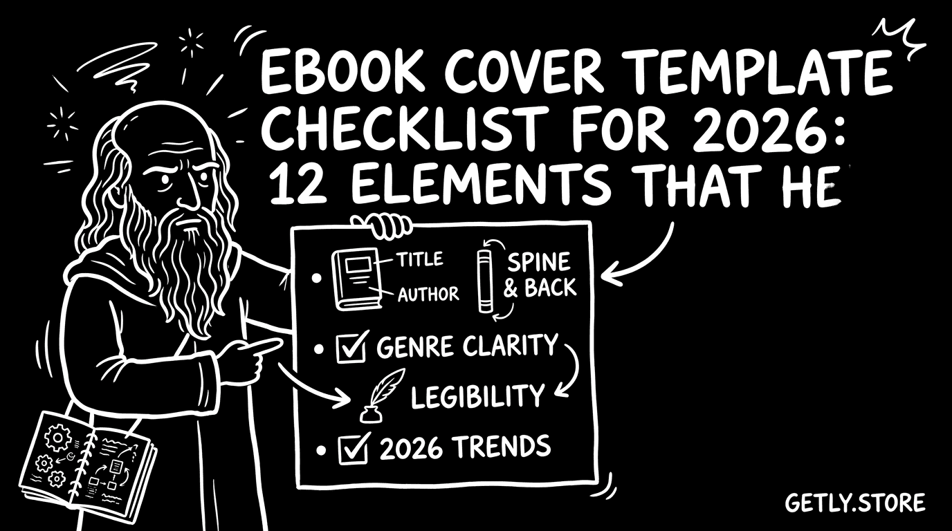
Below are 12 elements you should bake into your template. You can treat this as your “default cover recipe” for ebooks and digital planner templates, then customize for each title.
12 elements to include in your ebook cover template
- Primary title (largest readable text)
- Subtitle or benefit line (single outcome phrase)
- Genre cue (visual shorthand or explicit descriptor)
- Audience cue (e.g., beginners, creators, students)
- Author name + credibility marker (if you have one)
- Series branding (optional but powerful for recurring launches)
- Cover focal image (or typographic focus) aligned to the promise
- Color palette limited to 2 to 4 main colors
- Typography style that matches the genre’s tone
- Iconography for planners (weeks, habits, checklists, pages)
- Whitespace and contrast that survive resizing
- Callout-free simplicity (you guide with hierarchy, not clutter)
Match elements to the buyer’s scanning behavior
Marketplace browsing favors fast pattern recognition. Titles and benefit lines act like “handles” for your product in a crowded grid. Genre cues tell the buyer what category they are about to enter, so you reduce refund risk and improve reviews.
For selling Notion templates, your cover should signal organization and clarity. Use grid-like visual language, minimal icon sets, and a subtitle that describes the outcome. For example: “Content Calendar System” or “Study Workflow Planner” reads better than “Notes and more.”
Pro tip: Design two versions of the same template. Version A keeps your title dominant. Version B adds a subtle genre cue. Run them across categories with similar covers, then keep the version that gets higher click-through.
How to create free printable templates that look premium on cover
Free printable templates still need a professional-looking cover because buyers judge quality instantly. Even if the template is free, the cover should communicate structure, usability, and visual consistency, especially if you plan to upsell later.
When you design a cover for free printables, treat it like a sample: include one or two “what you get” signals. For example, show a single page preview corner, an icon row for trackers, or a clear descriptor like “Daily Schedule Page Set.”
Turn the cover into a promise of usability
Printables live or die by readability. Your cover should match the product’s internal layout. If your template uses grid lines, make those grid lines or a similar visual motif appear subtly on the cover. That visual consistency builds confidence.
For writing ebooks, connect the cover’s visual tone to the workflow inside. A template that promises “draft faster” should look like a writing tool, not a generic book cover with decorative flourishes.
Use the cover to pre-filter the right audience
Printables attract buyers who know what they want. If your cover calls the set “Meal Planning,” show meal-related visual cues. If your template supports “weekly review,” hint at weekly structure through iconography and spacing.
This prevents the wrong buyers from landing on your product. Better-fit buyers download more quickly, use more pages, and leave stronger reviews.
How to sell Notion templates with an ebook-style cover template?
Sell Notion templates by borrowing what ebooks do well: a clear title, a specific promise, and a tidy hierarchy. Buyers do not open your database before buying. Your cover must explain what the workspace does and who it serves.
An ebook cover template works for Notion because both formats rely on scanability. Use a layout similar to an ebook: title as the anchor, subtitle as the outcome, and a small visual system cue that signals “this is organized.”
What “good” looks like for digital planner template covers
Digital planner template covers should read like a tool, not like a poster. Choose language that matches usage: “Weekly Planner,” “Budget Tracker,” “Habit Dashboard,” “Content Calendar,” or “Project Workflow.” Then align the design to those words.
For example, a content calendar cover can include a minimalist grid, small date blocks, or a simple “plan” icon. A habit tracker cover can include check marks and a repetition motif. Keep the palette minimal so text remains legible.
Use preview-style design cues without showing every page
Do not overwhelm the cover with screenshots of your Notion pages. Your template should show one primary system cue, then let the title do the heavy lifting. Add one small “structure” hint, like a grid or card stack silhouette.
If you include a visual preview element, make it consistent with the internal UI theme. Otherwise, the mismatch creates doubt: buyers think they will get a different setup than the one they see.
Success pattern: creators who keep title size stable across a series generate easier recognition. When buyers see a consistent “system” look, they treat the next release as a continuation of the same value.
How to test and refine your ebook cover template in 2026?
Refining a cover means testing the parts that affect scanning. You rarely need to repaint everything. You tweak hierarchy, contrast, and clarity so buyers can read the promise faster.
In 2026, you can also speed up iteration by keeping your cover template as a modular system. Swap title font size, change the focal image, or adjust the subtitle format while keeping the same grid rules.
Use a checklist workflow that prevents cover drift
Create a release workflow that runs every time you publish a new product. Start with the title and benefit line, then place the author and series label, then choose a genre cue, and finally check legibility at thumbnail size.
Here is a tight preflight sequence you can copy for each new cover build.
- Read the title out loud. If you stumble, rewrite it.
- Resize the cover to thumbnail size. Check contrast and word shape.
- Confirm the subtitle states one outcome, not five vague ideas.
- Reduce to 2 to 4 colors. Remove anything that does not support hierarchy.
- For planners and Notion templates, include a structure cue (grid, blocks, checkmarks).
- Run a quick distance test. If you squint and the title becomes a blur, fix typography first.
Turn cover improvements into launch assets
Once your ebook cover template works, reuse it across assets. You can create consistent social tiles, product mockups, and inside-the-file preview pages that match the cover’s typography and palette.
Consistency reduces production friction. It also creates a recognizable brand for buyers who encounter you across different placements, from storefront grids to affiliate landing pages.
Example product directions you can mirror in your own design system:
- For an outcome-driven ebook, place the promise in the subtitle area and keep the title large. (Example inspiration: Escape the Paycheck Trap)
- For creator education products with a “process” angle, use a clean title block plus a strong visual metaphor. (Example inspiration: Product Title AI Text Animation Mastery)
- For highly technical tool-like offerings, prioritize clarity and a “workflow” vibe over decorative visuals. (Example inspiration: Unreal to Unity Material Converter)
- Use your cover template grid to keep title, subtitle, and genre cue in predictable positions.
- Design for thumbnail readability in 2026. Bigger type and fewer fonts win.
- For digital planner template and sell Notion templates niches, show “structure” cues, not just aesthetics.
- Test by changing hierarchy and contrast first, not by repainting the whole concept.
FAQ about ebook cover templates for selling ebooks online
How many elements should an ebook cover template include?
Build around 12 elements that cover title hierarchy, genre cues, readability, and planner or workflow signals. If you include everything, you increase clutter. If you include only the title, you lose trust cues. Keep the structure fixed and swap content.
Do free printable templates need the same cover checklist?
Yes. Free printables still compete in marketplace grids, and buyers still scan for clarity. Your cover should show the structure promise and match the template usability inside the file.
What’s the best way to make a digital planner template cover readable?
Make the title and outcome line the biggest elements, then add only one structure cue like checkmarks, weekly blocks, or a grid motif. Use high contrast, limit colors, and remove extra decorative text that disappears at thumbnail size.
How do I sell Notion templates with an ebook-style cover?
Use the same hierarchy: clear title, outcome subtitle, and a minimal visual cue that signals organization. Avoid dense screenshot mosaics. Buyers buy the promise, then confirm details after purchase.
Can I reuse one ebook cover template across multiple genres?
You can reuse the template grid, typography rules, and spacing. You should customize the genre cue, palette, and imagery to match each niche. The grid provides consistency; the cue provides relevance.
If you want a simple next step, pick one product you plan to publish soon and rebuild its cover using the 12 elements checklist. Keep the layout consistent, then improve thumbnail legibility first.
Getly Sellers Team