 Getly
Getly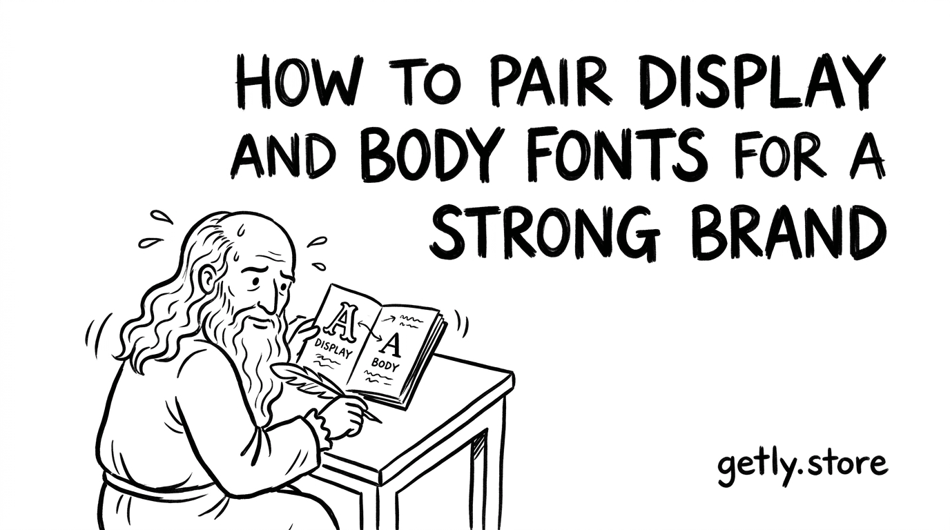
By the end of this guide, you will be able to choose a display face for headlines, pair it with a readable body face, and test the combination across real brand materials. You will also spot the font mistakes that make a polished product look like a quick template edit.
1. Define the job each font must do
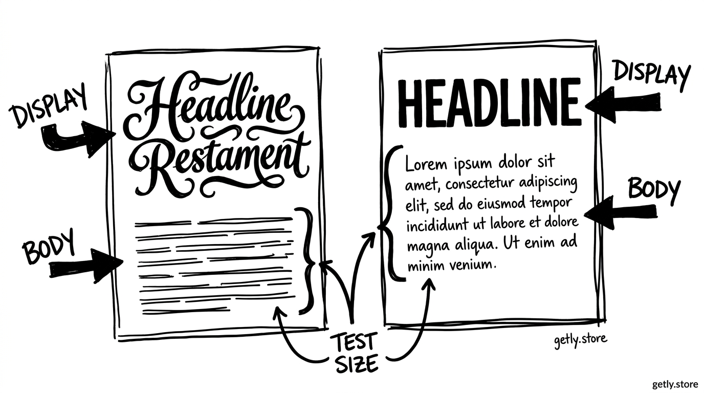
A brand font pair works when each typeface has a clear role. The display face carries personality in a logo, cover title, campaign headline, or product name. The body face handles instructions, captions, descriptions, prices, and longer paragraphs.
Start with the brand’s audience and product format. A children’s activity printable can support rounded letterforms and playful proportions. A resume template needs restrained shapes, clear numerals, and compact spacing. A beauty brand may use a high-contrast serif for its name and a neutral sans serif for shade names and directions.
Write three adjectives before you browse fonts. Use specific words such as “editorial,” “warm,” and “precise,” rather than “good” or “professional.” Those words give you a filter. They also prevent you from choosing a typeface because its specimen page looks attractive in isolation.
Name the brand mood
Choose three concrete adjectives that describe the product and its buyers.
Assign the display role
Reserve the more distinctive face for short, high-impact text.
Assign the body role
Choose a face that keeps paragraphs, labels, and small text easy to scan.
Test the pair in context
Build a headline, paragraph, button, price, and caption before you commit.
A product preview gives you useful evidence. For example, a recipe product such as 11 pages of Filipino Dishes Recipe needs a title with character, but ingredient lists and cooking steps need calm, efficient text. The same pair should support both moments.
2. Choose the display face first
Pick the display face from the brand’s most visible words. Type the product name, a sample headline, and one short phrase in several candidates. Compare the letter shapes, not only the overall mood.
Check the lowercase “a” and “g,” the width of capital letters, the height of the lowercase letters, and the shape of numerals. Those details create a brand’s voice. A narrow serif can feel refined and save space. A wide geometric sans can feel open but may force long headlines onto extra lines.
Use a display face at a size large enough to show its personality. A decorative script may look elegant at 64 pixels, then lose its joins at 18 pixels. A thin high-contrast serif may look sharp on a cover and disappear in a thumbnail. Your display choice must survive the smallest place where the headline will appear.
Check the character set before you build a system. Look for accented letters, currency symbols, punctuation, fractions, and the languages your buyers need. A beautiful font with missing characters creates awkward substitutions and breaks the visual system.
Use a simple scorecard like this when you compare candidates. The percentages represent your test results, not a universal font rating. A display face with strong headline impact but weak small-size clarity should stay out of body copy.
3. Pair it with a body face that stays out of the way
Choose the body face after the display face. Look for a useful countershape, stable spacing, and enough weights for your hierarchy. A family with regular, medium, semibold, and bold styles can handle paragraphs, labels, subheads, and emphasis without adding another typeface.
Contrast gives the pair a reason to exist. Contrast can come from classification, width, weight, or proportion. Pair a high-contrast serif display face with a humanist sans body face. Pair a rounded display sans with a sturdy grotesk that uses more neutral shapes. Pairing two expressive faces usually creates competition.
Match one structural trait so the fonts feel related. Similar x-heights help the display and body faces sit together. Similar stroke terminals can create a quieter connection. You do not need matching letterforms, but you do need a shared visual logic.
Set a sample paragraph at the size your product will use. Read it on a phone and on a laptop. Count how many words fit across a line. Lines that run too wide make readers lose their place. Lines that run too short create a choppy page and waste space.
Do
- Pair a distinctive face with a quieter companion.
- Check the pair at headline, paragraph, label, and caption sizes.
- Use the body family’s weights to build hierarchy.
Don't
- Use two ornate faces with equal visual volume.
- Judge a body font from one short sentence.
- Stretch or squeeze letters to force a fit.
Font categories offer a starting point, not a finished answer. A serif and sans pairing can fail when both faces have similar width and weight. Two sans serifs can work when one carries the display voice and the other supports reading.
4. Build a small type system
Limit the system before you design pages. Start with one display family and one body family. Add a third font only when the product has a clear functional need, such as a code face for editable numbers or a handwriting face for a short annotation style.
Set roles before you set sizes. A practical system might use the display face for product titles and major headings, the body face for paragraphs and instructions, and the body face’s semibold weight for labels. This approach keeps the brand recognizable when a page contains little text.
Use those figures as starting points, then adjust for the face, language, and format. A large x-height may need less line height. A compact face may support a longer line. A narrow mobile layout may need shorter measure than a desktop page.
Create a test page with a product title, two levels of headings, a 100-word paragraph, a bullet list, a price, a button label, and a caption. Keep the content realistic. Placeholder text hides problems with numerals, punctuation, and long words.
Check hierarchy in grayscale. If every line attracts equal attention, the font system lacks order. If the display face dominates body text even at a smaller size, reduce its weight or reserve it for fewer placements.
5. Check legibility and access before launch
Read the body copy at the smallest planned size. Check thin strokes, tight joins, open counters, and similar characters such as “I,” “l,” and “1.” Test numerals in prices, dates, page numbers, and measurements. Digital products often rely on these details more than a brand mood board does.
Use sufficient contrast between text and its background. A sophisticated pale gray can become tiring when you place it on a white page. Test the actual color combination, not a black-and-white type specimen. Keep decorative display text out of long passages and essential instructions.
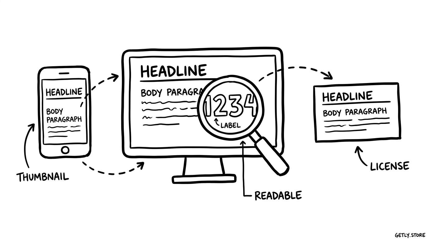
Review the pair in the places buyers will see first: a thumbnail, a product title, a preview page, and a mobile screen. A font that works on a full-size presentation slide may lose its identity when the marketplace preview reduces it to a small card.
Confirm your usage rights before you publish or sell a template. Check whether the license covers commercial work, redistribution inside editable files, desktop use, and web use. Keep the license record with the project files so you can answer future questions without rebuilding your research.
6. Common mistakes that make a brand look amateur
Using a novelty font for every text role
A novelty face can create a memorable headline, but repeated use makes every label compete with the product name. Give the display face fewer appearances. Let the body face handle the work that buyers need to scan.
Pairing fonts by category alone
“Serif plus sans” describes a category match, not a successful pairing. Compare x-height, width, stroke contrast, and spacing. Two fonts from different categories can still collide when they share the same loud proportions.
Adding fonts instead of fixing hierarchy
Designers often add a third or fourth face when headings, labels, and captions lack size or weight differences. Try spacing, scale, and weight first. A clear hierarchy usually needs fewer typefaces than a mood board suggests.
Ignoring the font’s default spacing
Tracking can rescue a short uppercase label, but it cannot fix a poorly chosen face. Tight tracking can close counters and make letters merge. Loose tracking can make a headline look disconnected. Adjust in small increments and compare the result at the final size.
Using fake bold or fake italics
Software-generated styles distort letterforms and produce uneven strokes. Choose a family with the weights and italics you need. If the family lacks an italic, keep the text upright rather than forcing a slanted version across the brand.
Copying a template without adapting its type system
A purchased template may show one successful pairing, but your product can need different proportions. Replace the sample text with your own longest heading, most detailed instruction, and largest price. For example, an IT resume product such as IT Resume Template + Writing Guide needs compact, scan-friendly text for skills and experience sections, even if its cover uses a more expressive title.
Skipping the thumbnail test
Small previews expose weak hierarchy. If the product title disappears, increase contrast or simplify the display treatment. If every word turns into a dark block, reduce weight, shorten the title, or choose a more open face.
Use a repeatable approval checklist
Save one test page with every font decision. Record the family names, roles, weights, sizes, line heights, tracking values, colors, and license source. This document keeps future pages consistent and makes handoff easier.
- Confirm that the display face matches the three brand adjectives.
- Confirm that the body face remains clear at the smallest planned size.
- Compare the pair in a title, paragraph, label, price, and caption.
- Review a thumbnail, mobile screen, desktop layout, and printed page when print matters.
- Remove any font that has no assigned role.
Approve the pair after it survives real content. A strong combination gives the brand a recognizable voice in headlines and a calm reading experience everywhere else.
FAQs
How many fonts should a small digital brand use?
Start with two families: one display face and one body face. Add a third only when it serves a specific function that the first two cannot handle, such as code, data, or a short handwritten annotation.
Can two sans serif fonts work together?
Yes. Give each face a different role and create contrast through width, weight, proportion, or spacing. A distinctive display sans can pair with a neutral text sans when the two faces do not compete for attention.
Should the logo font also appear in body copy?
Usually, the logo face should stay limited to the logo or short display moments. A logo font may lack the spacing, punctuation, weights, or small-size clarity that body copy requires.
What should I test before choosing a font pair?
Test your longest headline, a 100-word paragraph, a bullet list, a price, a button label, numerals, punctuation, and any accented characters your buyers need. View the results at the smallest planned size and in a reduced thumbnail.
How can I tell if a font pairing looks amateur?
Look for competing headline voices, inconsistent spacing, weak contrast, missing characters, fake bold styles, and text that becomes unreadable in a thumbnail. Assign each family a role, then remove any treatment that does not support that role.
Frequently asked questions
How many fonts should a small digital brand use?
Start with two families: one display face and one body face. Add a third only when it serves a specific function that the first two cannot handle, such as code, data, or a short handwritten annotation.
Can two sans serif fonts work together?
Yes. Give each face a different role and create contrast through width, weight, proportion, or spacing. A distinctive display sans can pair with a neutral text sans when the two faces do not compete for attention.
Should the logo font also appear in body copy?
Usually, the logo face should stay limited to the logo or short display moments. A logo font may lack the spacing, punctuation, weights, or small-size clarity that body copy requires.
What should I test before choosing a font pair?
Test your longest headline, a 100-word paragraph, a bullet list, a price, a button label, numerals, punctuation, and any accented characters your buyers need. View the results at the smallest planned size and in a reduced thumbnail.