 Getly
Getly
By the end of this guide, you will be able to plan a cover before you prompt, describe its composition with useful constraints, and test the result at thumbnail size. You will also have a workflow for handling titles, subtitles, and labels without trusting an image model to spell every word correctly.
1. Start with a cover brief
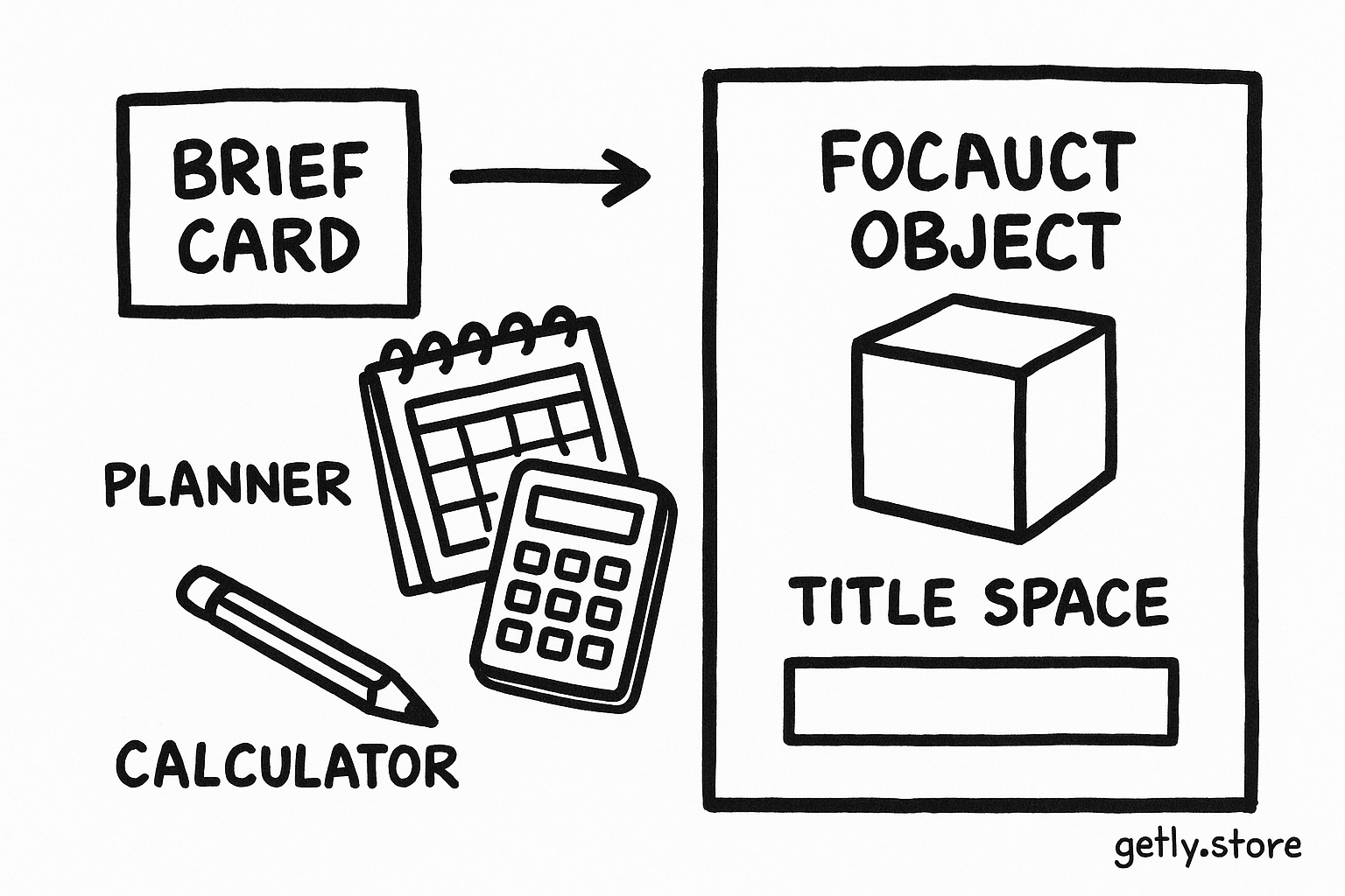
A strong prompt starts with a short brief, not a pile of visual adjectives. Write down the product type, buyer, promise, mood, format, and one focal object. A workbook for freelance designers needs a different visual signal from a recipe collection or a set of social media templates.
Give the cover one clear job. It might announce a result, identify a niche, or make a product family easy to scan. If you ask one image to show six features, three audiences, and a dozen decorative objects, the model will distribute attention across all of them.
- Product: a printable budget planner for first-time freelancers
- Buyer: a solo worker who wants a calmer monthly system
- Promise: track income, expenses, and tax savings in one place
- Mood: calm, practical, structured
- Focal object: an open planner beside a calculator and pencil
- Format: portrait cover with space above the object for a title
Choose the output ratio before you write the prompt. A portrait cover often works well at 3:4, a social thumbnail at 1:1, and a feed image at 4:5. Check the destination before production because cropping can remove the visual anchor or squeeze the title area.
2. Build the composition before adding style
Composition prompts work best when they describe relationships. Tell the model where the focal object sits, where the title area sits, and how much visual weight each area should carry. “Minimal beige aesthetic” gives the model a mood. “Open planner in the lower third, uncluttered upper third, soft window light from the left” gives it a layout.
Use a simple attention budget. Give the main object the largest area, the title zone the cleanest contrast, and decoration the smallest role. You can treat the split as a planning tool rather than a strict measurement.
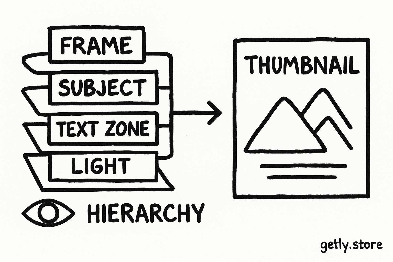
Describe the frame in layers
- Frame: name the ratio, camera angle, crop, and background.
- Subject: describe the focal object, its position, scale, and orientation.
- Text zone: reserve a clean area with a specific location and contrast.
- Light: state the light direction and softness so the subject separates from the background.
- Finish: add materials, palette, texture, and restrained decoration.
For example: “Portrait 3:4 product cover, open cream planner in the lower third, calculator and pencil near the right edge, warm off-white background, generous blank space in the upper third, soft daylight from the left, muted sage and charcoal palette, crisp editorial product photography.”
That prompt gives the model a spatial plan. Add style after the layout works. If you lead with “cinematic, dreamy, luxurious, viral, premium,” the model may spend its attention on atmosphere and ignore the cover’s hierarchy.
3. Write prompts that control hierarchy
A useful composition prompt answers five questions: what should viewers notice first, where should they look next, what should stay quiet, what should the crop protect, and what feeling should the palette create?
Use concrete design language. “Large centered object” beats “make it pop.” “Empty upper-left quadrant for a title” beats “leave room for text.” “One accent color on the pencil” beats “use vibrant details.” Specific nouns and positions reduce guesswork.
Name the focal point
Give one object the strongest scale, contrast, or sharpness.
Reserve text space
Place a quiet area away from complex edges and high-contrast details.
Set the reading path
Use object placement, light, and contrast to guide the eye toward the title.
Limit decoration
Choose two supporting objects or one restrained pattern.
Use negative prompts with purpose
Negative prompts help when they block a known failure. Ask for “no extra fingers” in a character cover, “no logos” in a commercial mockup, or “no objects in the upper third” when you need a title zone. Avoid a long catalogue of every unwanted detail. A crowded negative prompt can compete with the composition instructions.
Keep brand identity separate from scene direction. State the palette, material, and mood in the main prompt. State exclusions in a short final clause. For a bottle or other recognizable product, preserve its silhouette, cap, label placement, and color before you add lighting or background effects. A prompt such as Luxury Perfume Product Photography AI Prompt offers a useful example of separating product identity from art direction.
4. Treat text as a separate production step
Image models handle shapes, color, and lighting more reliably than exact typography. They may turn a short title into warped letters, duplicate characters, merge words, or invent a convincing pseudo-language. Small text suffers first because the model has fewer pixels to represent each letter.
Use the image model to create the visual base when the title matters. Ask for a blank title area instead of asking the model to render a long headline. Add the exact title in a design editor afterward, where you control the typeface, spacing, alignment, and export quality.
Do
- Ask for a clean area with strong contrast.
- Add the final title with editable text.
- Use one headline and one short subtitle.
- Check the title at the smallest display size.
Don't
- Trust a long rendered paragraph.
- Place type over a busy pattern.
- Use thin lettering against a textured background.
- Judge spelling from a large preview alone.
When you need text inside the generated image
Keep the wording short. A two-word label gives the model a better chance than a sentence. Put the exact text in quotation marks inside the prompt, describe its placement, and request large block lettering with high contrast. Generate several candidates, then inspect every character rather than assuming a familiar word looks correct.
Use a second generation for corrections instead of repeatedly asking one image to repair a damaged title. Regeneration may change the entire composition, so save the best background and add the lettering yourself if the layout already works.
5. Generate, select, and test at thumbnail size
Generate a small set of variations from the same brief. Change one variable at a time, such as the object position, background color, or camera angle. That method shows you which instruction improved the result. If you change the subject, lighting, palette, and crop together, you lose the reason for the improvement.
Choose a cover using a quick inspection sequence. First blur your attention and identify the largest shape. Next read the title without zooming. Then check whether the focal object still makes sense at thumbnail size. Finish by examining edges, hands, product identity, and any tiny labels.
- Thumbnail test: reduce the cover until it resembles the size buyers will see in a grid.
- Squint test: check whether the focal object and title remain separate.
- Grayscale test: confirm that contrast still separates the title from the background.
- Crop test: preview square, portrait, and narrow crops when several channels may use the asset.
- Spelling test: inspect every rendered letter at full size, then replace the text when possible.
Typography needs enough breathing room. Keep a visible margin around the title so a platform crop does not cut the first or last letter. Place important details away from corners, where interface labels and crop changes often compete for attention.
6. Common mistakes and practical fixes
The prompt names a mood but no layout
Words such as “professional” and “premium” do not tell the model where to put the object. Add a frame, a focal position, a quiet zone, and a light direction. Then add the mood as a finishing layer.
The cover contains too many objects
Remove objects until the product promise reads in one glance. Keep one focal object and two supporting details at most. A crowded desk can make a productivity product look like a stock photo rather than a usable tool.
The title competes with the background
Move the title to a calmer region, simplify the texture behind it, or add a solid color panel. Increase weight and contrast before increasing font size. Large type still fails when a busy pattern breaks its letterforms.
The image looks polished but says nothing about the product
Replace generic decoration with a visual cue from the product itself. Show a planner for a planning template, a chart for an analytics guide, or a clearly recognizable device for a device mockup. Let the focal object carry the category signal.
The model keeps changing the layout
Copy the successful composition into a tighter prompt. Remove style terms that do not affect the layout, keep the ratio and spatial instructions near the beginning, and request one controlled change per generation.
Save the final workflow with the cover brief, approved background, editable title layer, export dimensions, and a thumbnail preview. That record helps you create matching covers for a product collection without starting from a blank prompt each time.
Frequently asked questions
Should I ask an image model to render my full cover title?
Use the image model for the visual base and add important titles in a design editor. Image models often distort long words, small labels, and exact spelling.
How much text should an AI-generated thumbnail contain?
Use one short headline, usually two to eight words, and add a brief subtitle only when the thumbnail still reads at its smallest display size.
How do I reserve space for a title in a prompt?
Name the exact location and describe its conditions, such as an uncluttered upper third, a warm solid background, and strong contrast against the lettering.
What should I test before publishing a cover?
Reduce the cover to thumbnail size, check the reading order, inspect every letter, preview likely crops, and confirm that the focal object identifies the product.