 Getly
Getly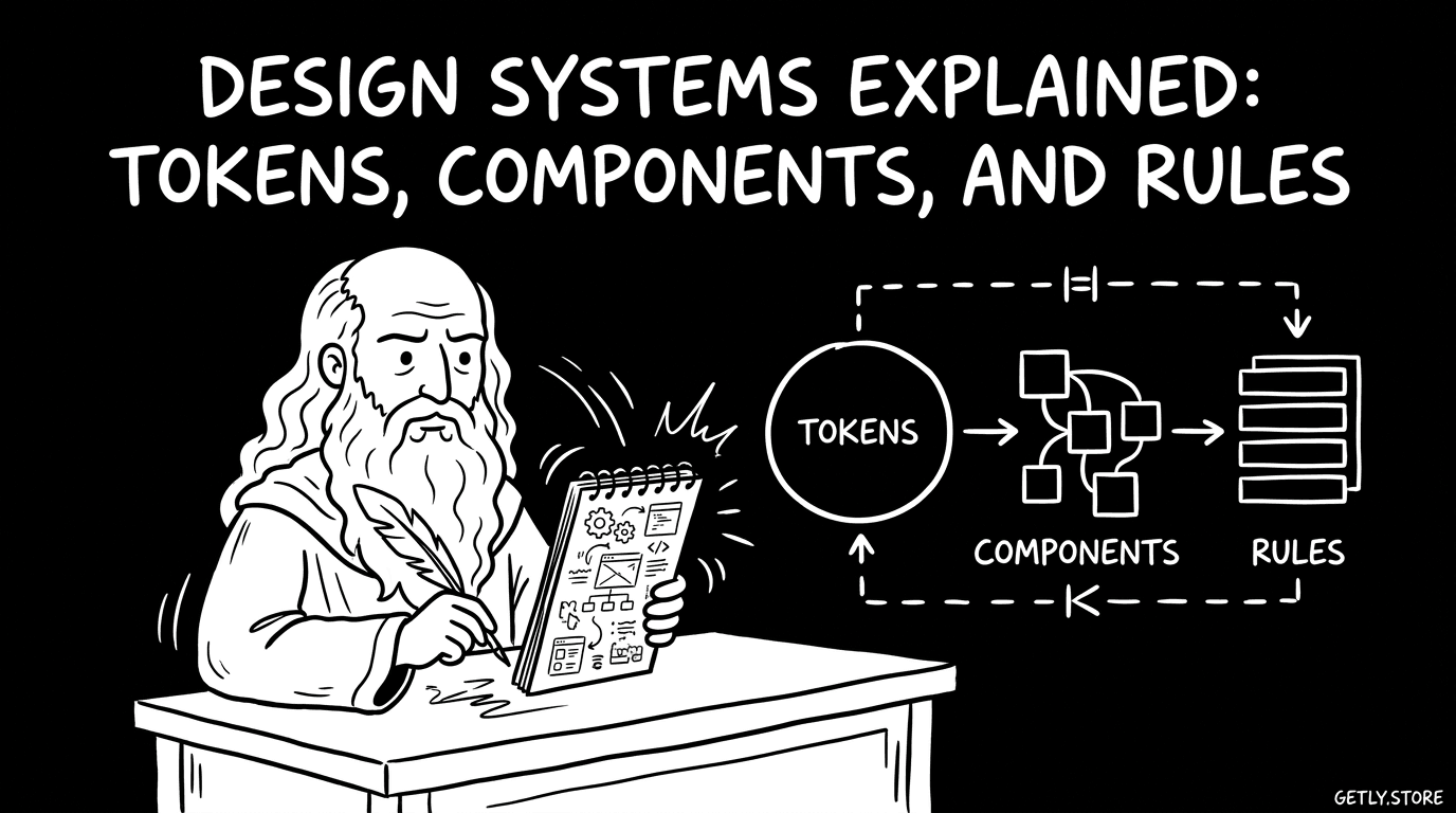
By the end of this guide, you will be able to separate a design system from a UI kit, map the parts of a small system, and decide what your digital product needs first. You will also have a practical workflow for turning repeated interface decisions into reusable tokens, components, and rules.
Start with the problem your interface repeats
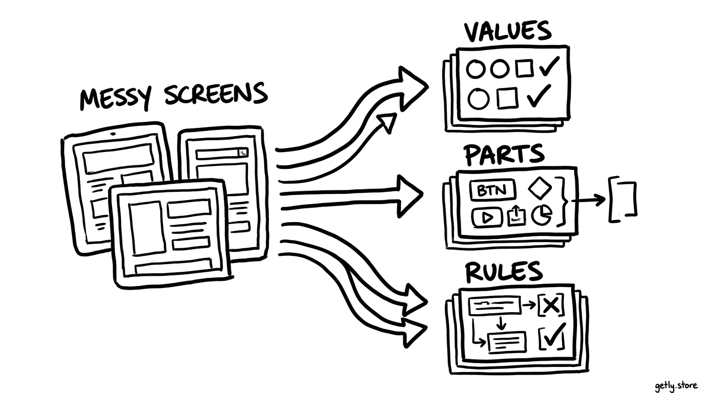
A design system helps a team make related interface decisions in the same way. The system covers visual values, reusable interface parts, and the rules that connect them. It gives designers and developers a shared vocabulary for building screens.
Start by collecting repeated decisions from a real product. Look for the same button appearing in several colors, the same spacing gap showing up under different names, or multiple card layouts that serve the same purpose. These repetitions show where a system can reduce choice and prevent drift.
Choose a narrow starting point. A checkout flow, a creator dashboard, or a landing-page family gives you enough material to find patterns without forcing you to document every screen. Your first release should solve a visible consistency problem, not describe an imaginary future product.
Collect examples
Place related screens, states, and content patterns beside each other.
Name repetitions
Mark shared colors, spacing values, type styles, controls, and behaviors.
Choose a boundary
Define the product area that your first system will support.
Build the foundation with design tokens
Tokens name the small values that your interface reuses. A token can represent a color, type size, spacing step, corner radius, border width, shadow, or motion duration. Instead of scattering raw values through files and design layers, your team refers to names such as color.text.primary, space.4, or radius.medium.
Choose names that describe purpose when a value serves a role. color.action.primary tells you why a color exists. blue.600 only tells you what the color looks like. A palette can still contain a blue scale, but components should use semantic roles where possible.
Keep the first token set small. Record the values that already repeat, then add a new token when a product decision needs a stable name. Too many near-duplicate tokens make the system harder to learn and encourage arbitrary choices.
Group tokens by responsibility
- Primitive tokens hold raw values such as a color scale, a spacing scale, or a type scale.
- Semantic tokens assign those values to roles such as primary text, danger background, or interactive border.
- Component tokens tune a specific part, such as a button's horizontal padding or input focus ring.
A practical token workflow moves from broad values to specific use. Define the palette and scales first. Map those values to roles next. Add component-level tokens only when a component needs a meaningful exception.
Do
- Name tokens by role when the role matters.
- Keep a visible relationship between semantic tokens and their source values.
Don't
- Create a separate token for every one-off color.
- Use names that depend on a temporary screen or campaign.
Turn repeated patterns into components
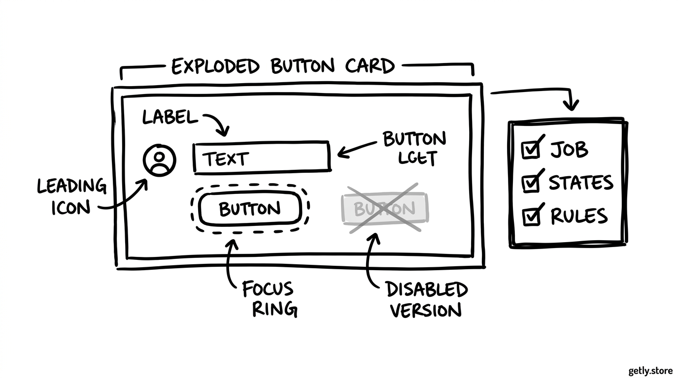
A component combines a visual structure with content slots, states, and interaction behavior. A button, input, navigation item, modal, card, or pricing row can qualify. The component earns its place when several screens need the same structure and your team wants those instances to stay aligned.
Start with the component's job. Write one sentence such as, “A button lets a person submit an action.” That sentence helps you reject options that belong elsewhere. A button may support primary and secondary emphasis, but it should not become a container for every unrelated action pattern.
Document the component at three levels:
- Anatomy: identify labels, icons, containers, supporting text, and other parts.
- Properties: list meaningful options such as size, emphasis, icon position, and disabled state.
- States: show rest, hover, focus, pressed, disabled, loading, error, or selected states when the component needs them.
Use variants for decisions that designers and developers can predict. Use composition when a component needs flexible content or a different internal structure. For example, a card with a fixed image, title, and price can use defined properties. A dashboard panel that accepts charts, filters, and notices may need slots or smaller components instead.
Write rules that guide choices
Tokens provide named values, and components provide reusable parts. Rules explain how your team should choose and combine them. Without rules, a library can contain polished components while every new screen still requires guesswork.
Useful rule categories
- Hierarchy: choose one primary action for a section and reserve stronger emphasis for higher-priority actions.
- Spacing: use the spacing scale for gaps between related elements, groups, and sections.
- Content: give labels, errors, empty states, and helper text a consistent structure.
- Responsive behavior: define what stacks, collapses, scrolls, or disappears as the available width changes.
- Accessibility: specify keyboard focus, readable contrast, target size, labels, and error communication.
Write rules as decisions a person can apply. “Use a compact gap inside a control and a larger gap between control groups” gives useful direction. “Keep spacing consistent” does not tell anyone which choice to make.
Show rules with examples and counterexamples. A short page that displays two valid card compositions and one invalid composition can teach faster than a long paragraph. Explain the reason behind each boundary so a team can adapt the rule without weakening it.
Know when a UI kit will do
A UI kit usually gives you ready-made visual assets: buttons, forms, cards, icons, type styles, and page patterns. You can use those pieces to design screens faster. A kit may include variables or component properties, but those features alone do not create a complete design system.
Choose a UI kit when you need a visual starting point, your product has a small surface area, and one person can keep the screens consistent. A kit can cover a campaign site, a short-lived launch, a portfolio, or a prototype that needs convincing presentation before a larger build.
Choose a design system when several people create related screens, multiple products share patterns, or repeated changes need one controlled source. A system also fits products that require documented behavior, accessibility decisions, content guidance, and a development implementation that matches the design files.
You can combine both. Treat the UI kit as raw material, then audit its tokens, states, naming, and usage rules before you build on it. Remove duplicate patterns and rename choices that conflict with your product's language. A purchased template or kit can save production time, but your team still owns the decisions that make the interface coherent.
Maintain the system through real work
Test the system on an active feature instead of polishing it in isolation. Pick a screen that contains several existing patterns and one new requirement. Build it with the current tokens and components, then record every place where the system forces an awkward choice.
Review each exception with three questions: Does the product need a new pattern? Can an existing component support the case through composition? Does a token or rule need clearer naming? These questions stop small differences from multiplying across future screens.
Give each release a short change note. State what changed, which components it affects, and what a designer or developer should update. Keep deprecated patterns available for a defined migration period, then remove them after the product no longer depends on them.
Measure quality through practical signals. Count duplicated components, unresolved accessibility issues, one-off values, and time spent answering recurring design questions. Those measures show where the system needs work more clearly than the size of its documentation.
Common mistakes
- Starting with a giant library: teams spend time naming hypothetical patterns instead of solving current product problems. Start with repeated work.
- Confusing visual sameness with consistency: two screens can share colors and still give different feedback or support different keyboard paths. Document behavior as well as appearance.
- Adding variants too quickly: every exception makes a component harder to choose. Ask whether composition or a separate component describes the difference better.
- Ignoring content: short placeholder labels hide wrapping, truncation, validation, and localization problems. Test realistic titles, prices, errors, and empty states.
- Stopping at the design file: a system needs a matching implementation or a clear handoff. Compare the rendered component with its documented states before calling it complete.
A small, tested system can support more reliable work than a large catalogue that nobody trusts. Add structure when repeated decisions justify it, and let active product work expose the next useful improvement.
Frequently asked questions
What is the simplest definition of a design system?
A design system is a shared set of named values, reusable components, and usage rules that helps a team create related interfaces with consistent appearance and behavior.
Is a UI kit the same as a design system?
No. A UI kit mainly supplies visual assets and reusable interface pieces. A design system also documents decisions, states, behavior, accessibility, content, and implementation guidance.
What should I create first in a small design system?
Start with repeated values and patterns from one product area. Define a small token set, then document the components and states that appear across those screens.
How do I know when a component needs a new variant?
Add a variant when the difference represents a predictable product decision that appears in more than one context. Use composition or a separate component when the structure or job changes.