 Getly
Getly
By the end, you can choose a main color, build supporting shades, assign each color a job, and check whether your palette stays readable on screens. You will also have a repeatable workflow for covers, templates, slides, social graphics, and other digital products.
1. Start with the job, not the color wheel
Write one sentence that describes the product and its intended mood. For example: “This recipe guide should feel warm, homemade, and easy to scan.” A wedding invitation might need romance and restraint, while an IT resume needs clarity and trust.
Next, choose two or three mood words. Use those words to reject colors that fight the product. A neon green may suit a gaming worksheet but distract from an elegant invitation. A muted blue may support a resume but flatten an energetic lesson deck.
Pick one visual reference before you collect colors. You could use a photograph, a book cover, a room, a plant, or a product in the same category. Pulling colors from one reference keeps the palette connected. Random color picking often creates several attractive colors that compete for attention.
Name the product
Write what you are making and who will use it.
Choose mood words
Select two or three words that guide color decisions.
Choose a reference
Use one image or object to keep the colors visually related.
2. Learn the three controls that shape a color
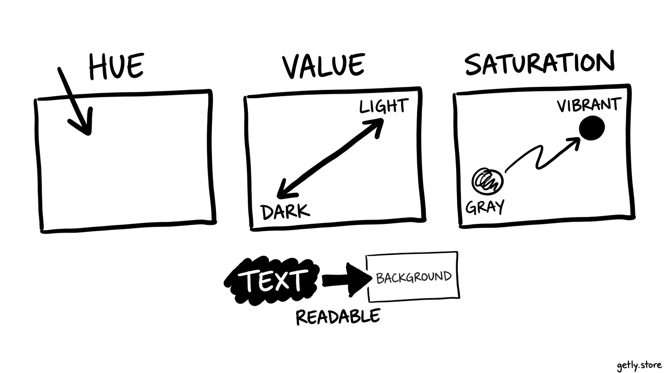
Hue means the color family, such as blue, yellow, or red. Saturation describes intensity. A saturated orange looks vivid; a desaturated orange looks dusty or muted. Value describes lightness and darkness. A pale navy has a higher value than a deep navy, even though both share the same hue.
Value does most of the work in readability. Two colors can have different hues but similar values, which makes text hard to separate from its background. Convert a draft to grayscale for a quick check. If the heading and background merge in grayscale, increase the difference between their lightness levels.
Use saturation to control emphasis. Give your call-to-action or key label the strongest saturation, then reduce intensity in decorative areas. A page full of vivid colors leaves the eye without a clear starting point.
3. Build a palette with clear roles
Start with one anchor color. This color should express the product’s character and appear in a recognizable place, such as a title, border, icon, or cover shape. Choose a second color that supports the anchor without stealing its job. Add a neutral for backgrounds and body text.
Assign a role to every color before you add it. A simple palette can include:
- Anchor: the color people associate with the product.
- Support: a related or contrasting color for secondary headings and accents.
- Neutral: a background, ink, cream, gray, or off-white that gives the eye rest.
- Signal: an accent for buttons, warnings, prices, links, or important labels.
Limit the signal color to a small area. A 60-30-10 split offers a useful starting point: let the neutral cover about 60 percent of the design, the anchor or support color cover about 30 percent, and the signal color cover about 10 percent. Adjust those proportions when the product needs a quieter or louder mood.
You can create harmony in several ways. Analogous colors sit next to each other on the color wheel and create a smooth, low-conflict look. Complementary colors sit across from each other and create strong separation. A split-complementary palette keeps that energy while giving you more flexibility. Pick one relationship, then let value and saturation create variation.
For example, choose deep teal as the anchor, pale blue-gray as the neutral, warm coral as the signal, and charcoal for text. The palette gives you cool structure, a warm point of attention, and enough dark value for legibility.
4. Turn swatches into a usable system
Create a small color board with the color name, hex value, role, and example use. Names such as “deep teal” help you remember the intent, while a hex value helps you reproduce the same color across a product. Keep the board beside your working file.
Build light and dark versions of the anchor color before you design full pages. Use the light version for soft panels and the dark version for headings or icons. Do not assume that a darker version will keep enough contrast against every background. Test each pairing where it will appear.
Give text colors their own rules. Use a dark neutral for body copy instead of your brightest brand color. Reserve the anchor or signal color for short labels, links, and display text unless you have checked its contrast.
A purchased template can speed up the layout stage, but you still need to map its existing colors to your roles. For example, you could adapt a wedding invitation card by keeping its spacing and typography while replacing its accent colors with your own anchor, neutral, and signal colors.
Check contrast before polishing
For normal-sized text, aim for a contrast ratio of at least 4.5:1 against its background. Large text can use a ratio of at least 3:1. Treat those figures as a practical baseline, then inspect the design on a dim screen and at small size. Thin fonts and low-resolution previews can reduce legibility even when a color tool reports an acceptable ratio.
Check links, buttons, captions, form labels, and text placed over photographs. A color that works on a plain cream background may disappear over a bright section of an image. Add a solid panel, a translucent overlay, or a different text color when the background changes.
5. Test the palette in real content
Make a small test page before you decorate the full product. Add a title, paragraph, button or callout, image, footer, and one dense section. This sample exposes weak pairings faster than a row of isolated swatches.
Test the palette at three sizes: a close view, the size buyers will see on a screen, and a small thumbnail or preview. The anchor color should remain recognizable at each size. The signal color should still mark the intended action instead of blending into nearby decoration.
Review the design in grayscale, then check it with a color-vision simulator. Do not rely on color alone to communicate status or meaning. Pair color with text, an icon, a pattern, a border, or a change in position. A red warning label should also say “Warning,” rather than asking color to carry the message by itself.
Ask a practical question during review: can a buyer find the title, understand the hierarchy, and identify the next action without guessing? If the answer feels uncertain, adjust value and spacing before adding another hue.
Do
- Test colors inside headings, paragraphs, buttons, and images.
- Pair color signals with words, icons, or patterns.
- Keep a written role for each swatch.
Don't
- Judge a palette from isolated swatches alone.
- Use saturation to solve a value problem.
- Make every color compete for attention.
6. Fix common palette mistakes
Too many unrelated colors
Remove colors that have no assigned role. If a shade appears once as a decorative dot and nowhere else, it probably adds noise. Reuse an existing anchor, support, or signal color instead.
Beautiful swatches, weak hierarchy
Increase the value gap between the background, body text, and headings. Then reduce saturation in secondary elements. Your viewer should find the main title before noticing small accents.
Brand color used for every task
Let the anchor identify the product, but let neutrals handle long reading sections. Use the signal color for a specific action or message. This separation makes each role easier to recognize.
Color-only instructions
Add labels or symbols to charts, status markers, and navigation cues. Test the result after removing color. If the meaning disappears, add another visual signal.
Palette chosen before content
Write or place the real content before you finalize the palette. A short title and a long paragraph create different demands. Your test page should include the longest heading, densest text block, and most complex image in the product.
7. Save a repeatable palette checklist
- Write the product’s purpose and two or three mood words.
- Choose one reference image or object.
- Select one anchor, one support, one neutral, and one signal color.
- Record each color’s role and hex value.
- Create light and dark versions of the anchor.
- Check normal text at 4.5:1 and large text at 3:1 or higher.
- Test a real page in color, grayscale, thumbnail size, and a color-vision simulator.
- Remove any color that has no clear job.
Keep the final palette small enough to remember and flexible enough to cover the product. A clear role system will help you make faster choices on the next cover, worksheet, presentation, or template.
Frequently asked questions
How many colors should a beginner use in a palette?
Start with four roles: one anchor, one support, one neutral, and one signal color. Create lighter or darker variations only when a specific layout need requires them.
What matters more, hue or value?
Value matters more for readability because it controls the lightness difference between text and its background. Check value before you fine-tune hue or saturation.
How can I make a palette accessible?
Check normal text at a contrast ratio of at least 4.5:1 and large text at 3:1 or higher. Pair color with labels, icons, patterns, or position so color does not carry meaning alone.
What should I do if my palette feels too busy?
Remove colors without a clear role, reduce saturation in secondary areas, and let a neutral cover more space. Keep the strongest accent for one specific action or message.
Can I use a palette from a template?
Yes. Keep the template’s layout if it suits your product, then map its colors to your own anchor, support, neutral, and signal roles. Test every text and background pairing after the change.