 Getly
Getly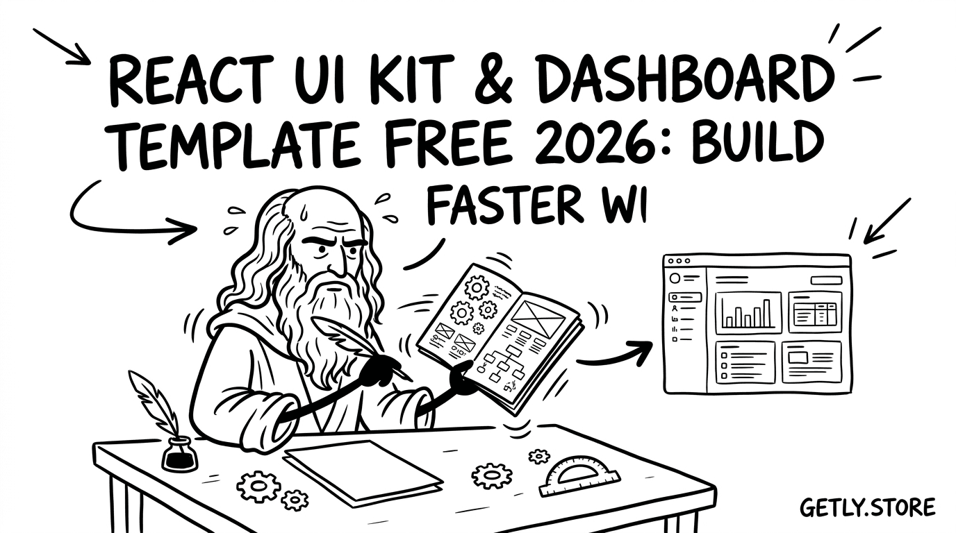
You can ship a React dashboard faster when you start from a proven layout. In 2026, “dashboard template free” searches usually mean wireframes, reusable components, and UI patterns that save hours of UI design resources work before you connect data.
This guide shows you how to evaluate free React UI kit options, pick a free dashboard template that matches your product, and adapt it with real UX decisions. You will also find example Getly templates you can use as reference when you build your own UI system.
TL;DR: Pick a React UI kit that matches your dashboard goals
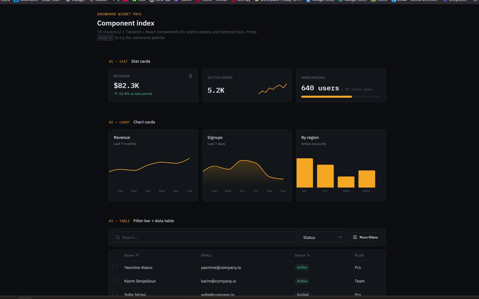
- A “free UI kit” works best when it includes layout primitives (sidebar, header, tables, forms) you can actually reuse.
- Choose a free dashboard template based on your data types, not just the visual style.
- Start with wireframe templates for navigation and empty states, then upgrade visuals later.
- Make sure licensing and use-cases fit your project scope before you publish.
What is a React UI kit, and what should it include?
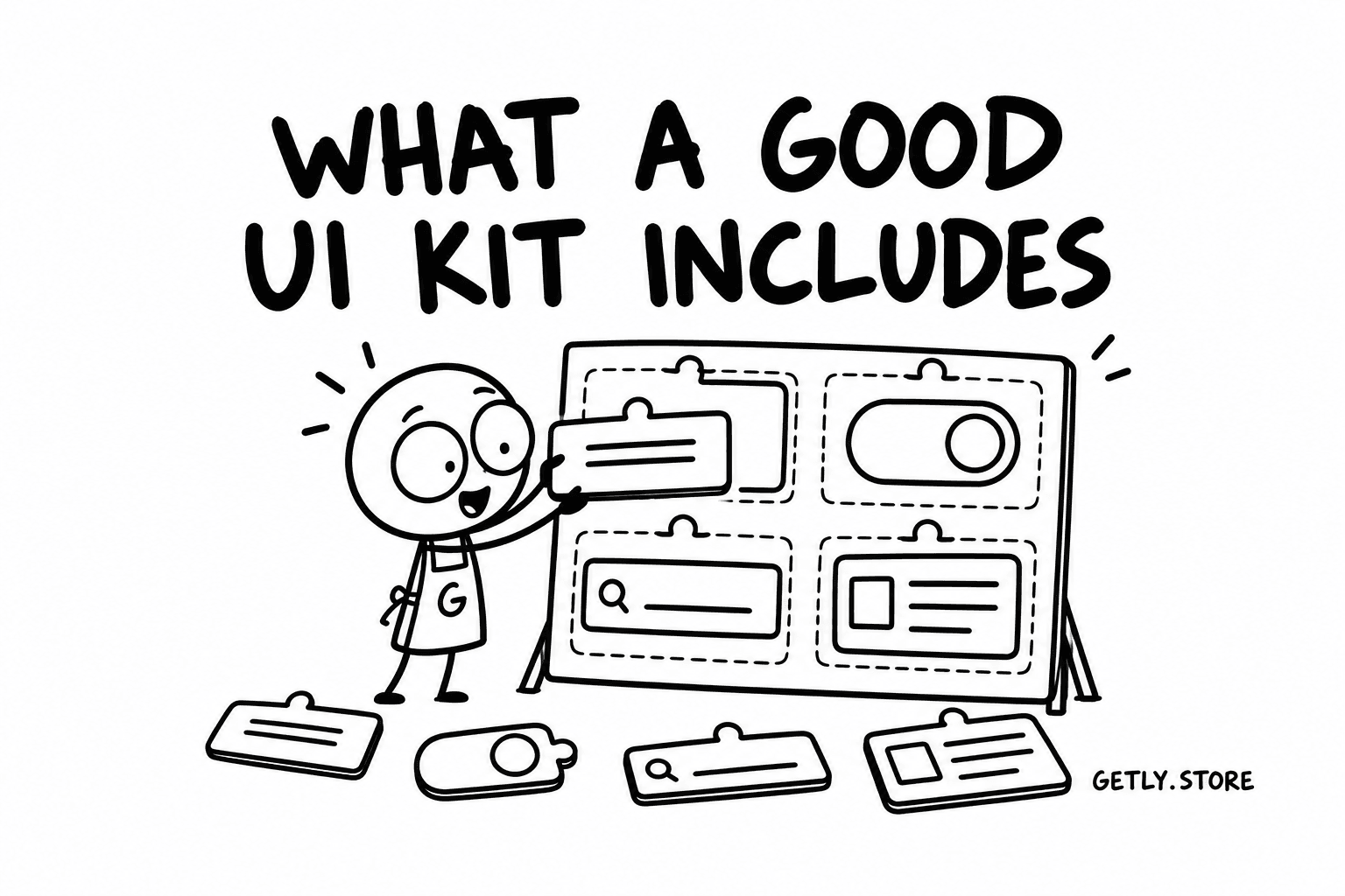
A React UI kit gives you reusable interface components and layout patterns you can drop into your application. A good kit covers more than buttons. It gives you the building blocks for a complete product experience: navigation, forms, tables, charts placeholders, and consistent spacing.
When you search “react UI kit” alongside “dashboard template free,” you usually want the same outcome. You want a dashboard that looks coherent in the first prototype and stays coherent after you connect endpoints and add real data.
Core components that matter for dashboards
Dashboards tend to share a small set of UI surfaces. If your kit lacks any of these, you end up rebuilding UI earlier than you expected.
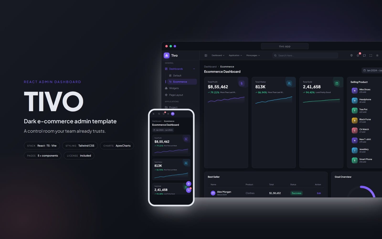
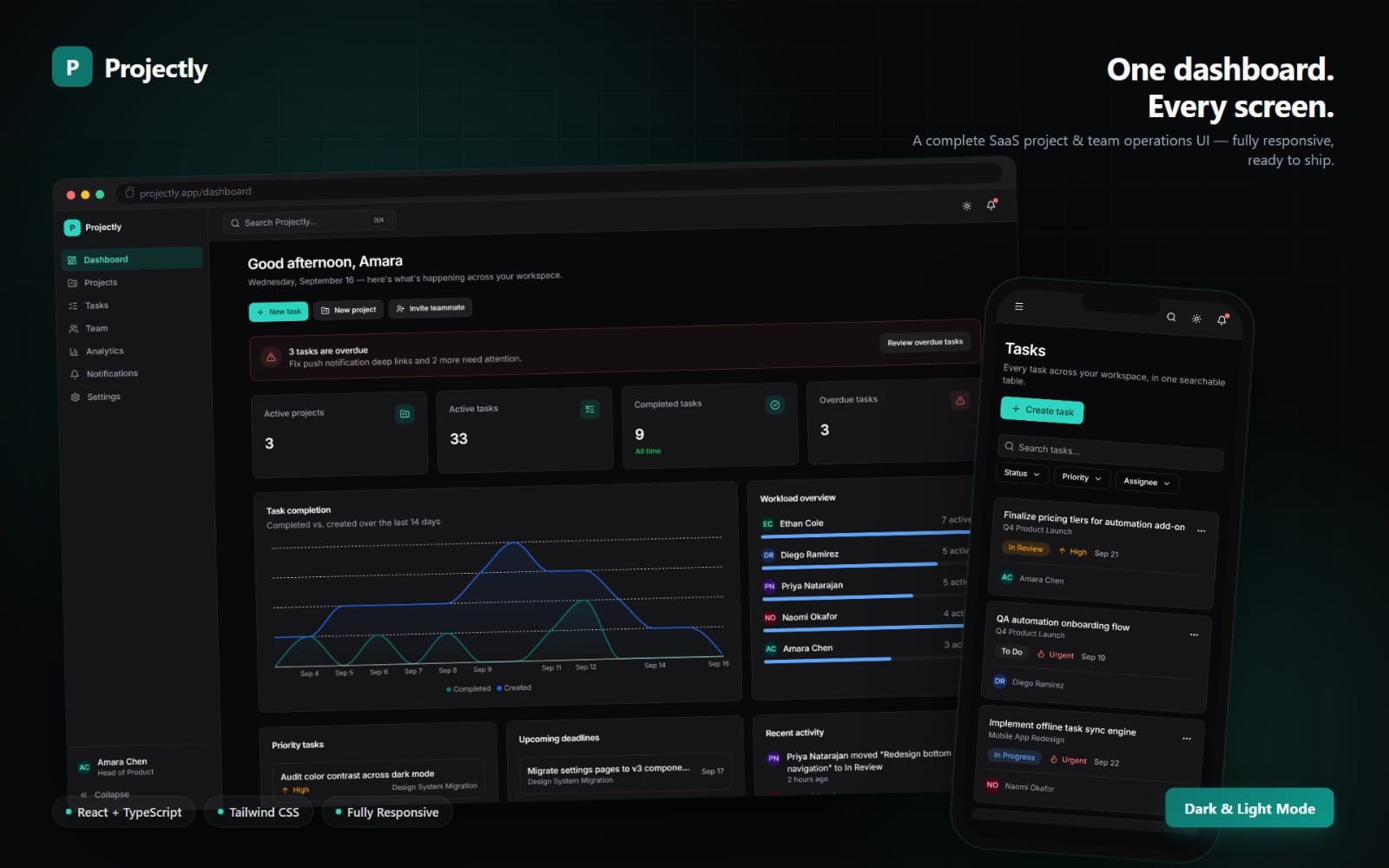
- Sidebar navigation with active state
- Top bar actions (search, notifications, profile menu)
- Cards with consistent padding and headers
- Data tables with sorting and empty states
- Forms with labels, validation messaging, and helper text
- Modals and drawers for “create/edit” flows
- Toast notifications and confirmation dialogs
UX patterns you should expect to reuse
UI components matter, but UX patterns save time. A React UI kit that includes UX defaults helps your app feel finished quickly.
Look for a kit that supports: predictable spacing tokens, consistent typography scales, and interaction states (hover, focus, disabled). Also check for patterns around onboarding, loading skeletons, and error handling.
Pro tip: Treat your dashboard as a set of repeatable screens: overview, analytics, list detail, and settings. If your free UI kit covers these screens with consistent components, you will finish a prototype faster than you would by mixing random components.
How to choose a dashboard template free for real products?
A “dashboard template free” should start as a UX map, then become a UI system you can theme. The fastest path focuses on screen structure first. Visual style comes next.
To choose correctly in 2026, match your template to your product’s data and user workflow. A sales dashboard and an admin console need different hierarchy, different table layouts, and different actions.
Match the template to your data types
Use your dashboard’s data shapes as the selection filter. For example, a template for events and schedules needs calendars or timeline sections. A template for subscriptions needs plan status cards and renewal controls.
| Dashboard use case | UI surfaces to look for | What to avoid in “free” templates |
|---|---|---|
| Analytics | Chart cards, date range selector, filter chips | Missing loading and empty states |
| Admin management | Tables, bulk actions, search, modal forms | Only static UI with no interaction patterns |
| Support and engagement | Ticket lists, message threads, status filters | UI that cannot represent “no conversation yet” |
| E-commerce operations | Orders list, status timeline, returns flow | One-column layout that breaks at scale |
Check for workflow fit: create, edit, approve
Most dashboards do not just “display.” They manage. Pick a free template that includes action placement you can reuse: where the create button lives, how edit happens, and how approvals confirm.
If your template leaves actions scattered, you will fix hierarchy after you implement. That typically costs more time than choosing a better starting template.
Common mistake: Grab a free UI kit because it looks clean, then discover it lacks drawer or modal patterns. Once your API integration starts, you need consistent “edit entity” flows. Plan those upfront.
How to use free wireframe templates to design faster?
Wireframe templates let you test navigation, information hierarchy, and decision paths before you commit to a visual theme. That approach cuts UI design rework because you validate structure early.
If you search “free wireframe templates,” you usually want editable layouts for: sidebar navigation, content grids, cards, lists, and forms. Use them as a blueprint for your React UI kit implementation.
Wireframe your dashboard screens in a fixed order
Designing in a sequence reduces confusion and keeps UX consistent across pages. Start with the easiest screen to define. Then add complexity.
- Overview dashboard (KPIs and quick actions)
- List view (search, filters, pagination, empty state)
- Detail view (summary header, tabs, activity)
- Create/edit view (form layout and validation states)
- Settings and permissions (role selection, confirmation)
Define empty, loading, and error states before styling
You cannot “style” your way out of missing states. Users notice empty screens immediately, especially in dashboards where they expect data to load on first glance.
- Empty state: what the user sees when no records exist
- Loading state: skeletons or spinners with consistent heights
- Error state: copy that tells users what happened and how to recover
- Partial data state: when some endpoints succeed and others fail
Success pattern: Teams that wireframe empty and loading states first ship fewer UI regressions after integrating APIs. They also reduce “surprise layout shifts” when data comes back slower than expected.
Best free UI kit resources for common dashboard components
The best free UI kit resources provide repeatable components for the screens you use every day in a dashboard. You want consistency more than novelty, especially for spacing, typography, and interaction states.
Use these selection tips to evaluate “free UI kit” packages without wasting time. A kit earns your trust when it supports the same component patterns across your app.
Component checklist for a dashboard UI kit
Before you commit, scan the kit for these essentials. If it misses multiple items, you will rebuild them later.
- Layout primitives: grid, container widths, responsive breakpoints
- Form controls: input, select, checkbox, radio, switch
- Feedback: toasts, inline validation, banners
- Navigation: tabs, breadcrumbs (optional but useful), sidebar
- Data display: tables, badges, status pills
- Overlays: modal, drawer, confirm dialog
Theme the kit once, then scale it
In 2026, the quickest dashboard builds rely on one theming system, not per-page styling. Set your token strategy early: colors for backgrounds, text, borders, and status states.
Then apply those tokens consistently across cards, tables, and forms. You get a UI that looks intentional even when you ship new pages weekly.
“A free UI kit saves you time only when it also saves you design consistency. Pick the kit that keeps spacing and component states aligned across screens.”
How to adapt a free template for your React dashboard stack?
A free dashboard template free can become a real product UI once you connect it to your routing, state management, and data-fetching strategy. The goal focuses on integration points: navigation state, filters, and form submissions.
Most teams slow down at the glue work. You can avoid that by aligning your UI structure with how your app stores filters and permissions.
Plan your integration points with UI structure
Start with the UI surfaces that depend on data. Then decide how you represent that data in UI state.
- Filters and search: map to query params or internal state
- Table selection: store selected IDs for bulk actions
- Drawer/modals: store the “current entity ID” and mode (create/edit)
- Notifications: store last action result to display success or errors
- Permission gating: render disabled actions with helpful copy
Use UI patterns that reduce API-related UI bugs
API integration introduces partial failures and slow responses. UI patterns that anticipate these cases make your dashboard feel stable.
Prefer patterns like “optimistic UI with rollback,” or “submit then show spinner with disabled button.” Keep it consistent. Consistency reduces user confusion and prevents duplicate submissions.
Warning: Do not hardcode table column widths and form row heights before you test multiple datasets. Your “free template” might look perfect with placeholder data and then break with real content length.
How Getly UI resources can inspire your dashboard UI (without copying)
Free templates accelerate your first prototype, but you still need uniqueness: your dashboard language, typography decisions, and component behavior. You can use UI design resources as inspiration for brand consistency and layout rhythm.
Getly hosts UI-adjacent template ideas across niches. You should not copy layouts blindly. Instead, you borrow structure: how a header behaves, how sections stack, and how CTAs get prioritized.
Template ideas that map well to dashboard sections
These templates can help you think about section hierarchy and visual grouping. Use them as reference when you design your own dashboard cards and page headers.
- Real estate layout inspiration for hero headers and property-style cards: Dream Home Real Estate Branding Kit
- Community or multi-section event structure: Together forever
- Editorial-style organization for content blocks you can adapt into admin panels: JUNGLE ANIMALS BOOK
If you build AI features, borrow the UI from engagement tools
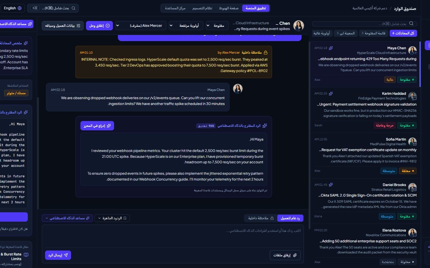
Dashboards increasingly include AI assistance panels. A common pattern uses a side panel or embedded card for chat, summaries, and next-step actions.
When you design that panel, follow the same UX rules as your tables and forms: show loading indicators, handle empty history (“start a conversation”), and make error messages actionable. You can also look at engagement tool UI structure for how they separate “context,” “messages,” and “actions.” For an example of AI-focused resource direction, see: AI-Powered Customer Service Systems Chatbots, Virtual Assistants, and Customer Engagement Tools.
Pro tip: Use a “component audit” checklist after you integrate your first endpoint. Update only the components that conflict with real data. That keeps your dashboard stable while you improve visuals.
FAQ: React UI kit, dashboard template free, and wireframe templates
Where do I find a dashboard template free that works with React?
Look for resources that include layout structure, not only screenshots. You want components or editable wireframe templates that map cleanly to React sections like sidebar, tables, and form pages. Then implement interactions (filters, pagination, modals) based on your data needs.
What makes a free UI kit “good enough” for production?
A free UI kit earns production readiness when it includes consistent states: hover, focus, disabled, loading, and error. It should also support responsive layout basics so your dashboard remains readable on smaller screens and not just on a designer’s monitor.
How do I design dashboards faster without losing UX quality?
Use free wireframe templates to lock navigation and hierarchy first. Then define empty, loading, and error states. After you connect APIs, adjust only the components that receive real data in different shapes.
Can I reuse a template layout across multiple dashboard products?
Yes if you treat the layout as a system, not a fixed page. Keep your grid, spacing tokens, and component states consistent. Change content hierarchy and actions to match each product’s workflow.
What should I check before using UI design resources?
Check licensing and intended use-cases for your project scope. Also review whether the resource supports the kind of screens you need, especially tables, forms, and feedback states. Finally, test the layout with realistic data lengths and long labels.
Conclusion: Build your React dashboard on structure, then refine the UI
In 2026, “react UI kit” and “dashboard template free” searches come down to one practical goal: ship a dashboard that looks coherent on day one and stays coherent after data integration. Wireframe templates help you validate hierarchy, while a strong UI kit helps you keep component behavior consistent.
If you want to move faster, start from a template that already supports the core dashboard surfaces. Then adapt it with your UX decisions: empty states, loading behavior, and clear actions. When your prototype feels stable, you can invest in polishing brand visuals and interactions.
Soft call-to-action: browse Getly for UI-adjacent templates and inspiration, then turn the best layout ideas into your own React dashboard component structure.