 Getly
Getly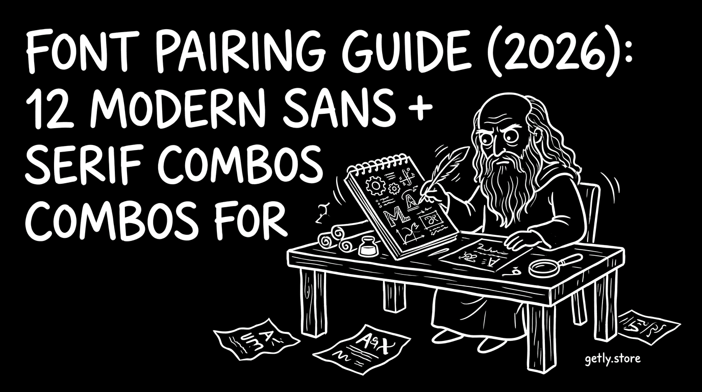
Great typography feels effortless. The right font pairing gives your layout clarity, hierarchy, and mood in seconds, whether you build a wedding invite, a product page, or a brand deck. This font pairing guide for 2026 gives you 12 modern sans serif combos you can copy into real projects and refine fast.
80% of successful design “taste” comes from spacing, contrast, and pairing discipline, not from using the fanciest font in the library. Below you will find sans-to-serif strategies you can apply immediately, plus practical do’s and don’ts for commercial use fonts.
- Pair modern sans serif fonts with a classic serif to create fast hierarchy and strong readability.
- Use contrast rules: humanist sans + transitional serif for friendly brands, geometric sans + modern serif for sharp brands.
- Choose licensing before you design. Commercial use fonts require the right agreement, even if you like the letterforms.
- Match x-height and weight: aim for similar visual “darkness” across headings and body copy.
- Test at the sizes you’ll ship. Type that looks great at 48 pt often fails at 12 pt.
What is a font pairing guide and why it matters in 2026?
A font pairing guide tells you which font styles work together and how to combine them without fighting the design. In 2026, you will see more “brand-first” layouts. Designers need type systems that stay consistent across posters, decks, invitations, and UI mockups, even when you use templates.
Typography success comes from predictable contrast: one font carries voice and readability, the other carries emphasis. Most of the time, you get the best results with modern sans serif fonts paired to a serif that adds texture, tradition, or editorial energy.
What a good combo does on a real layout
When your pairing works, headlines and body text feel like they belong to the same brand world. The sans gives clean structure, while the serif adds character for captions, supporting text, or hero callouts.
On production files, you also reduce friction. A clear hierarchy means fewer font-size experiments, faster spacing decisions, and fewer “why doesn’t this look right?” moments.
How to choose modern sans serif fonts for your first combo
The fastest path to a strong pairing starts with the sans. Choose a modern sans serif font that already looks intentional at small sizes. Then you pick a serif that complements the sans’s rhythm and stress patterns.
If you want consistent results across templates, favor families with multiple weights and optical sizes. Variable fonts also help when you need the same type voice in light body copy and bold display headlines.
Pick a sans by personality first, not by trend
Sans families usually fall into a few personality buckets. Use these cues to decide your “main font” voice before you choose the serif.
- Humanist sans: warm, approachable, great for communities, hospitality, education.
- Geometric sans: crisp, structured, good for tech, fintech, modern campaigns.
- Neo-grotesk sans: neutral, editorial-ready, strong for brand identity systems.
- Rounded sans: friendly and softer, ideal for invitations and lifestyle marketing.
Then you match the serif to that personality, so your pairing feels planned instead of accidental.
Choose weights that match the “ink” darkness
Most pairing failures happen because the fonts do not “read” with the same visual density. A light sans might look like it disappears next to a bold serif. Start with a practical target: body copy should feel stable, then headings should feel intentionally louder.
If you use the same weight family for both fonts, you will often get a mismatch. For many designers, the sweet spot looks like regular or medium sans for body, and semibold or bold sans for headlines, while the serif stays at regular or medium with a slightly heavier weight for emphasis.
Pro tip: When you test a pairing, write two short lines: one headline and one body sentence. Then reduce the design to the final size you will ship (like 12–14 px body). If the body turns into noise, change the sans first.
12 modern sans serif font combos for 2026 design
This section gives you 12 ready-to-apply pairing patterns. Each combo names the style relationship and tells you how to assign the roles: headline, body, captions, and UI-like labels.
Use these as building blocks for templates you already own, or for new projects like brand kits, invitations, decks, and marketing pages.
| Combo # | Modern sans serif font role | Serif role | Best for |
|---|---|---|---|
| 1 | Humanist sans (medium) | Transitional serif (regular) | Editorial brands, lifestyle, education |
| 2 | Neo-grotesk sans (semibold headings) | Classic serif (regular captions) | Product pages, polished portfolios |
| 3 | Geometric sans (bold display) | Modern serif (medium emphasis) | Tech launches, Web3 identity systems |
| 4 | Rounded sans (regular) | Book-style serif (regular) | Invitations, community events, wellness |
| 5 | Humanist sans (body) | Old-style serif (headlines) | Restaurants, recipes, heritage storytelling |
| 6 | Neo-grotesk sans (labels) | Slab serif (headings) | Industrial, bold claims, posters |
| 7 | Geometric sans (UI-like labels) | Didone-style serif (contrast) | Luxury, fashion, high-contrast editorial |
| 8 | Neo-grotesk sans (medium) | Contemporary serif (captions) | Brand decks, modern storytelling |
| 9 | Rounded sans (subheads) | Humanist serif (body) | Friendly marketing, kid-friendly education |
| 10 | Humanist sans (headings) | Transitional serif (body) | Documentation, guides, learning materials |
| 11 | Geometric sans (hero) | Slab serif (emphasis) | Gaming pages, strong callouts |
| 12 | Neo-grotesk sans (clean body) | Classic serif (pull quotes) | Essays, founder stories, editorial landing pages |
How to apply each combo in your layout
Assign roles before you change sizes. A simple rule: let the sans handle structure (grid, scanning, labels), and let the serif add meaning (emphasis, captions, quotes). This stops your typography from feeling random across sections.
Example roles that work for almost every combo above:
- Hero headline: modern sans serif font in semibold or bold.
- Body copy: modern sans serif font in regular or medium.
- Captions and quotes: serif in regular or medium, with slightly tighter line-height.
- Buttons and UI labels: sans at a consistent size, using tracking only when needed.
Quick placement examples you can copy
If you build a recipe page, you can use Combo #5 for the “story” sections and Combo #2 for the product-style list layout. For science education decks, Combo #10 keeps the tone readable while the serif adds a calm editorial cadence.
If you design a brand identity kit, choose Combo #3 or #8 for a modern, confident voice that still feels human. Serif captions give the brand an editorial edge without breaking the modern rhythm.
Success pattern: Teams that standardize type roles (sans for structure, serif for meaning) cut design revisions. They also keep templates consistent when new pages join the system.
What are commercial use fonts and how to verify licenses?
Commercial use fonts let you use the type in client work, paid ads, and products you sell. Free fonts download options often look tempting, but many “free” licenses block commercial usage or limit what counts as a derivative.
You avoid licensing mistakes by checking the exact terms for each font family. Pay attention to web, app, print, and logo usage. A license that allows a poster might not allow a logo, and a license that allows a website might not allow embedding in an interactive product.
What to check before you buy fonts online
When you buy fonts online, your checklist should focus on permissions, not price. Use this order so you do not waste time styling a layout you cannot legally ship.
- License scope: personal, commercial, or studio/client work.
- Allowed media: print, web, video, app, and packaging.
- Embedding rules: whether you can embed fonts in templates, PDFs, or design files.
- Project type: brand identity, marketing assets, or templates sold to customers.
- Number of users or seats: some licenses limit usage count.
- Geography and duration: some terms restrict distribution or time.
How to handle free fonts download without breaking rules
Free fonts download sources often label fonts “free for personal use” or “free for commercial use.” You should treat those labels as legal boundaries. If you plan to sell a template or deliver client work, you need a commercial-friendly license.
Also check whether the font license allows redistribution. If you package a font inside a template file for other designers to use, the license might forbid re-sharing the font itself.
Common mistake: Designers download a “free for commercial use” font but then embed it into a template sold for others to download. Some licenses allow your usage but forbid font redistribution. Always verify template-redistribution terms.
How to pair fonts for invitations, brands, and templates
You can use font pairing strategies across many product types because the hierarchy stays consistent. Invitations need a legible serif voice with a modern sans for the dates and details. Brand kits need reliable structure for lockups, headings, and UI-like sections.
Templates also demand predictable behavior. If you mix a serif with inconsistent punctuation or extreme contrast, your template can break when users swap languages or change content length.
Invitation typography that feels premium
For wedding invitations, pick Combo #4 (rounded sans + book-style serif) or Combo #1 (humanist sans + transitional serif). Use the sans for the names, and let the serif carry the event details or longer lines.
If you already work with a ready-to-edit design file, you get faster outcomes by setting font roles once: assign fonts to styles (headline, date, details) and lock them before you adjust spacing.
Brand and identity typography for modern campaigns
For Web3 and tech brand identity, Combo #3 or Combo #8 keeps the tone crisp. Use the sans in bold weights for brand marks and key headings. Use the serif for supporting copy or tagline emphasis so your brand feels less robotic.
When you present this in a deck, the pairing should work at small sizes on a slide. That means the body text should never rely on thin serif weights.
Web3 Brand Identity Kit™ Complete Premium Digital Product Package
Educational and content templates: clarity wins
For science lessons, guides, and explainer decks, choose Combo #10 (humanist sans + transitional serif). The serif handles headings or captions, and the sans stays readable for paragraphs and step lists.
When you build content templates for classes, you also reduce design churn. A stable pairing makes it easier for you and clients to update text without losing hierarchy.
For content-heavy layouts, add structure before decoration. Use consistent margins, a two-level heading system, and restrained font weights. Your typography system should help the reader move through information.
Pro tip: If your template includes both English and taglines or headings in another language, test glyph coverage early. Some serif families fail on punctuation marks and accents, especially in headings.
Buy fonts online vs free fonts download. What to choose?
Buying fonts online usually buys you more consistent families, broader weights, and clearer licensing terms. Free fonts download can help you prototype quickly, but you need to validate commercial use fonts permissions so you do not hit a wall after you publish.
For creators selling templates, commercial-ready typography matters even more. Customers judge your product by how polished the type system feels in real content, not by how good a font looks in isolation.
When free fonts download works
Use free fonts for:
- Personal experiments and mockups.
- Practice designs where you do not sell assets.
- Non-commercial brand studies.
- Internal slides that you do not distribute.
Then verify licensing before you move that same design into a client project or a commercial template.
When buying fonts saves time
Buying fonts usually pays off when you need a cohesive family. You get better results faster because you can use matching weights across titles, body, and UI labels.
Pick paid families when you ship frequently. Teams that maintain type systems spend less time adjusting letterforms and more time improving layout and spacing.
- Use modern sans serif fonts for structure and serifs for meaning and emphasis.
- Choose weights that match visual darkness to avoid “headline mismatch” between fonts.
- Commercial use fonts require license checks, especially for templates you sell or redistribute.
- Test at final sizes and with real copy lengths, not placeholder text.
FAQ: font pairing guide, commercial use, and free font downloads
What is the best font pairing guide for beginners?
Start with a modern sans serif font for body and a serif for captions or headlines. Follow consistent roles: sans for structure, serif for emphasis. Test the pairing at your final body size first, then scale headings once you trust readability.
Can I use free fonts download for commercial use?
Only if the license explicitly allows it. Many free fonts download licenses restrict commercial projects or forbid redistribution inside templates. Always check the exact commercial and embedding rules before you ship client work.
Which modern sans serif fonts pair best with serifs in 2026?
Humanist and neo-grotesk sans families pair consistently with transitional or book-style serifs. Geometric sans works best with modern or slab serifs when you want sharp contrast. The key is matching rhythm and weight so the “ink” feels consistent.
How many font weights should I use in a pairing system?
Most clean systems use 3 to 5 weights total: regular or medium for body, semibold or bold for headlines, and occasionally a lighter weight for labels. Too many weights make hierarchy unstable when content length changes.
How do I know if a font pairing will look good on templates?
Use real content in both short and long forms. Then check how headings wrap and how serif punctuation behaves. If the layout stays readable and consistent across variations, the pairing will hold up when users edit your template.
Conclusion: lock your pairing system, then ship faster
Font pairing is a system decision. When you choose modern sans serif fonts for structure and serifs for meaning, your designs gain hierarchy, consistency, and a recognizable brand voice across every page and template.
If you want to build faster with typography you can trust, try applying one of the 12 combos above to a real template project you already use, then refine the weights and roles for your next release.
Soft next step: Browse your next layout idea and pick a template direction you can typography-test quickly.
Getly Sellers Team