If you build SaaS in 2026, speed matters more than cleverness. A strong SaaS starter kit turns “blank repo” into working auth, billing, UI, and developer tooling in days, not weeks. This guide gives you a practical React components library must-have list you can drop into Next.js templates and evolve into something you can sell.
Below you’ll get implementation-focused picks: layout, navigation, forms, tables, states, uploads, notifications, permissions, docs-ready UI, and testing hooks. Each section starts with a direct answer so you can use it as Position Zero reference while you build.
- A real SaaS starter kit needs reusable UI primitives, not just “pretty components.”
- Your React components library should cover empty, loading, error, and success states from day one.
- Next.js templates win when routing, auth gates, and billing UX share the same UI contracts.
- To sell code online, structure your starter kit as composable modules with clear docs and examples.
- Include developer tooling that helps other builders ship faster, not just you.
What is a SaaS starter kit and what should it include?
A SaaS starter kit bundles the recurring parts of SaaS engineering: authentication flows, tenant or workspace UI, billing entry points, settings pages, and consistent front-end patterns. Think “repeatable product scaffolding,” not a single repo dump.
In practice, your kit should also define what “done” looks like for UI and UX. That means predictable component APIs, clear loading and error states, and a routing approach that won’t break when you add more pages.
Definition that maps to how you build
Use this test: if you can start a new SaaS project and reach a working dashboard with auth, navigation, and a settings area without rewriting everything, you’ve built a starter kit.
In 2026, that also means you should design the UI as a set of primitives your app can remix, because your future features will reuse the same patterns.
Starter kits that are easier to sell
If you plan to sell code online, your kit should ship with small, testable components and example pages. Buyers pay for clarity and speed, not mystery meat.
Build your library so a developer can replace the backend later, keep the UI contracts, and still move fast.
Pro tip: Treat your starter kit like a product. Write “contracts” for components. For example, every form component should accept standardized error and success props so buyers can integrate quickly.
Best React components library for SaaS dashboards in Next.js
The best React components library for SaaS dashboards covers navigation, layout, and data presentation with consistent state handling. A library that fails on edge cases (loading, empty, permission-denied) fails in real SaaS use.
Since you target Next.js templates, you also want components that play nicely with server and client boundaries. Your UI should not lock you into one rendering approach.
Start with a dashboard skeleton component
Create a “page shell” component that standardizes spacing, header slots, and content containers. Include a breadcrumb slot if you expect nested routes.
When the shell handles structure, your feature pages become smaller. That also makes it easier for others to reuse the kit.
Define global UI state patterns
Standardize how the app shows loading skeletons, empty states, and error banners. Then, expose those patterns as components rather than ad hoc markup.
In SaaS, these states show up everywhere: analytics screens, settings forms, team management, and billing history.
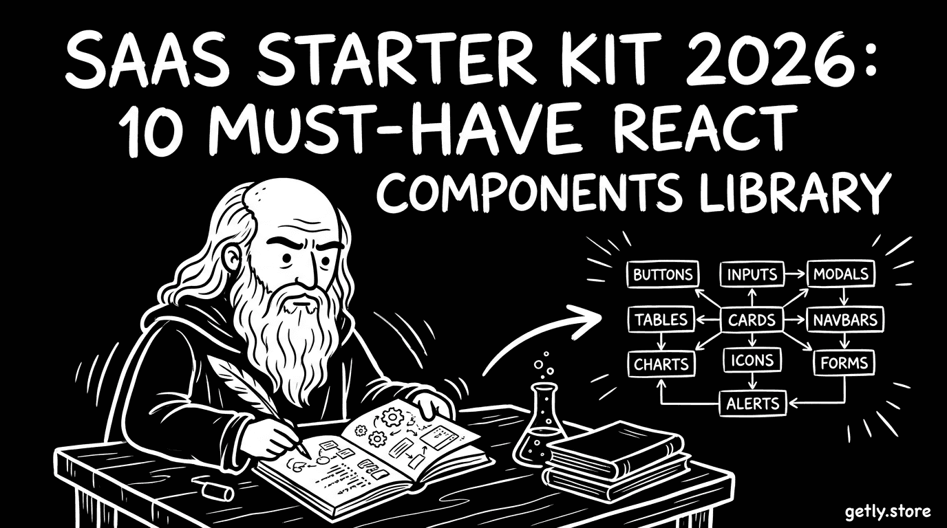
How to choose 10 must-have React components for your library
Use these 10 must-have components as your SaaS starter kit baseline. They cover the core UX flows you’ll rebuild for every SaaS app, and they set a consistent foundation for future screens.
Each item below includes what it solves and what the component API should include, so you can turn it into a reusable React components library module.
- AppShell (layout + responsive nav) that supports header slots, side navigation, and mobile drawer behavior.
- Auth-aware Gate component that handles “loading auth,” “signed out,” and “signed in but no access.”
- Workspace or Tenant switcher UI with a clear callback contract for switching context.
- Form system primitives (Input, Select, Checkbox, Textarea) that share validation and error rendering.
- Data table component with sorting hooks, column definitions, and consistent empty/loading states.
- Notifications system (toast or banner) with standardized variants and durations.
- Modal and drawer components designed for confirmation flows and settings edits.
- File upload component with drag-and-drop UI, progress states, and accessible error handling.
- Permission-aware UI controls that hide or disable actions based on capabilities.
- Developer-friendly Docs/Example components that demonstrate usage patterns and edge cases.
Warning: Don’t ship “happy path only” components. If your form shows errors differently from your modal and your table uses a different empty-state layout, buyers will spend time fixing UX instead of building features.
Make component contracts explicit
For every component, define input props and output callbacks. Example: a modal should accept open, onClose, title, and an optional onConfirm with an action loading state.
This prevents “tight coupling” when developers integrate your kit into their own app.
Design APIs around SaaS workflows
SaaS screens often start with a list, then transition to create, edit, or confirm actions. Your components should match that workflow instead of forcing custom wrappers every time.
That’s how you reduce code duplication and keep your Next.js templates clean.
How to implement Next.js templates that use your components
Implement your Next.js templates so routing, layout, and state share the same UI contracts. You want page components that remain thin and delegate to your React components library.
In 2026, template buyers expect predictable structure. If your folder conventions and component usage patterns stay consistent, they can swap backend logic without rewriting the UI.
Route structure that matches SaaS modules
Group pages by product modules: dashboard, billing, settings, team, and analytics. Each module should rely on a shared page shell and navigation links.
When a buyer adds a new module, they can clone an existing pattern instead of reinventing layout.
Auth and permission gating in the UI layer
Use a gate component to control what renders when a user lacks access. Show a consistent permission denied UI rather than letting each page invent its own behavior.
That one decision makes your kit feel cohesive and reduces support questions.
Pro tip: Add a “skeleton mode” for every module page. A skeleton is UX polish, and it also helps template buyers test loading flows quickly.
How to test and harden your components for production
Harden your components by testing the UI states that break in production: slow networks, missing data, validation errors, and unauthorized actions. This step keeps your starter kit stable when buyers connect real APIs.
A starter kit earns trust when it behaves consistently under stress. You should build a small set of test scenarios for each core component, not one mega test that nobody understands.
What to test for each component
Focus on state transitions. Example: a form should test how it renders while submitting, how it shows field-level validation, and how it resets after success.
A table should test empty data rendering, error banner rendering, and loading skeleton rendering.
- Accessibility checks for keyboard navigation in modals and drawers.
- Permission scenarios for action buttons and destructive flows.
- Consistency checks for error message formatting across components.
- Snapshot or DOM checks for empty and loading states.
Hard rules for reusable library components
Make sure components don’t assume a single page-level context. For example, don’t hardcode navigation links inside the AppShell; pass them as props.
Keep side effects out of presentational components. If a component needs to start an upload, separate the UI from the upload logic so buyers can plug in their own APIs.
How to package a React components library so you can sell it
To sell code online, package your React components library with a clear integration story: installation steps, examples, and a short “what’s included” list. Buyers want to know how fast they can ship after purchase.
In a marketplace context, buyers also scan for structure. They look for organized modules, consistent naming, and predictable props. A messy kit becomes hard to trust.
What your starter kit should ship with
Deliver a complete “minimum viable SaaS UI” so buyers can see real usage, not just component definitions.
Include:
- A dashboard page that uses your AppShell and table
- A settings page that demonstrates modals and forms
- A billing page pattern (even if it uses mock data)
- At least one permissions example that hides actions based on capabilities
Documentation that reduces buyer friction
Write docs that start with “how to use” rather than “what it does.” Then include edge cases: empty states, errors, and permission denied.
If you include example code, show a realistic flow: open modal, validate input, submit, show success notification, and close.
Success pattern: Creators who sell starter kits usually reduce support load by shipping working examples for each major component. Your buyer should be able to run the demo, edit a prop, and understand the integration without reading the whole codebase.
On Getly.store, creators commonly list ready-to-use digital assets across code and dev tools, plus templates that help teams ship faster. If you turn your starter kit into a product, the same buyer logic applies: clarity and plug-and-play examples sell.
To round out your SaaS UI offerings, you can also bundle visual or media assets that pair with templates. For example, creators list specialized animation and media workflows like Product Title AI Text Animation Mastery: Create Viral Videos Without Showing Your Face and other creative templates. Those assets can complement landing pages or demo experiences for your SaaS kit.
FAQ: SaaS starter kit 2026 and React components library
What is a React components library in a SaaS starter kit?
A React components library in a SaaS starter kit is a reusable set of UI primitives and patterns: layout, forms, tables, modals, notifications, and state handling. It lets you build multiple SaaS pages with consistent UX and fewer duplicated components.
Why do Next.js templates matter for SaaS?
Next.js templates accelerate development by standardizing routing, layout structure, and page conventions. When templates and components use the same UI contracts, you reduce rewrite time when you add auth, permissions, and billing flows.
How do I structure a starter kit so buyers can integrate fast?
Ship modular components with explicit props, include working example pages, and document edge cases like loading, empty, validation errors, and permission denied. Buyers integrate fastest when they can run the demo and change a few inputs to match their own backend.
What developer tools free options should I include?
Include developer tools that speed debugging and integration: consistent UI state patterns, example code, and documentation that shows realistic flows. A “developer tools free” approach works best when you remove guesswork, not when you hide how the components connect.
Can I sell my components library as part of a bigger SaaS starter kit?
Yes. Many creators package UI kits as standalone libraries and also provide a complete starter application that demonstrates usage. That combination helps buyers who want either “drop-in components” or a full working foundation.
- Pick 10 must-have components that cover real SaaS workflows and UI states, then standardize their APIs.
- Build Next.js templates that keep pages thin and delegate UI to your library.
- Harden components with tests for loading, empty, errors, and permissions.
- Package and document your kit so buyers can integrate in hours, not days.
If you build a components library that makes edge cases predictable, you’ll ship faster and earn better adoption. Start by implementing the AppShell, the auth gate, and one data table page with full state coverage, then expand until your SaaS starter kit feels like a system.
Soft call-to-action: Keep refining your kit into a product-ready template and explore listings and examples on Getly.store to see how buyers respond to clear structure and fast integration.


