 Getly
Getly
By the end of this guide, you can choose a mockup angle that suits your digital product, match its lighting to the scene, and place your artwork without warped edges or muddy text. You can also label mockup images so buyers understand exactly what they will receive.
Mockups work best when they answer a buyer's practical questions at a glance: What does the product look like? How large does it appear? Which pages, screens, or formats come with the purchase?
Start with the product and the buyer's view
Write down the product's main viewing situation before you open a template library. A printable planner needs a page angle that shows writing space. A presentation template needs a screen or slide angle that keeps text readable. A logo package needs a branded surface, such as a card, sign, or laptop display.
Choose one primary image that shows the product clearly, then add supporting images that answer specific questions. A recipe file might need a full-page view, a close crop of a finished recipe card, and a spread that shows the number of pages. A resume template might need a full-page view plus a close crop that proves the text remains legible.
Keep the product's use case ahead of decoration. A dramatic desk scene can attract attention, but a buyer still needs to inspect the actual layout. Use props only when they support scale or context. A pen beside a printable page helps show size. A vase that covers half the page hides information buyers need.
Name the buyer's task
Write the action your buyer should understand, such as print, present, read, or customize.
Choose the proof image
Select a view that shows the product's format, hierarchy, and most useful detail.
Add context with restraint
Place one or two props near the product without covering its content.
Choose an angle that shows the right evidence
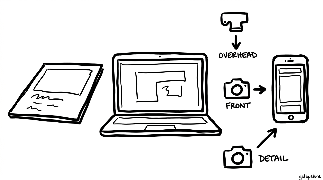
Match the camera angle to the product's physical or digital behavior. A straight-on view gives buyers the cleanest read of a page, poster, worksheet, or slide. A slight overhead view gives context while preserving most of the design. A low angle creates depth, but it can distort a flat page and make small text harder to inspect.
Use perspective with care. A book mockup can show a page turning toward the camera because the fold communicates a real reading experience. A single-page printable usually benefits from a flatter angle because buyers need to judge margins and writing space.
| Product type | Useful primary angle | Reason |
|---|---|---|
| Printable worksheet | Front or slight overhead | Shows margins, prompts, and writing areas |
| Presentation template | Front-facing screen | Keeps slide text and alignment readable |
| Phone interface | Three-quarter device view | Shows the screen and device context |
| Recipe collection | Overhead page spread | Shows food imagery, headings, and page structure |
| Brand identity kit | Mixed flat lay and close crop | Shows both the system and its applications |
Check the template's perspective before you insert artwork. Look for corner points on the replacement area. If the top edge angles down toward the side, your design needs the same perspective. A mockup tool usually handles this transformation, but the source artwork still needs the correct proportions.
Match the light before you adjust color
Study the scene's light direction first. Find the brightest edge on the product, the shadow's opposite side, and any cast shadow from a prop. A scene with light entering from the upper left needs artwork whose highlights and tonal balance can sit comfortably under that light.
Dark artwork can work in a bright scene, but it needs enough contrast against the surface. White artwork needs a visible edge or a soft shadow so it does not disappear into a white background. Saturated colors can shift when the scene uses a warm lamp, a cool window, or a tinted background.
Match these four traits before you fine-tune color:
- Direction: place the artwork's visual emphasis where the scene's light supports it.
- Softness: use gentle shadows for diffused window light and harder shadows for direct light.
- Temperature: balance warm beige scenes with warm-neutral artwork, unless deliberate contrast supports the design.
- Contrast: preserve readable type instead of forcing the artwork to copy every shadow in the photograph.
Use the template's existing shadows and highlights as your starting point. Place your artwork beneath those layers when the file separates them. Reduce opacity only when the artwork should show texture through paper or fabric. Excessive opacity changes make colors look faded and can suggest that the finished product has a different appearance.
Place the artwork without losing accuracy
Prepare the artwork before you insert it. Crop extra transparent space, remove accidental guides, and export at a size that preserves small type. Keep a clean master file so you can create several mockup views without repeatedly compressing the design.
Follow the replacement area's shape rather than forcing a square image into every scene. A phone screen needs a tall crop. A presentation screen needs a wide crop. A two-page spread needs enough width to show the gutter without cutting off either page.
Inspect these details at the final display size:
- Check the corners for halos, white gaps, or artwork that spills beyond the object.
- Check small type at thumbnail size, because buyers often scan gallery images before opening them.
- Check folds and curved surfaces for unnatural stretching.
- Check the crop for important content that sits too close to an edge.
Use a close crop only when it adds information. A detail image should reveal paper texture, interface hierarchy, an illustration, or a typography treatment. It should not repeat the same view with a smaller frame.
Do
- Show one full view and one useful detail.
- Keep the artwork's proportions intact.
- Use the same brand colors across the image set.
Don't
- Cover key content with a coffee cup or plant.
- Stretch a portrait page into a landscape screen.
- Use a crop that hides the product format.
Build a small image set that answers questions
Plan three to five images for a product with several pages or formats. Use fewer images when one clear view explains the offer. Each image should earn its place by showing a different piece of evidence.
- Lead image: show the product in its clearest, most recognizable view.
- Format image: show the page, screen, file type, or collection structure.
- Detail image: enlarge a feature that buyers may inspect before purchase.
- Variation image: show another color, page, device, or use case when the product includes it.
- Information image: state included files, editable software, or page count when those details affect the buying decision.
Keep the camera height, background family, and color treatment consistent across the set. Consistency helps buyers compare images instead of wondering whether each picture represents a different product.
Reserve text overlays for facts that the image cannot show. A short label such as “12 pages” or “editable slides” can clarify the offer. Avoid claims that the file cannot support, such as promising a physical delivery for a download.
Stay honest about what buyers receive
Label mockups as previews when the scene could make a digital product look physical. Buyers should know whether they will receive a PDF, editable template, image file, slide deck, or another digital format. State the required software when it affects editing.
Do not add features to a mockup that your product does not include. A tablet scene can show a digital planner, but the product description should explain whether the purchase includes hyperlinks, a tablet application, or only a downloadable file. A printed card scene should not imply that you ship the card when you sell a design file.
Keep sample content recognizable as sample content. Mark placeholder names, photos, prices, and contact details with labels such as “sample text” when a buyer could mistake them for included assets. Use licensed or original images in the product preview, and identify any stock elements that the buyer will not receive.
Common mistakes to catch before publishing
Run a final review at the size buyers will see in the product gallery. Open the image on a smaller screen and check whether the product still reads. Then compare the mockup against the actual files so the preview does not promise a different layout, color, or format.
- Wrong angle: You choose a cinematic view that hides the page or screen. Replace it with a flatter view for the lead image.
- Light mismatch: You place bright artwork in a dark, warm scene without adjusting contrast. Choose a better scene or revise the artwork's tonal balance.
- Unreadable type: You shrink a full page into a busy desk photo. Add a detail image or simplify the crop.
- False physical impression: You show a printed object while selling a download. Add a clear digital-product label and name the file format.
- Extra elements: You include fonts, photos, icons, or device screens that the purchase excludes. Remove them or label them as presentation samples.
- Inconsistent set: You mix cool studio lighting with warm bedroom lighting. Keep the image family consistent unless the variation explains a real product option.
Finish by asking a simple buyer-side question: could someone identify the product, inspect its quality, and understand the delivery format without guessing? Revise the image set if any answer depends on a hidden assumption.
Frequently asked questions
What angle works best for a digital product mockup?
Use a front-facing or slight overhead angle when buyers need to read a page, slide, or screen. Use a three-quarter view when device or object context matters, but add a flatter detail image if perspective reduces legibility.
How can I match artwork to a mockup's lighting?
Find the scene's light direction, shadow softness, color temperature, and contrast. Place artwork under the template's shadow and highlight layers, then adjust tonal balance without washing out the product's real colors.
Should I label a mockup as a digital product preview?
Yes, label the image when the scene could make a download look physical. Name the actual file format and state whether buyers receive editable files, sample content, stock assets, or only the digital design.
How many mockup images should a digital product have?
Use one clear lead image and add two to four supporting images when the product has multiple pages, formats, or important details. Give each image a distinct job instead of repeating the same view.