 Getly
Getly
By the end of this guide, you can choose an aspect ratio before writing a scene, place the subject where the final crop will preserve it, and write prompts that match the frame. You can also diagnose awkward crops and decide when to regenerate instead of forcing a bad composition into a new shape.
TL;DR: choose the frame first
Start with the destination. A product thumbnail, phone screen, presentation slide, and cinematic banner each need a different frame. Pick the ratio before you describe the subject, then build the scene around the available width and height.
- Use 1:1 for square thumbnails, avatars, icons, and grid layouts.
- Use 4:5 for portrait feeds, product cards, and editorial images that need more vertical room.
- Use 16:9 for video covers, presentations, website banners, and desktop hero images.
- Use 9:16 for phone-first stories, short-video covers, and full-screen mobile graphics.
Keep the main subject away from the outer edge unless you know the design will preserve the full canvas. Leave room for text in the prompt itself, such as “open upper-left space for a headline,” rather than adding text as an afterthought.
1. Choose the destination before the subject
Write down where the image will appear. The destination determines how much horizontal or vertical space the composition needs.
| Destination | Useful starting ratio | Composition priority |
|---|---|---|
| Square product thumbnail | 1:1 | Keep the product large and centered |
| Portrait product card | 4:5 | Show height, packaging, or a standing figure |
| Website banner or video cover | 16:9 | Spread the scene across the width |
| Mobile story or short-video cover | 9:16 | Stack the subject and preserve top and bottom margins |
| Print poster | 2:3 or 3:4 | Reserve room for a title, details, and trim |
Ask what the viewer needs to see at a small size. A square thumbnail needs a clear silhouette. A wide banner needs a subject that can sit to one side while the background carries the scene across the frame. A tall mobile image needs vertical staging, so a wide group shot often feels cramped.
Check the placement rules before you prompt. A platform may display the full image, crop it into a card, or place text over part of it. If you control the design, choose the source ratio that gives you the most useful crop options. If you do not control the display, generate for the narrowest frame that matters and protect the focal subject inside it.
The bars compare usable width at the same 1000-pixel height. A 1:1 canvas gives you 1000 pixels of width, 4:5 gives you 1250, and 16:9 gives you about 1778. Use the wider formats when you need lateral breathing room, not because they look more cinematic by default.
2. Translate the frame into composition
Convert the ratio into a simple layout before you write the scene. Mark the focal subject, the supporting details, and the empty area that will carry copy or branding.
- Choose the focal zone. Put a product near the center for a thumbnail, or place it on the right third when the left side needs headline space.
- Choose the direction of movement. Give a person, vehicle, or animal more room in front of its gaze or motion. A runner facing the right edge needs space on the right, not a wall of pixels.
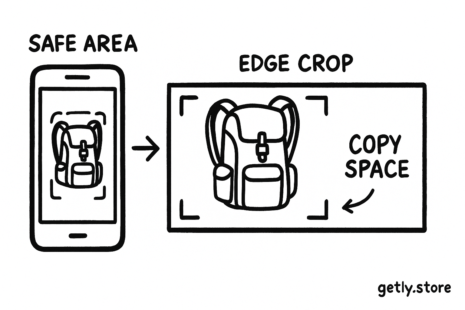
- Choose the safe area. Keep faces, logos, hands, and small product details away from the outer 5 to 10 percent of the frame. A later crop can remove those details.
Think in shapes before details. A tall bottle needs vertical room. A landscape needs horizontal room. A group of three people needs enough width to separate faces and hands. If the frame cannot hold the subject and its action, change the ratio before adding more prompt adjectives.
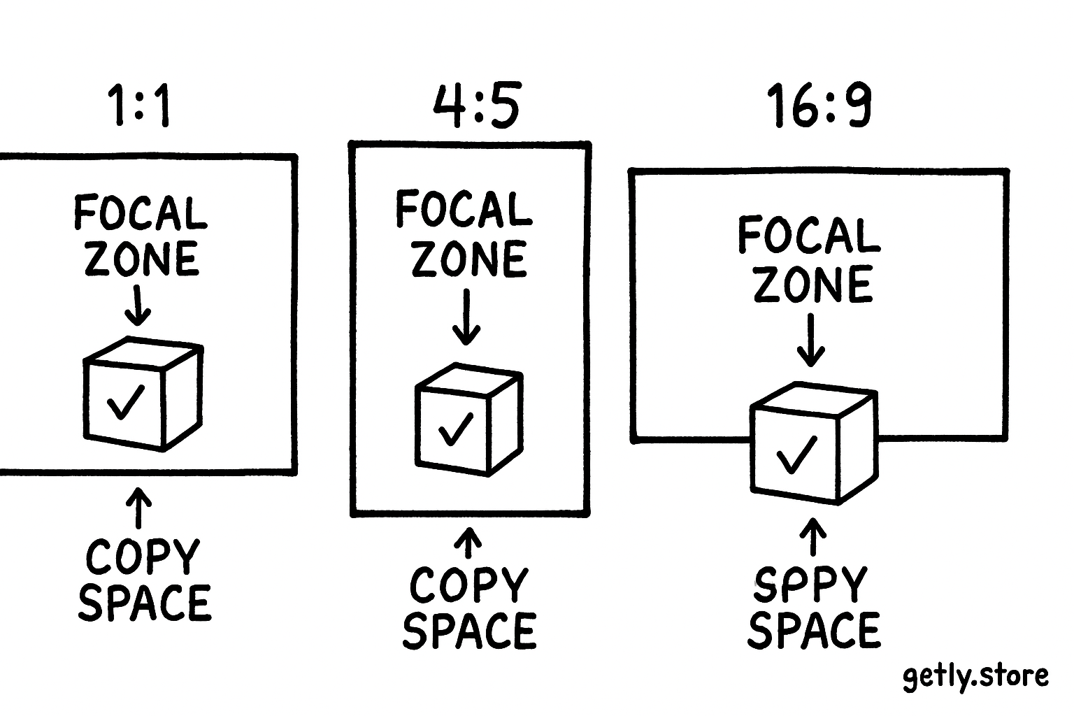
Decide where text will sit before you describe lighting or materials. Write “clean negative space on the left third for a headline” or “clear lower margin for a price label.” The model may not render accurate lettering, but it can arrange low-detail space in the requested area. Add the final words in a design tool when exact spelling matters.
3. Write the prompt around the selected ratio
Build the prompt in layers. Start with the subject and action, add the composition, then specify the visual treatment. This order keeps the frame decision attached to the scene instead of burying it beneath style language.
Name the subject
Describe the object, person, or environment that must survive the crop.
Set the layout
State the focal position, camera distance, direction of movement, and negative space.
Add visual treatment
Specify light, color, lens feel, materials, season, and finish after the layout.
Repeat the frame
Include the target ratio in the generation settings and in the written brief.
For a 16:9 course banner, write: “Wide 16:9 composition, ceramic desk lamp on the right third, warm pool of light, open dark blue space across the left half for a course title, eye-level camera, clean editorial product photography.” The prompt gives the model a subject, a position, a space requirement, and a visual language.
For a 9:16 mobile cover, write: “Vertical 9:16 composition, single red hiking backpack centered from waist height to near the top margin, mountain trail rising behind it, clear lower margin for a subtitle, morning side light, crisp outdoor editorial style.” The prompt stacks the visual information instead of asking a tall canvas to hold a wide panorama.
Use camera distance to control how much context enters the frame. A close-up protects a small product in a square crop. A medium shot gives a person room to gesture in a portrait frame. A wide shot suits a landscape banner, but it can make a small subject disappear on a phone.
4. Generate, inspect, and compare the crop
Generate a small set with the same prompt and ratio first. Compare composition before you compare style. Look at the subject position, the empty space, and the edges of the frame. A beautiful image with a cut-off product handle will create more work than a simpler image with a clean silhouette.
Use this inspection order:
- Edges: Check heads, hands, wheels, packaging, and shadows near the border.
- Focal scale: Confirm that the subject remains readable at the display size.
- Copy space: Check that the quiet area stays quiet. Extra objects can compete with a headline.
- Direction: Give faces and moving subjects enough room to look or travel into.
- Background: Look for accidental objects that resemble part of the product or person.
Test the image at the size people will see. A detailed 16:9 banner can lose its product identity when a platform reduces it to a small card. A 9:16 cover can hide its lower subject under interface controls. Keep important information inside the center safe area when the display may add overlays.
Do
- Regenerate after changing the ratio.
- Describe copy space by side or third.
- Keep small details away from the edge.
Don't
- Stretch a square image into a banner.
- Ask a wide scene to fit a phone cover.
- Trust the preview without checking the final display size.
5. Fix a mismatch without losing the subject
Choose the least destructive fix. If the subject looks strong but the frame needs a small adjustment, crop from the quiet background. If the crop removes a hand, product edge, or important architectural line, regenerate with a new ratio and a revised layout.
Use these decisions:
- Crop: Use a crop when the focal subject sits well inside the frame and the background carries the excess area.
- Extend: Add surrounding background when the subject already works and the composition needs more room for a banner or text block.
- Regenerate: Start again when the subject touches an edge, the gaze faces a boundary, or the image needs a different camera distance.
- Recompose: Change the subject position in the prompt when the destination needs a fixed copy area.
Do not stretch the image to force a new ratio. Stretching changes circles into ovals, alters faces, and makes packaging look distorted. A crop, extension, or new generation preserves the geometry.
6. Common mistakes
Choosing a ratio after writing the scene
A detailed prompt cannot repair a frame that lacks room for its subject. Decide the destination first, then describe the scene that belongs inside it.
Putting the subject in the middle every time
Centering works for icons, product thumbnails, and direct portraits. Side placement works better when you need copy space or want to show the subject moving through an environment.
Confusing resolution with aspect ratio
Resolution describes pixel dimensions. Aspect ratio describes the relationship between width and height. A 1024 by 1024 image and a 2048 by 2048 image share a 1:1 ratio, while a 1536 by 1024 image has a 3:2 ratio. More pixels do not create a wider or taller composition.
Adding style before layout
Words such as “cinematic,” “luxurious,” or “hyper-detailed” do not tell the model where to place the subject. State the frame, camera distance, focal zone, and copy space first. Add style after those decisions.
Expecting text inside the generated image
Ask for the right empty area, then add exact headlines, prices, and labels during design. Generated lettering can distract from the composition and force another round of edits.
FAQ
Which aspect ratio should I use for a digital product thumbnail?
Start with 1:1 when the marketplace or catalog uses square cards. Keep the product large, centered, and clear against a simple background. Use 4:5 when the product has a tall shape or the display gives portrait images more room.
Can I use one image for every channel?
You can create one master image, but a single ratio rarely serves every placement well. Generate or recompose separate 1:1, 4:5, 16:9, or 9:16 versions when the subject position and copy space change.
How much space should I leave around the subject?
Keep faces, hands, logos, and small product details inside the central 80 to 90 percent of the frame when you expect later cropping. Leave more room in the direction of a gaze or movement, and reserve a larger quiet area where text will sit.
Should I mention the aspect ratio in the prompt?
Yes. Set the ratio in the image tool and repeat it in the prompt or creative brief. The setting controls the canvas, while the wording guides the composition inside that canvas.
Frequently asked questions
Which aspect ratio should I use for a digital product thumbnail?
Start with 1:1 for square catalog cards. Keep the product large and centered against a simple background. Choose 4:5 when a tall product needs more vertical room.
Can I use one AI image for every channel?
You can create one master image, but each placement may need a different composition. Make separate 1:1, 4:5, 16:9, or 9:16 versions when subject position and copy space change.
How much space should I leave around the subject?
Keep faces, hands, logos, and small product details inside the central 80 to 90 percent of the frame when later cropping may occur. Leave extra room in the direction of a gaze or movement.
Should I mention the aspect ratio in the prompt?
Yes. Set the ratio in the image tool and repeat it in the prompt or creative brief. The setting controls the canvas, while the wording guides the composition inside that canvas.