 Getly
Getly
Wireframes move faster when you start from a clean layout instead of drawing everything from scratch. In 2026, you can still build production-ready UI flows using free Figma templates, quick UI design resources, and a repeatable dashboard template free approach.
This guide gives you 12 free, practical UI starting points for Figma wireframes, plus a simple workflow to turn a wireframe into a consistent dashboard or product UI. You can also grab inspiration from existing template designs you find on marketplaces when you need layout ideas you can adapt.
- Use free wireframe templates to lock structure early, not to “finish” design.
- Pick templates that match your flow: dashboard, onboarding, pricing, landing, or forms.
- Build a reusable component set (buttons, inputs, sidebar, cards) on top of any template.
- Validate with real content. Replace placeholder text and icons to catch layout breaks.
- Keep one spacing and typography system across every page to avoid redesign later.
What are free UI kit and free Figma templates in 2026?
A free UI kit in Figma usually gives you pre-made styles and components like buttons, inputs, cards, layout grids, and sometimes common UI patterns. A free Figma template focuses on page structure, often with frames for a specific layout like a dashboard, landing page, or settings screen.
In practice, you use both together. The template gets you to “usable screens” faster. The UI kit standardizes how those screens look so your project stays consistent when you add new views.
What “wireframe templates” should include
Good free wireframe templates give you frames, basic layout sections, and placeholder elements that map to real UI components. You want wireframe layers that align to common product patterns: navigation, content regions, filters, and form rows.
Look for templates that include: consistent grid or spacing rules, reusable component placeholders, and clear naming. If the file uses random layers and mixed spacing, it slows you down during iteration.
What “dashboard template free” means for UI/UX
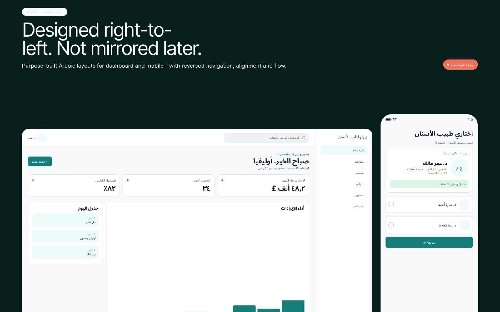
A dashboard template free starter should cover the whole screen grammar: side navigation or top navigation, KPI cards, charts areas, table layouts, and a filter bar. If your template only shows a card grid without table or filter structures, you will rebuild key parts.
Start with dashboard templates that include table and form wireframes. Those two patterns carry most admin UI complexity.
Pro tip: Treat wireframes as structure, not decoration. After you place the wireframes, immediately add your real content (headings, counts, field labels) so layout breaks show up early.
How to pick free wireframe templates that don’t waste time
Pick templates based on the screens you actually need, not on how many pages the file includes. If you only build an onboarding flow and profile settings, a generic “landing page + blog” template adds noise.
Then check the file hygiene. The fastest template is the one you can edit without fighting layer organization, inconsistent constraints, or mixed component styles.
Use this checklist before you download
- Layer naming: “Sidebar,” “Filters,” “Table,” “Form row” beats “Frame 12.”
- Spacing rules: consistent margins and spacing across similar sections.
- Responsive hints: constraints or layout behaviors that make sense for common breakpoints.
- Component reuse: consistent placeholders for buttons, inputs, dropdowns, cards.
- Content-ready frames: space for long titles, multiple rows, and varying field counts.
A practical scoring method for wireframes
Score templates quickly on five points: clarity of layout, reusability of components, match to your target UX flow, ease of editing, and “breaks less” when content changes. Choose the template with the highest score, not the one with the most frames.
If two options tie, prefer the one with a dashboard or table structure. Tables and filters usually save more time than extra marketing blocks.
Common mistake: Copying a complete UI without adapting spacing and type. The result looks “designed” early, then falls apart when you add real data, long names, or extra rows.
12 free UI design resources for Figma wireframe templates
Below you get 12 resource types you can search for and reuse as free wireframe templates in 2026. The goal is not to list random downloads, but to give you a clear target you can assemble into a full product flow.
Use these categories to find or request templates that match your interface. Then convert them into your own component system.
- Dashboard layout wireframe: sidebar, KPI cards, chart placeholder, and table shell.
- Admin table wireframe: rows, checkbox column, actions menu, pagination placeholders.
- Filters and search wireframe: filter chips, dropdowns, date range, and results counter.
- Settings and preferences wireframe: left navigation, profile header, segmented form sections.
- Onboarding flow wireframe: stepper, progress indicator, and form blocks with validation space.
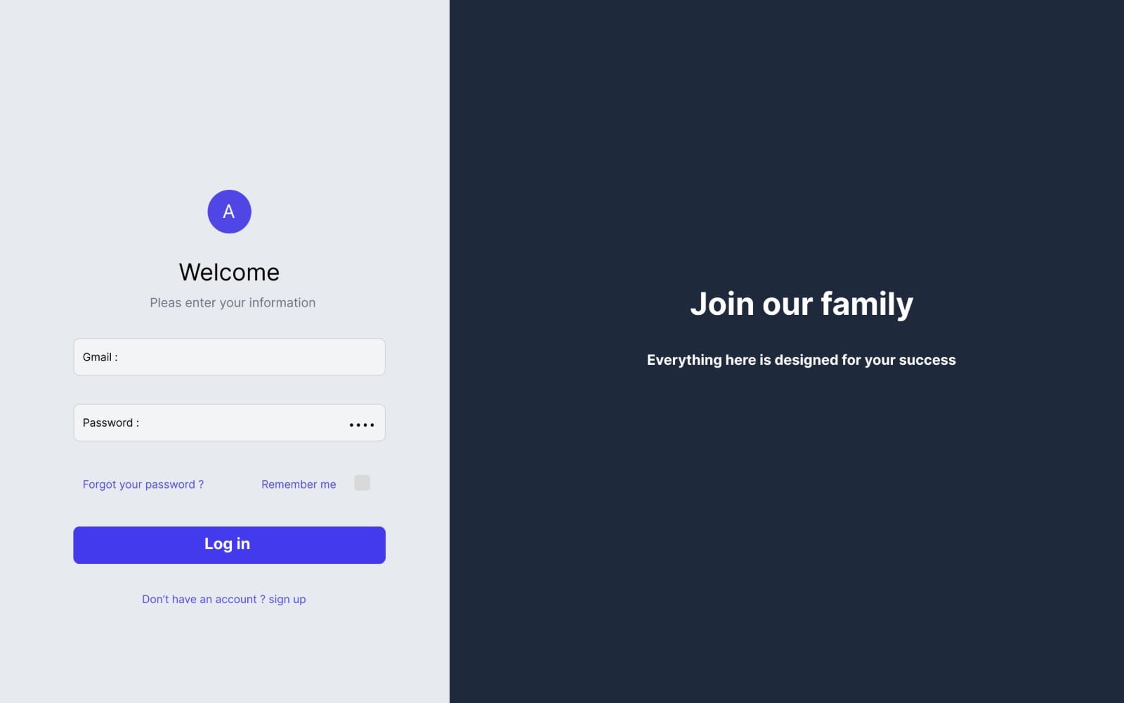
- Authentication templates: login, sign up, password reset, and social login button placeholders.
- Form and input wireframe: input states (default, focused), labels, helper text, and error space.
- Pricing page wireframe: plan cards, feature list rows, FAQ accordion placeholders.
- Community or content list wireframe: cards, list rows, empty state frame, and “load more” placeholder.
- Detail page wireframe: header summary, tabs layout, and related items grid placeholder.
- Mobile bottom navigation wireframe: tab bar, content container, and screen header pattern.
- Design system starter wireframe: spacing scale preview, button and input components, typography placeholders.
If you want to accelerate further, build one “master dashboard template free” canvas that includes: table, filters, and form modals. Then you reuse it across every admin screen.
This approach keeps layout decisions stable. You only adjust data labels, columns, and filter types.
Success pattern: Teams that reuse a dashboard wireframe shell typically cut layout rework because they stop debating structure on every new screen.
How to turn free wireframe templates into a consistent UI
Free templates speed up layout, but consistency comes from your rules. Create a small set of UI design resources inside the file: spacing scale, typography styles, and component variants that match your brand.
Then apply those rules to every frame in the template so your UI stays coherent as you add more screens.
Create a “minimum viable design system” in Figma
You do not need a full design system on day one. Start with a minimal set that covers how users interact: buttons, inputs, cards, navigation, and table rows.
Use your wireframe placeholders as anchors. Replace generic rectangles with component variants while keeping positions identical, so you never break the layout.
Replace placeholder content to catch layout bugs
After you place the template, immediately swap in real content. Add longer names, multiple categories, and realistic numeric ranges for KPI cards and tables.
This test reveals problems like truncated headers, overlapping form fields, and charts without enough vertical space. Fix those early while you still have a wireframe structure.
| UI area | Wireframe placeholder | What to validate |
|---|---|---|
| Navigation | Sidebar rectangles | Active item height, icon + label spacing |
| Filters | Dropdown and chip rows | Wrapping behavior with many chips |
| Tables | Header + 5-10 rows | Column widths and action column alignment |
| Forms | Input stacks | Error text spacing and helper text overflow |
Best dashboard template free workflow for a production-ready UI
A dashboard template free workflow should go from structure to interaction to polish. Start with wireframes that lock the grid and screen sections. Then add real components for the table, filters, and key actions users take.
When you finish this loop once, you can repeat it for every new module: reports, billing, user management, or settings.
Step-by-step workflow
- Define the dashboard skeleton: nav, top actions, KPI card row, and content area frames.
- Wire the table: columns, row height, selection checkbox, and action menu placeholder.
- Wire the filters: filter bar section with chips and dropdown placeholders.
- Add modal and empty states: confirm delete, “no results,” and permission warning frames.
- Create component variants: default, hover, focused, and error spacing versions.
- Swap placeholder text with real data: longer company names, larger counts, and mixed statuses.
Use a single “layout truth” across pages
Pick one spacing and typography system and reuse it on every dashboard screen. If you change typography or spacing halfway, the UI looks stitched together.
Also keep your table pattern stable across pages. Consistent tables reduce user learning time, which matters more than visual novelty.
Dashboard pro tip: Create one reusable frame for the filter bar. You can then drop it into Reports, Users, and Billing pages without rethinking alignment every time.
Where to find free Figma templates and how to evaluate them fast
You can find free Figma templates from multiple sources, but the fastest way to evaluate them is to skim for the same essentials: screen coverage for your workflow, editable layers, and consistent spacing.
Since wireframes often get used as starting points, the file you choose should let you move fast without breaking constraints or renaming everything.
Use a 60-second evaluation
- Open the file and find the main components. If nothing repeats, it will take longer later.
- Check whether a table and form area exist. Those areas create most real product complexity.
- Scan naming. If you cannot find “Table” or “Filters” quickly, the file likely slows you down.
- Look for consistent spacing. Compare two KPI cards and two input rows.
When you want design inspiration for layouts, you can also use ready-made template pages as references. For example, non-wireframe templates can show how designers structure sections, headers, and grids. That knowledge helps you set the right section hierarchy in your wireframes.
If you also build marketing pages alongside your UI, you can study landing-page templates to mirror hierarchy and spacing in your onboarding or dashboard release screens. A clean landing structure often translates into a clean product UI structure.
Example product references you might browse for layout inspiration include: Lumen — AI SaaS Landing Page Template and Baker. Use them as layout vocabulary, not as a wireframe substitute.
FAQ: free wireframe templates, UI design resources, and dashboard templates
Are there really free Figma templates that work for dashboards?
Yes, but you need templates that include dashboard-specific structures like KPI cards, filters, and table placeholders. Many “UI kits” focus on components only, so you should prefer templates with actual dashboard page frames.
When a template includes table and filter sections, you can adapt it quickly to different admin workflows.
What’s the best free UI kit for turning wireframes into UI?
The best free UI kit for this job contains reusable components for buttons, inputs, cards, and basic navigation patterns. That coverage helps you replace rectangles in your wireframes without redesigning the interaction states from scratch.
Prioritize kits that maintain consistent spacing and typography styles, because inconsistency shows up across multiple screens.
How do I make a dashboard template free design look consistent?
Use one spacing scale and one type scale across the entire dashboard, then reuse the same table row and filter bar patterns across every screen. Replace placeholder text with real content early to catch overflow and alignment issues.
This method keeps the UI coherent even when you add new data types.
Can free wireframe templates speed up UX testing?
They can, because wireframes let you test flow and information hierarchy before you commit to visuals. Once you have the core structure, you can create clickable prototypes faster by reusing the same frame logic across states.
Test with real tasks, not with “pretty” screens.
Should I use multiple wireframe templates in one project?
Use one main structure template for the majority of screens, then add a few specialized templates only when needed (for example, an onboarding flow or an admin table pattern). Mixing templates without shared spacing and components usually causes rework.
Keep the design system rules consistent, and mixing becomes much easier.
- Choose templates by workflow fit: dashboard, forms, tables, and filters save the most time.
- Turn wireframes into UI by applying a minimal design system for spacing, type, and components.
- Validate layouts with real content immediately to avoid late-stage redesign.
- Reuse one dashboard layout truth so every new screen looks and behaves like the rest.
If you want a fast next step, pick one wireframe template type from the 12 options above, build your dashboard skeleton, and test it with real labels and data. That single loop usually beats collecting more templates and never shipping the first usable screen.
Getly Support