 Getly
Getly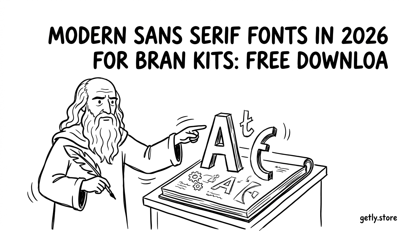
Modern brand kits need two things: legibility and a consistent visual voice across web, packaging, video overlays, and product UI. In 2026, the fastest way to build that voice starts with modern sans serif fonts, then locks in the right pairing so your brand looks intentional everywhere.
This guide gives you a practical font pairing guide for brand kits, explains how to evaluate commercial use fonts licenses, and shows how to approach free fonts download without accidentally stepping into “personal use only” territory.
- Pick one “workhorse” modern sans serif for UI and paragraphs, then one contrasting family for headlines.
- Use licensing checks to separate free fonts download from commercial use fonts.
- Pair fonts using consistent x-height, weight rhythm, and similar numeral styles.
- Test pairings on real outputs: headings, pricing, motion captions, and mobile sizes.
- Create a repeatable brand kit system so your team can ship fast in 2026.
What are modern sans serif fonts in 2026 for brand kits?
Modern sans serif fonts are typefaces designed for contemporary layouts, with clean letterforms, neutral tone, and strong on-screen performance. In a brand kit, they act like the “default language” of your visuals: product pages, onboarding screens, email headers, and video captions all rely on them.
In 2026, most brands also expect sans serif to carry both clarity and personality. That means you can use subtle design cues, like distinctive terminals, consistent spacing, and deliberate optical adjustments, without switching to a heavy display font for every headline.
Why sans serif wins for brand consistency
Sans serif gives you predictable rhythm across sizes. When you pick one family for the body and another for headings, you can reuse the same hierarchy system year after year and keep your brand kit stable.
It also makes localization less painful. Longer strings, different punctuation, and mixed-case brand names still land cleanly when the family handles spacing well across character sets.
What to look for in “modern” families
Start with typography behavior, not style names. Look for consistent stroke contrast, sturdy punctuation, and a clear lowercase for readability at small sizes. Then check whether the font has enough weights and italics to support your kit.
Finally, test numerals and currency symbols. Your brand kit needs numbers to look deliberate in tables, prices, and motion graphics, not like a random overlay.
Pro tip: Build a quick “brand stress test” page: 8px body copy, 14px captions, pricing at 20px, and a multi-line headline. If the pairing still reads well there, it will survive real marketing work.
How to download free fonts safely for commercial use
Free fonts download sites can help you explore styles fast, but you must treat licensing like part of the design process. The biggest risk with free downloads is mixing “free to download” with “free to use commercially,” which rarely match.
For a brand kit, you need clarity on distribution rights: can you embed the font in a website, use it in video, and ship it inside templates or deliverables for clients.
Check these license terms before you install
When you find modern sans serif fonts for inspiration, open the license page and verify the exact permissions. Scan for language that limits use to personal projects or prohibits commercial client work.
If the font family supports multiple tiers, choose the tier that matches how you will deploy it. Brand kit workflows often shift from “internal brand” to “client deliverable,” and licenses treat those differently.
- Confirm whether you can use the font in commercial projects.
- Look for web embedding or desktop embedding permission.
- Verify video motion usage rights if you create overlays, intros, or ads.
- Check whether you can bundle fonts with templates or assets you sell.
- Note attribution requirements, if any.
Warning: “Free” almost always refers to download price, not guaranteed commercial use. If the license says “personal use only,” using it in a brand kit can put your project at risk even when the design looks perfect.
What to do when the license is unclear
If the license page doesn’t list permissions clearly, treat the font as non-commercial until you confirm details with the foundry or author. Many modern sans serif families come with separate terms for web, desktop, and application embedding.
Instead of guessing, use a safe workflow: build a mock-up using the font for layout, then swap in a properly licensed commercial-use font before you ship.
How to choose font pairing for a brand kit
The best font pairing guide starts with a simple goal. You want contrast that creates hierarchy, not contrast that fights your brand identity.
In brand kits, the most reliable pattern uses one modern sans serif for body and UI and a second family that adds character for headlines, pull quotes, or standout UI elements.
Use pairing rules that designers actually feel
When you compare families, focus on measurable traits. Two fonts can look similar in style but differ in spacing, x-height, and numeral design, which shows up immediately on pricing and headings.
Here are pairing signals that consistently create harmony in 2026 brand kits.
- x-height alignment: Similar perceived height keeps paragraph and headlines from feeling disconnected.
- Weight rhythm: Match the headline’s light/regular weights with the body’s medium/semibold range.
- Terminal shapes: Rounded terminals pair well with rounded body designs, and sharp terminals pair with sharp designs.
- Numerals style: Use tabular or consistent numeral formats across UI and marketing outputs.
- Italic personality: If you plan to use italics, pick fonts whose italics feel like the same system.
A practical pairing template for quick decisions
Use this “2-hour brand kit pairing” method. You narrow down families by vibe in the first 30 minutes. Then you validate them with a small set of real layout scenarios.
That avoids a common mistake: picking fonts that look great in posters but fail in UI size or motion captions.
- Pick 3 candidate modern sans serif families for body copy.
- Pick 2 candidate families for headlines (one more expressive, one closer in style).
- Pair each body family with both headline families.
- Test on the same page with identical spacing and line length.
- Select the pair that keeps hierarchy clear at mobile sizes.
Success story: Many teams build brand kits around one “neutral” sans for UI and one slightly more styled sans for headlines. They report fewer redesign cycles because the pairing survives landing pages, pitch decks, and motion overlays without constant tweaking.
Best font pairing guide: modern sans serif combinations that work
The best font pairing guide in 2026 uses repeatable combinations. You don’t need a complicated typographic system. You need predictable contrast and stable readability.
The combinations below follow common industry pairing logic: neutral + expressive, geometric + humanist, or condensed + standard. Use them as frameworks, then select specific families that match your brand’s tone.
| Pairing goal | Body font style | Headline font style | Where it shines |
|---|---|---|---|
| Clean tech and SaaS | Modern neutral sans | Geometric sans or slightly wider headline | Dashboards, docs, onboarding |
| Premium lifestyle | Humanist sans | Soft expressive sans with distinct terminals | Landing pages, editorial sections |
| Bold campaigns | Readable multi-weight sans | Condensed or display-like sans | Hero headlines, posters, ads |
| Fast e-commerce | UI-optimized sans | Same family different weight, or sibling family | Pricing tables, product grids |
How to validate a pairing on real assets
A brand kit pairing only matters when it appears in the places your brand lives. Validate your pairing in UI, then validate it again in motion.
If your team creates video captions, use the same headline font logic for overlays: stroke contrast and letter spacing should stay legible when the background moves.
- Hero headline in a landing page section with a gradient background.
- Price, discount, and unit text at small sizes.
- Email header with line breaks and mixed punctuation.
- Video caption test: short phrases and longer sentences.
- Mobile menu: condensed labels and stacked navigation.
Font pairing mistakes that show up in 2026
Teams don’t usually fail because they chose “bad” fonts. They fail because they picked fonts that look okay at 48px but break at 12px. Spacing and glyph shape differences become obvious under constraints.
Also watch for numeral mismatches. A body font with tidy numerals paired with a headline font that uses proportional numerals can make pricing feel inconsistent.
Common mistake: Pairing two fonts with mismatched x-height often makes your headings feel like they belong to a different brand, even when the color palette matches.
How to build a brand kit with modern sans serif typography
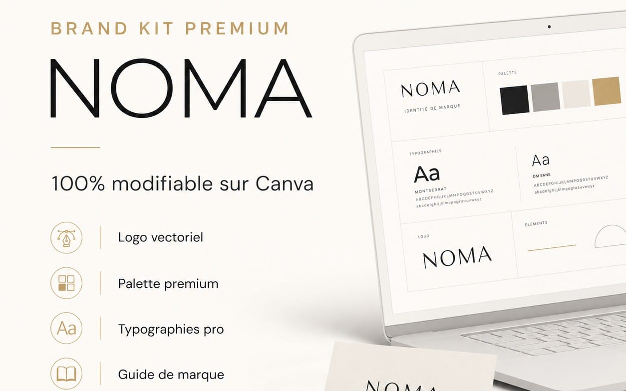
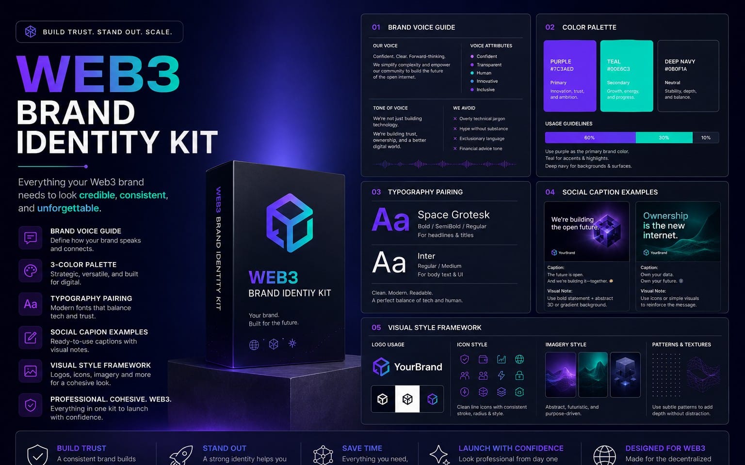
A brand kit turns font choices into rules. Modern sans serif fonts alone don’t build consistency. Your kit does, through sizing, weight usage, and spacing rules your team can apply in minutes.
When you set these rules early, you reduce redesign loops and keep every deliverable aligned in 2026, from product pages to presentation decks.
Create a simple typographic scale
Start with a small scale. Pick type sizes that match your layout constraints: mobile first, then desktop. Then map weights to semantic roles, not to aesthetic preferences.
For example, set regular for body, medium for emphasis, and semibold for UI labels. Then reserve bold for major headings or standouts.
- Body copy: use one modern sans serif with strong lowercase.
- Captions: use the same family at smaller size with tighter line-height.
- Headings: use the second family or a higher-contrast weight system.
- UI labels: use a consistent weight so buttons feel uniform.
- Small text: keep letter spacing subtle to avoid jitter.
Define letter spacing and line-height ranges
Brand kits fail when designers tweak spacing by eye every time. Pick ranges and stick to them. In 2026, consistency matters as much as style because your content becomes modular across templates.
Also define how you handle line breaks in headlines. Sans serif fonts can wrap differently based on their punctuation widths, which impacts the grid of product pages and video cards.
Bundle your typography rules with templates and assets
Once you finalize your pairing, apply it to your most reused deliverables: social templates, landing page sections, pitch decks, and motion caption presets.
That reduces the time between “good idea” and “shippable asset.” It also keeps your team from accidentally using substitute fonts that break your brand system.
For motion workflows, teams often pair a brand font with reusable caption presets. If your brand kit includes animated text, you can streamline production by pairing your chosen fonts with your text animation workflow (for example, presets and template packs you already use).
Pro tip: If your kit supports multiple asset types, keep a “type test checklist” inside your template folder. The checklist should remind you to verify size, weight, and numeral rendering before publishing.
How to buy fonts online and avoid licensing headaches
Buying fonts online should feel boring. You should spend time validating licensing, not chasing surprises after you upload to a client site.
In a brand kit, you need commercial-use permissions for every deployment you plan. That includes website use, client deliverables, and sometimes bundled assets in template workflows.
Choose the right license tier for how you work
Many font families offer multiple license tiers. The tier matters because it often controls whether you can use fonts in client work, in app embedding, or inside distributed templates.
If your deliverables include branded design templates, pick a tier that permits distribution. If you only design for your own brand, you can often choose a narrower commercial tier.
- Internal brand use: pick a license tier that covers your brand assets.
- Client deliverables: choose a tier that explicitly allows client work.
- Template distribution: choose a tier that allows bundling or reselling deliverables.
- Web projects: confirm web embedding rights.
- Video marketing: confirm motion usage rights if required.
Plan your brand kit licensing like a checklist
A brand kit ships with more than fonts. You ship rules, and you ship assets that rely on the fonts. Your licensing checklist should match that reality.
Use this approach: list each font you plan to use, list each deployment (web, video, templates), then map each font to a license that covers it.
| Deployment | Questions to ask | Typical permission you need |
|---|---|---|
| Website | Can I embed or serve the font? | Web embedding |
| Video overlays | Does the license allow motion usage? | Video/graphics use |
| Client work | Can I use the font in deliverables? | Commercial client use |
| Templates you sell | Can I distribute font-dependent templates? | Template distribution rights |
If you’re also building motion-ready brand kits, you can pair a font system with animation templates and presets. For example, a text animation workflow that matches your brand font can help you keep typography consistent across reels and ads. (As a reference point for what teams often bundle alongside fonts, consider products like Product Title AI Text Animation Mastery: Create Viral Videos Without Showing Your Face.)
- Modern sans serif fonts work best as a system: body for readability, headline for hierarchy.
- Free downloads require a licensing check before you treat them as commercial-use fonts.
- Font pairing guide success depends on x-height, weight rhythm, numerals, and real-size tests.
- Buying fonts online demands a deployment-by-deployment licensing checklist.
FAQ: modern sans serif fonts, free downloads, and pairing
Are modern sans serif fonts good for brand kits in 2026?
Yes. Modern sans serif fonts give you strong readability across UI, marketing pages, and video captions. In 2026, the best brand kits use sans serif for both body and headings, then differentiate hierarchy through weight, size, and spacing rules.
Can I use free fonts download fonts for commercial use?
Only if the license explicitly allows commercial use. Many free fonts downloads come with “personal use only” restrictions, so you should confirm web, video, and client deliverable permissions before you ship brand assets.
What is the best font pairing guide method for beginners?
Choose one readable body modern sans serif and one contrasting headline family, then test the pair on real outputs. Validate at mobile sizes, on pricing numerals, and in motion caption contexts to catch spacing problems early.
How do I avoid licensing headaches when I buy fonts online?
Make a deployment checklist and match each font to a license tier that covers it. Include website embedding, video overlay use, client deliverables, and any template distribution you plan.
Should I pick different fonts for UI and video?
You can, but you don’t need to. Many teams keep the same font pairing across UI and motion to maintain brand consistency, then adjust tracking and line-height per medium so captions stay legible on moving backgrounds.
Want a smart next step? Pick one modern sans serif for body copy and one for headlines, then build a 1-page brand kit test using your real content. When the pairing survives that test, you can expand confidently into templates and motion assets.
Getly Support