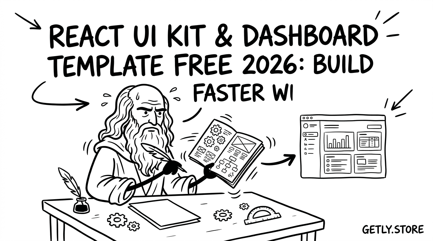
В 2026 году React-разработка ускорилась настолько, что «писать всё с нуля» чаще всего — самая дорогая стратегия. Лучшая альтернатива — брать проверенные react UI kit и react components library, собирать интерфейсы быстрее и поддерживать их спокойнее.
Ниже — практичный гид: что выбрать под ваш проект, как оценивать качество UI, и где обычно прячутся подводные камни (доступность, типизация, лицензии, производительность).
TL;DR: что выбрать из React компонентов в 2026
Если вам нужен быстрый старт, выбирайте UI kit с сильной документацией и предсказуемой архитектурой. Для сложных продуктовых интерфейсов важнее не «красота», а доступность, качество компонентов и стабильность обновлений.
- Хотите production-качество: берите компонентные библиотеки (accessibility, focus management, keyboard UX).
- Хотите готовую витрину: берите UI kits (страницы, формы, таблицы, тёмные темы).
- Нужна скорость интеграции: ищите компоненты с TypeScript и понятными API.
- Если бюджет ограничен: используйте free React components, но проверяйте лицензии и поддержку.
- Если вы развиваете бизнес: продавайте код и делайте «developer tools free» как вход в воронку.
Что такое React components library и зачем она нужна в 2026?
React components library — это набор готовых компонентов (кнопки, модалки, формы, таблицы), которые вы подключаете в проект вместо ручной верстки и логики. В 2026 такие библиотеки стали «базовым слоем» для продуктовых интерфейсов: они снижают риск ошибок и ускоряют итерации.
Вместе с этим react UI kit чаще включает готовые шаблоны экранов, стили и композиции компонентов. То есть библиотека — про строительные блоки, а UI kit — про «как всё собрать и как это выглядит».
Прагматичный выбор: библиотека vs UI kit
Если вы делаете сложную админку/CRM/кабинет пользователя, вам важны компоненты (таблицы, фильтры, формы, уведомления). Если вы запускаете маркетинговый сайт или MVP с несколькими типовыми страницами, UI kit даст заметный выигрыш по времени.
Оптимальный подход в 2026: часто комбинируют UI kit (шаблоны) и компонентную библиотеку (сложные/критичные элементы), но важно, чтобы стили и токены дизайна не конфликтовали.
Сигналы зрелости библиотеки
- TypeScript по умолчанию или качественные типы.
- Доступность (ARIA, управление фокусом, навигация с клавиатуры).
- Стабильный changelog и предсказуемые major-релизы.
- Семантика: корректные роли, заголовки, aria-describedby.
- Производительность: виртуализация таблиц, мемоизация тяжёлых компонентов.
Совет: в первую очередь проверьте focus management у модалок/поповеров и работу клавиш Tab/Shift+Tab. Это самый частый источник «тихих» багов в UI, особенно на production.
Какие free React components реально пригодятся в проде?
Лучшие free React components — это не обязательно «самые популярные», а те, которые решают конкретные задачи без скрытых компромиссов по лицензии и доступности. В 2026 я рекомендую оценивать бесплатные решения через чеклист инженерной зрелости.
Ниже — типы решений, которые обычно дают максимум пользы за минимум затрат. Названия конкретных библиотек и киты со временем меняются, но критерии отбора остаются стабильными.
Чеклист качества для бесплатных компонентов
- Лицензия: MIT/Apache обычно безопаснее, чем «неясно что».
- Обновления: наличие релизов и адекватных issues за последние 6–12 месяцев.
- Архитектура: нормальные export’ы, отсутствие «магии» в сторонах.
- Стили: предсказуемая тема (CSS variables, className API).
- Тесты: хотя бы базовые тесты для критичных компонентов (таблицы/формы).
Где бесплатные киты обычно выигрывают
- Формы: валидация, маски ввода, селекты с хорошей UX.
- Навигация: табы, аккордеоны, роутинг-ориентированные компоненты.
- Визуальные эффекты: загрузчики, тосты, скелетоны страниц.
- Диаграммы и визуализация: базовые графики, тултипы.
- Интерфейсы админки: простые таблицы, фильтры, пагинация.
Частая ошибка: брать бесплатный UI kit «из красивых скриншотов» и игнорировать доступность. Потом вы переписываете компоненты по требованиям WCAG или подводите A11y-аудит под сроки релиза.
Какие лучшие React UI kit для бизнеса и MVP в 2026?
Лучшие react UI kit для бизнеса — те, что ускоряют не только дизайн, но и реализацию: уже готовые страницы, шаблоны таблиц/форм, единый стиль токенов и понятная структура.
В 2026 почти все успешные продуктовые команды используют UI kits для «первого слоя», а затем наращивают их под свою доменную логику: роли пользователей, сценарии покупок, импорт данных, интеграции.
Как выбрать UI kit под тип продукта
- SaaS/кабинет: табличные интерфейсы, фильтры, формы настроек, мастер-подтверждения.
- E-commerce: карточки товаров, корзина, варианты, статусы доставки, чек.
- Маркетплейс: витрины, страницы товара, медиагалереи, сравнение, лицензии.
- Образование: шаги курса, прогресс, задания, рубрики и комментарии.
Если UI kit включает хотя бы базовые состояния (loading/empty/error), вы экономите часы на «краевых кейсах». Это напрямую снижает баги в продакшене.
Производительность: как UI kit не замедлит приложение
Проверьте, насколько компоненты рендерят тяжелые части без виртуализации. Таблицы и списки — главные виновники просадок. В идеале кит использует виртуальные списки или хотя бы оптимизирует ключи, мемоизацию и обработчики событий.
Также важно, как подключаются стили: CSS-in-JS бывает удобным, но при неверной настройке может увеличивать размер бандла и время рендера.
- Для MVP важны шаблоны и состояния, а не «идеальный пиксель».
- Для бизнеса критичны доступность, стабильность и единая тема.
- Проверяйте таблицы/списки на виртуализацию и перфоманс.
- Комбинируйте UI kit и библиотеку компонентов только при совместимых стилях.
Как оценить качество React компонента перед внедрением?
Качество компонента в 2026 лучше всего предсказуемо проверяется не по демо, а по тому, как он ведёт себя в ваших сценариях: форма ввода, сложная таблица, состояние ошибки, модалка на мобильном и клавиатурная навигация.
Ниже — практический набор тестов, который занимает 30–60 минут на библиотеку и экономит дни потом.
Тест-план: 10 минут, чтобы найти «дорогие» баги
- Откройте модалку/поповер и проверьте Tab-цикл и возврат фокуса.
- Смоделируйте сценарии: loading → success → error.
- Проверьте пустые состояния (empty): заголовок, действие, поддержка скринридеров.
- Заполните таблицу 500+ строками или длинными значениями.
- Найдите, как компонент управляет высотой/переносом строк и overflow.
- Включите тёмную тему (если доступно) и проверьте контраст.
- Проверьте в мобильном: скролл, липкие элементы, свайпы/касания.
Технические вопросы, которые стоит задать библиотеке
- Есть ли официальные примеры с TypeScript?
- Как устроена система темизации: CSS variables, tokens, className?
- Как обрабатываются формы: контролируемые поля, валидация, ошибки?
- Как обновления влияют на обратную совместимость?
- Есть ли поддержка RTL/локалей (важно для глобальных продуктов)?
Pro tip: заведите «контракт» UI в виде набора тестовых сценариев (storybook/страницы) и гоняйте их при каждом обновлении библиотеки. Это дешевле, чем ловить регрессии в середине спринта.
Как внедрять React UI kit: шаги, структура и best practices
Внедрение UI kit в 2026 — это управляемый процесс: сначала выстраивают дизайн-токены и каркас состояния, затем подключают компоненты, и только потом начинают «массовую замену» существующей верстки.
Если делать наоборот, вы рискуете получить несогласованные стили и конфликтующие компоненты (особенно с таблицами и формами).
Пошаговый план интеграции
- Определите дизайн-токены (цвета, типографика, радиусы, тени) и закрепите их как единый источник истины.
- Сделайте слой адаптеров: оберните базовые компоненты в ваши «контрактные» компоненты.
- Стандартизируйте состояния: loading/empty/error для каждой сущности.
- Подключите формы как самый рискованный домен и протестируйте валидации.
- Проверьте доступность на ключевых сценариях, а не только в демо.
- Локализуйте тексты и форматы дат/чисел на раннем этапе.
Архитектура: как избежать «стиля спагетти»
Сильная практика — держать стили в одной системе и запрещать компонентам «прятать» важные значения. Например, радиусы/цвета должны идти через токены, а не дублироваться. Это уменьшает технический долг при росте продукта.
Также помогает стратегия «один путь правды» для классов: или всё через theme-контекст, или строго через CSS variables — иначе вы усложните поддержку тем и совместимость.
Важно: не смешивайте несколько UI kit с конфликтующими reset’ами (например, разные подходы к box-sizing). Такой конфликт проявляется внезапно: ломаются отступы, модалки и таблицы начинают «прыгать» на разных платформах.
Как продавать код и зарабатывать на компонентах: путь creator-to-dev
Если вы хотите монетизировать библиотеку или набор компонентов, стратегия в 2026 проста: публикуете полезный «вход» (demo/шаблоны или developer tools free), а затем продаёте расширенные версии, документацию, интеграции и поддержку.
Это близко к тому, как работают успешные цифровые продукты: вы продаёте не только файл, а ускорение команды и снижение рисков.
Модель монетизации: что обычно покупают
- Коммерческие UI-расширения (премиум-страницы, сложные компоненты, темы).
- Мульти-лицензии под разные масштабы проектов.
- Интеграции: платежи, CRM, трекинг, A/B сценарии.
- Скрипты и утилиты (генераторы, конвертеры, импортеры ассетов).
- Поддержка и обновления под новые версии React экосистемы.
Ключевой момент: покупатели хотят прогнозируемый результат. Поэтому продавайте качество — через примеры, changelog и ответы на issues.
Почему «developer tools free» — это сильная воронка
Бесплатные инструменты снижают барьер входа. Команда может оценить, как вы думаете, как строите архитектуру и насколько удобно интегрировать. После этого платная версия воспринимается как логичное продолжение: больше кейсов, больше поддержки, меньше рисков.
Как только продукт подтверждает ценность, вы можете предлагать premium tiers, расширенные функции и лицензии — это устойчивый подход для creator economy.
Пример из практики цифровых продуктов: когда в комплекте есть бесплатный demo + платная «полная» версия, конверсия обычно растёт, потому что покупатель уже понимает структуру и качество. Это особенно работает для UI-компонентов и инструментов, где важна UX-интеграция.
Какие премиум-пакеты и экосистемы ускорят разработку в 2026?
Премиум-пакеты в React и смежных доменах ценятся за скорость внедрения и «всё включено»: готовые подсистемы, примеры, ассет-пайплайн и поддержку обновлений.
Смарт-подход в 2026 — смотреть шире React: качественные инструменты вокруг (рендер, импорт/экспорт ассетов, конвертеры) экономят время на этапе подготовки данных и визуальных элементов.
Как смежные инструменты влияют на UI-скорость
Компоненты интерфейса — это только половина скорости. Вторая половина — как быстро вы получаете ассеты, материалы, анимации и готовый контент для UI (карточки, превью, витрины, 3D/медиа).
Например, если ваш продукт использует 3D-превью, то система импорта/экспорта ассетов и конвертеры материалов напрямую ускоряют визуальный слой — а значит, и интерфейс.
Где искать готовые системы (не только UI)
Если вы делаете продукт с медиа-слоем (маркетплейс, кастомайзер, визуальные генераторы), смежные системы часто становятся «ускорителями» всей разработки. В качестве ориентира по типам инструментов — вот примеры цифровых продуктов, которые логично комбинировать с UI-слоем:
- Studio 3D Import/Export — полный asset pipeline для 3D-элементов.
- Unreal to Unity Material Converter — конвертация материалов для ускорения переходов.
- Pro Recorder — полезно, когда вам нужно быстро документировать UX или готовить контент.
Это не «React-компоненты», но такие пакеты уменьшают время на подготовку визуальных частей интерфейса, что на практике означает быстрее релизы.
FAQ: React components library и UI kit — ответы на частые вопросы
Какая библиотека React компонентов лучше для доступа и keyboard UX?
Берите решение, где явно продумано управление фокусом у модалок/поповеров и корректные роли/ARIA. Самый быстрый путь проверить — прогнать Tab-навигцию и сценарии открытия/закрытия на клавиатуре.
Где искать free React components без риска по лицензии?
Ориентируйтесь на ясные лицензии (MIT/Apache) и проверяйте репозиторий: README обычно содержит условия. Также полезно смотреть, как библиотека упоминается в продакшене и есть ли регулярные обновления.
Как понять, что UI kit не конфликтует с моей текущей архитектурой?
Сделайте «пилот»: подключите kit к одному модулю (например, страницы настроек или таблицу). Проверьте стили, форму и состояния загрузки/ошибки, затем только расширяйте внедрение.
Можно ли комбинировать React UI kit и библиотеку компонентов?
Да, но только если у них совместимая система темизации и предсказуемые стили. Лучший вариант — договориться о «едином источнике дизайна» (токены) и завернуть всё в ваши адаптеры-контракты.
Как продать свой React UI kit и увеличить шансы на покупку?
Сделайте сильное демо, покажите сценарии (включая error/empty/loading) и дайте понятные примеры интеграции. Продавайте не только макеты, а архитектуру и снижение рисков внедрения.
В заключение: лучший стек в 2026 — тот, который ускоряет вашу команду и уменьшает ошибки в критичных сценариях (таблицы, формы, модалки, доступность). Если хотите один шаг сделать прямо сейчас, начните с оценки 2–3 кандидатов через тест-план и выберите победителя по UX, а не по скриншотам.
Мягкий следующий шаг: просмотрите готовые системы и библиотеки в вашем домене и соберите «матрицу сравнения» перед внедрением — так вы быстрее придёте к стабильному решению.