 Getly
Getly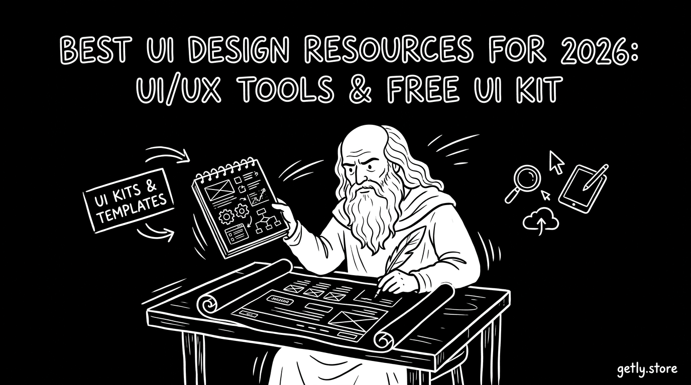
Wenn Du UI/UX schneller, konsistenter und „produktfähiger“ gestalten willst, brauchst Du mehr als nur Geschmack — Du brauchst UI design resources, die wirklich in den Workflow passen. In diesem Guide zeige ich Dir die besten UI/UX Tools & Free UI Kits für 2026, plus eine praktische Methode, wie Du Inspiration in wiederverwendbare Designsystem-Bausteine verwandelst.
TL;DR:
- Die besten UI design resources kombinieren Komponenten, Layouts und Beispiele für States/Varianten.
- Nutze UI/UX tools gezielt: für Systeme (Tokens), für Tempo (Starter-Kits) und für Qualität (Review/Consistency).
- Eine designer resource library ist nur dann nützlich, wenn Du sie nach Nutzung (Use-Cases) ordnest.
- „Free UI kit“ lohnt sich besonders als Ausgangspunkt — aber achte auf Lizenzbedingungen und Anpassbarkeit.
Was sind UI design resources in 2026 und wofür brauchst Du sie?
UI design resources sind alles, was Dir beim Entwerfen von Interfaces Zeit spart und Qualität erhöht: UI/UX Tools, Layout-Vorlagen, Komponenten-Sets, ikonbasierte Systeme, Pattern-Bibliotheken und sogar kuratierte Inspirationsquellen. Der Kern in 2026 ist weniger „mehr Dateien“, sondern bessere wiederverwendbare Bausteine, die sich an Dein Produkt anpassen lassen.
Gerade in UI/UX Templates wird der Unterschied sichtbar: Ein gutes Starter-Kit liefert nicht nur Screens, sondern enthält Denkstrukturen wie Hierarchie, Abstände, Zustände (z. B. Hover/Disabled/Loading) und konsistente Typografie. Damit wird Dein Design schneller „implementierbar“ — und Entwickler müssen weniger raten.
Ressourcen-Typen: Templates, Kits, Pattern, Libraries
Du kannst UI design resources in vier Kategorien aufteilen: (1) UI/UX Templates (komplette Layouts für konkrete Seiten), (2) Free UI kits (Komponenten & Stile), (3) Pattern Libraries (bewährte UX-Muster) und (4) designer resource library (ordnende Sammlung für schnelle Wiederfindbarkeit).
Wenn Du z. B. an einem Checkout oder Dashboard arbeitest, sind Templates oft der schnellste Weg. Wenn Du ein Designsystem aufbaust, brauchst Du eher Kits & Libraries, die Tokens/Styles logisch abbilden.
Pro-Tipp: Sammle Inspiration nicht als Screensammlung, sondern als „Use-Case-Karte“: Welche Komponente löst hier welches Problem? So wird Dein „design inspiration sites“-Material später direkt wiederverwendbar.
Welche Kriterien entscheiden, ob ein Free UI kit wirklich hilft?
Ein Free UI kit ist nur dann ein echter Gewinn, wenn es Dir mindestens drei Dinge abnimmt: (1) konsistente Typografie & Abstände, (2) Varianten für UI-States, (3) klare Struktur für Layouts (Grid/Spacing/Container). Bonuspunkte gibt es für Formular-Komponenten, Navigation und Tabellen/Listen.
Außerdem zählt: Ist es anpassbar (z. B. Styles, klare Benennung, klare Komponentenlogik)? Und: Passt es zu Deinem Zielprodukt — Marketingseite, SaaS-Dashboard, mobile App oder Web-Checkout?
Wie wählst Du UI/UX tools aus, die Deinen Workflow wirklich verbessern?
Die besten UI/UX tools sind die, die Engpässe in Deinem Prozess reduzieren: von der Idee bis zur finalen, konsistenten Spezifikation. In 2026 sieht man oft Teams, die mit Tools „mehr“ machen — aber nicht „besser“. Deshalb: wähle Tools nach Aufgabe, nicht nach Hype.
Praktisch gedacht: Du brauchst typischerweise (a) ein Design-Tool für Layout & Komponenten, (b) ein System- oder Token-Ansatz für Konsistenz, (c) ein Tool für kollaboratives Feedback und (d) ggf. einen Export-/Dokumentationsweg für Übergaben.
Tool-Auswahl nach 4 Jobs: Struktur, Tempo, Qualität, Übergabe
Statt „welches Tool ist das beste?“ ist die bessere Frage: Welches Tool löst welchen Job?
- Struktur: Für Layout-Logik (Grids, Komponenten, Styles).
- Tempo: Für schnelleres Zusammenbauen (Templates, Libraries).
- Qualität: Für Konsistenzchecks (Spacing, States, Typo-Hierarchie).
- Übergabe: Für klare Spezifikationen (Dokumentation, Export-Strategie).
Wenn Dein Prozess an „zu vielen Varianten“ scheitert, sind Libraries und Pattern wichtiger als neue Mockup-Tools. Wenn Du am Anfang „zu langsam“ bist, helfen Templates und ein gut gepflegtes designer resource library.
Häufiger Fehler: Free UI kits „blind“ übernehmen und später nachträglich anzupassen. Das erzeugt Inkonsistenzen (z. B. abweichende Abstände oder abweichende Button-States) — und macht die Übergabe an Entwicklung schwerer.
Was „Designsystem-ready“ in 2026 bedeutet
„Designsystem-ready“ heißt: Das Kit oder Template unterstützt konsistente Bausteine (Buttons, Input Fields, Alerts, Navigation) — und zeigt Dir, wie Du Varianten und States abbildest. Ein gutes UI/UX Template macht nicht nur Screens hübsch, sondern spiegelt die Regeln wider, die später im Code gelten.
Wenn Du das ernst nimmst, kannst Du aus einer UI design resources-Sammlung nach und nach eine echte System-Library bauen: erst „Basis“, dann „Komponenten“, dann „Pattern“.
Welche design inspiration sites liefern 2026 die beste UI/UX-Qualität?
Die besten design inspiration sites sind diejenigen, die Dir nicht nur visuelle Styles zeigen, sondern konkrete UI-Details: Komponenten-Struktur, State-Varianten, Typografie-Hierarchie und UX-Pattern. In 2026 erkennst Du hohe Qualität daran, dass Designer Inspiration nicht als „Shots“ posten, sondern als „bauplanfähige“ Beispiele.
Für Deine Auswahl gilt: Achte darauf, ob die Quelle dir sowohl High-level-Layouts als auch „micro decisions“ liefert — z. B. Abstände zwischen Feldern, Verhalten von Modals oder Statusmeldungen.
So filterst Du Inspiration, statt Dich zu überladen
Wenn Du viele Quellen schaust, brauchst Du ein Filtersystem — sonst bleibt es bei „Wow“ statt „Werkzeug“. Nutze dieses Raster:
- Use-Case: Welche Seite/Komponente?
- Problem: Welche UX-Frage wird gelöst?
- Baustein: Welche Komponente(n) sind wiederverwendbar?
- State-Check: Sind Hover/Disabled/Loading/Empty enthalten?
So baust Du aus Inspiration eine designer resource library, die Du in echten Projekten schneller wiederfindest.
Inspiration in Templates übersetzen: Ein 30-Minuten-Workflow
Ein schneller Workflow, der sich in der Praxis bewährt: Nimm ein inspiriertes Pattern, identifiziere die Kernkomponenten und setze daraus ein Mini-Template. Danach definierst Du 3 Varianten (z. B. „Normal“, „Error“, „Loading“).
Das Ergebnis: Du bekommst nicht nur ein Look-and-Feel, sondern ein funktionales UI/UX Template, das Entwicklung und QA erleichtert.
Success: Teams, die Inspiration in Komponenten-Varianten übersetzen, reduzieren häufig Iterationsrunden — weil weniger „Was genau meintest Du?“ entsteht und mehr „Hier ist die Regel“.
Bestes Vorgehen: Free UI kit für Deine Produktkategorie auswählen
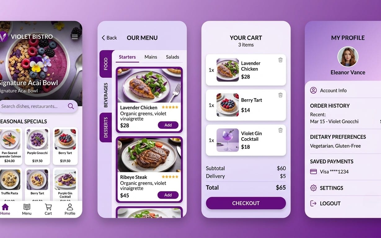
Die beste Wahl für einen Free UI kit hängt davon ab, welche Art Oberfläche Du baust: Marketing, SaaS-Dashboard, Mobile App oder E-Commerce. Wenn das Kit zu Deiner Kategorie passt, sparst Du nicht nur Zeit — Du bekommst auch bessere UX-Muster und typischen Inhalt (z. B. Tabellen, Karten, Feed-Layouts).
In 2026 achten gute UI/UX Templates stärker auf „Content-first Design“: Wie sieht die UI aus, wenn die Inhalte real sind? Deshalb solltest Du beim Checken eines Free UI kits immer auf Felder, Längen und typische Fehlermeldungen schauen.
Vergleich: Kit-Typen nach Projektziel
| Projektziel | Empfohlene UI design resources | Woran Du Qualität erkennst |
|---|---|---|
| Landingpage & Marketing | UI/UX Templates + Landing-Sections | Konsistente Hero/CTA-Varianten & mobile Layouts |
| SaaS Dashboard | Component Kits + Pattern Libraries | Tabellen/Filter/Empty States vorhanden |
| Mobile App | Responsive UI kits + Navigation Patterns | Bottom Tabs, Modals, Toasts & Gesten-Logik |
| E-Commerce / Checkout | Form-Komponenten + UI States | Validation, Error, Loading, Success |
So passt Du ein Free UI kit an, ohne das System zu zerstören
Damit Du ein Kit nicht „zerschneidest“, starte mit Typografie & Abständen. Danach übernimm die Komponenten-Struktur (Buttons, Inputs, Cards) und erst zum Schluss die Farben. Wenn Du Farbe zuerst änderst, aber Spacing/Typo später anpasst, entstehen oft unklare Layout-Kontraste.
Ein weiterer Tipp: Lege pro Komponente eine kleine „Definition of Done“ fest — z. B. „Button hat alle States“ oder „Input zeigt Error & Helper Text korrekt“.
Pro-Tipp: Erstelle eine Mini-Checklist mit 6 Items (Typo, Spacing, States, Empty/Loading, Responsiveness, Accessibility-Checks) und nutze sie pro Bildschirm — nicht nur am Ende.
Designer resource library aufbauen: Von Screens zu wiederverwendbaren Bausteinen
Eine designer resource library ist dann wertvoll, wenn sie schneller findet, als Du suchen kannst. In 2026 reicht es nicht, Ordner anzulegen — Du brauchst Kategorien, die mit Deiner tatsächlichen Arbeit zusammenhängen: „Checkout Inputs“, „Data Table States“, „Onboarding Screens“ oder „Empty States für Dashboard“.
Das Ziel ist, dass Du in neuen Projekten nicht bei null startest. Du ziehst aus Deiner Bibliothek ein Set an Bausteinen, statt nur Stilentscheidungen zu übernehmen.
Struktur, die in der Praxis funktioniert
Nutze eine zweistufige Struktur: erst nach Use-Case, dann nach UI-Komponente. Beispiel:
- Use-Case: Onboarding
- Komponenten: Progress Indicator, Stepper, Form Fields, Alerts
So kannst Du später Kits und Templates kombinieren, ohne dass Du die gesamte Bibliothek umräumen musst.
Ordnen nach „State Coverage“ statt nur nach Ästhetik
Viele sammelbare UI/UX Templates sehen auf Dribbble/Behance toll aus, aber verlieren im Detail. Frage bei jeder Ressource: Deckt sie die relevanten Zustände ab? Bei Forms sind das mindestens: Default, Focus, Error, Disabled, Loading (falls vorhanden).
Je besser Dein State-Ansatz, desto schneller kannst Du neue Screens daraus zusammenbauen — und desto konsistenter bleibt das Produkt über Sprints hinweg.
Welche UI/UX Templates als nächstes lernen: Mini-Plan für 2026
Wenn Du nicht nur „Ressourcen sammeln“, sondern wirklich besser werden willst, brauchst Du einen Mini-Plan. Der beste Weg ist: Jeden Tag eine kleine UI-Einheit bauen — und zwar mit klarer Zielsetzung. In 2026 ist „klein, aber konsequent“ oft effektiver als große Redesigns.
Hier ist ein pragmatischer Plan, der Dich von UI design resources zu nutzbaren Ergebnissen führt.
7-Tage-Übungszyklus (für Templates & Free UI kits)
- Tag 1: Wähle 1 Use-Case (z. B. Dashboard Filter-Row).
- Tag 2: Baue die Basis-Komponenten (Cards, Buttons, Inputs).
- Tag 3: Ergänze States (Error/Disabled/Loading/Empty).
- Tag 4: Teste Responsiveness (mobile & desktop Layout).
- Tag 5: Definiere Typo-Hierarchie (H1/H2/Body/Caption).
- Tag 6: Erstelle ein Mini-Template (z. B. „Filter + Results“).
- Tag 7: Dokumentiere die Regeln für die Übergabe.
So wird aus UI/UX Tools & Free UI kit-Vibe echte Kompetenz: Du lernst, wie man aus Designs Systeme macht.
Bonus: Lernschleife durch Content-Beispiele
Ein häufiger Grund, warum Designs „auf dem Screen“ gut aussehen, aber im Produkt nicht: fehlende reale Inhalte. Baue deshalb Dummy-Content ein: längere Namen, andere Statuswerte, leere Listen, Fehlermeldungen.
Das macht Dein UI/UX Template belastbarer — und Deine nächste Iteration wird schneller.
Wichtig: Achte bei jedem Free UI kit immer auf die Lizenz- und Nutzungsbedingungen. Nicht jede Ressource ist für kommerzielle Produkte gleich gut geeignet — und nicht jede darf ohne Anpassung weitergegeben werden.
Bonus: So helfen Lernprodukte bei UI-Umsetzung (nicht nur UI-Dateien)
UI design resources sind großartig, aber sie lösen nur einen Teil: Wie Du Produkte wirklich besser machst, hängt auch davon ab, wie Du Inhalte, Copy und Abläufe denkst. Gerade bei digitalen Angeboten ist es oft der „Produkt-Teil“ (Messaging, Struktur, Nutzenkommunikation), der entscheidet, ob ein UI Template im Alltag überzeugt.
Wenn Du neben Design auch Deine Produktstrategie und Inhalte schärfen willst, können passende Lern- und Workflow-Ressourcen Dir helfen, klarer zu entscheiden, welche UI-Komponenten Du überhaupt brauchst.
Beispiele für Lernrichtungen, die UI indirekt verbessern
Hier sind drei Lern-/Blueprint-Ansätze, die häufig direkt mit UI-Entscheidungen zusammenhängen (z. B. was prominenter ist, welche Schritte sinnvoll sind, wie Du Werte erklärst):
- Audience & Wachstum: Damit Du UI-Flows nach Reibung optimierst.
- Produkt-Landing & Nutzen: Damit CTAs und Hierarchie wirklich tragen.
- AI-/Workflow-Denken: Damit Du Inhalte & Entscheidungen beschleunigst.
Wenn Dich das konkret interessiert, sieh Dir diese Angebote an — sie sind nicht „UI kits“, aber sie liefern oft den Kontext, der Deine UI Templates effektiver macht: Escape the Paycheck Trap.
Und für weitere Struktur-/Content-Optimierung: Instagram Growth Blueprint: A Beginner-Friendly Guide to Growing on Instagram in 2026.
- Die besten UI design resources liefern State-Abdeckung, saubere Struktur und anpassbare Komponenten — nicht nur Screens.
- UI/UX tools auswählst Du nach Jobs: Struktur, Tempo, Qualität und Übergabe.
- Deine designer resource library wird erst mit Use-Case- und State-Logik schnell nutzbar.
- Trainiere mit einem 7-Tage-Zyklus, um aus Inspiration echte UI/UX Templates zu machen.
FAQ zu UI design resources, Free UI kit & UI/UX tools
Wo finde ich die besten UI design resources für 2026?
Such nach Quellen, die Komponentenlogik und States zeigen, nicht nur fertige Screens. In der Praxis helfen besonders UI/UX Templates und Free UI kits, die Navigation, Formular-States und Empty/Loading-Zustände abdecken.
Welcher Free UI kit lohnt sich am meisten für Einsteiger?
Der beste Free UI kit für Einsteiger ist der, der Dir eine klare Startstruktur gibt: Typografie-Setup, wiederverwendbare Buttons/Inputs und mindestens Error/Disabled/Loading-Varianten. Damit kannst Du schneller konsistent arbeiten statt später zu „reparieren“.
Welche UI/UX tools sind Pflicht, um konsistent zu bleiben?
Pflicht sind Tools, die Konsistenz unterstützen: eine saubere Design-Struktur (Komponenten/Styles), ein klarer Dokumentations- oder Exportweg und ein Feedbackprozess. Wenn Du nur „schnell zeichnest“, aber nicht systematisch prüfst, leidet die Qualität.
Wie baue ich aus Inspiration eine designer resource library?
Ordne Inspiration nach Use-Case und Komponente — und bewerte sie nach State Coverage. So findest Du später nicht nur „ähnliche Screens“, sondern genau die Bausteine, die Du für neue UI/UX Templates brauchst.
Warum wirken UI/UX Templates im Produkt oft anders als in Beispielen?
Meist fehlt realer Content und echte Fehler-/Empty-Szenarien. Wenn Du Templates mit Dummy-Inhalten testest (lange Texte, leere Listen, Fehlermeldungen), wird Deine UI/UX Vorlage deutlich zuverlässiger.
„Gute UI-Inspiration ist kein Ziel — sie ist Rohmaterial. Dein Job ist, daraus Regeln und wiederverwendbare Bausteine zu machen.“
Wenn Du jetzt direkt anfangen willst: Wähle einen Use-Case, nimm einen Free UI kit als Ausgangspunkt und arbeite konsequent die States & Varianten durch. Das ist der schnellste Weg, aus UI/UX Tools & Ressourcen echte Design-Skills zu machen — viel Erfolg bei Deinem nächsten Template-Upgrade!
Getly Sellers Team